For the PPP2 Module, we have to be able to produce a brand for ourselves that would be able to use in the real world that we would then present in front of the year, giving a 5 minute presentation.
I started off by looking at some design inspirations in regards to how I could approach the brief.
 |
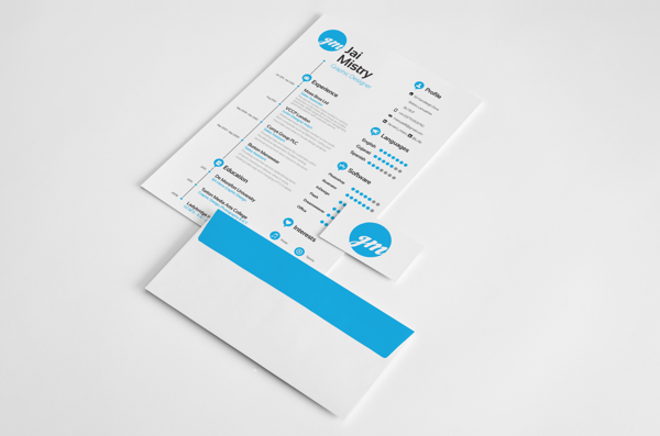
"Self Promotion" (2013) by Jai Mistry
|
This self promotion brand is very professional with a clean and specific aesthetic that is reflective of the characteristic style of the designer. While it has these qualities, it doesn't come across to me that it says anything about the personality or character of the designer themselves and is solely professional. I would like my own design to put across both sides of my personality so that the person who sees it can give a sense of what I would be like to work with as well as my ability as a designer.
 |
"PERSONAL IDENTITY" (2013) by Jonathan Shackleton
|
This identity is a little bit more adventurous than the previous one as Shackleton has used a range of stocks and print techniques to give his work a more luxurious aesthetic. The grey white and peach colour scheme works with the professional aesthetic but the range of techniques gives us an insight into what the designer is like in regards to his practise.
 |
"Giorgia Smiraglia- Graphic Designer" (2013) by Giorgia Smiraglia
|
This design for a personal identity comes across as being a bit more personal than the other brands as it looks softer and includes a photograph of the designer herself. This softness from the stock choice and colour is reflected in the pattern work that is made from the letterforms so that it is much more feminine.
 |
"Revert Design" (2013) by Trevor Finnegan
|
I absolutely love this brand identity for Revert Design Studio as it is powerful visually and experimental, giving both a professional and personal reflection through the aesthetic of the brand identity. The identity is very comprehensive and exciting with a bold colour scheme and a playful layout which is why I like this style.
 |
"Self Promotion- Leave Behind" (2013) by Lacey Leach
|
This self promotional piece is exciting and memorable, acting as a leave behind after a visit or an interview so that you will still be in the mind of the employer when you leave the process. It is very thoughtful and considered in regards to how it apples to her own brand of reuse and renewal. I would like my own brand identity to have this sort of memorable aspect so that people instantly want to see more.
 |
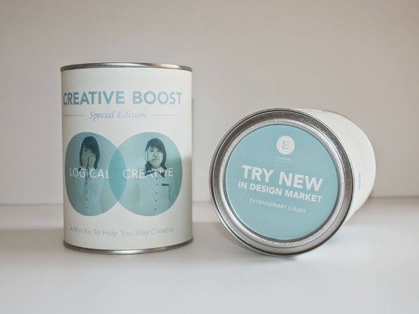
"Self Promotion: Creative Boost" (2012) by Chew Iijuan
|
This brand identity is very conceptual which is defiantly something that I would like to reflect within my brand as I work quite conceptually. The idea is to produce a kit to show how Iijuan can be a creative influence of energy and passion for the company that she is trying to get involved with, with the kit itself showing a creative flair and a strong personality characteristic which is what I would like to show.
 |
"Self Promotion" (2013) by Almari Carosini
|
This range of promotional materials is quite expansive and has a vast range with its own unique aspect of having a clock packaging which is memorable and influential. The design is quite whimsical and type-based which makes for a relaxed promotional pack.
 |
"Mind Controlled Pencil" (2013) by Amanda van der Walt
|
This brand identity is very personal whilst still being bold and specific o the intention of the designer. Everything is thoroughly thought out and planned with reason and meaning behind everything which is similar to the way I work. It is quite illustrative and colourful with a strong personality characteristic that comes across straight away.
After looking at these design inspirations, I decided to start working on my brand. The problem is that, I don't feel comfortable putting my actual name out there yet. Not only do I not like my name anyway but, naturally, I am a very anxious person and I find it difficult to put myself out there. I feel like if I was to use this to put myself out there, I would want to go by a pseudonym as, to me, I would feel safer and more comfortable doing this as I would be still involved but I would be stood away from the action which would make me feel much more comfortable.
Originally I tried to brainstorm names that would work for either one person or for a design studio. I decided to split the names up in regards to how it would reflect me:
Ideas and Concepts:
- Lightbulb Design
- Lightning Bolt
- Velocity
- Rocketship
My Personality:
- Pencil Case
- Sweet Tooth
- Wonderland Design
- Refuse To Sink
My Future:
- Leviathan
- Monolith
- Wise Owl
- Mastermind Design
My Design Practise:
- Black Line Design
- Cherry on Top
- All We Know Design
- Sink or Swim
- Stay Inspired Design
- Vector Robot
- Vector Kitty
- Ocean Floor
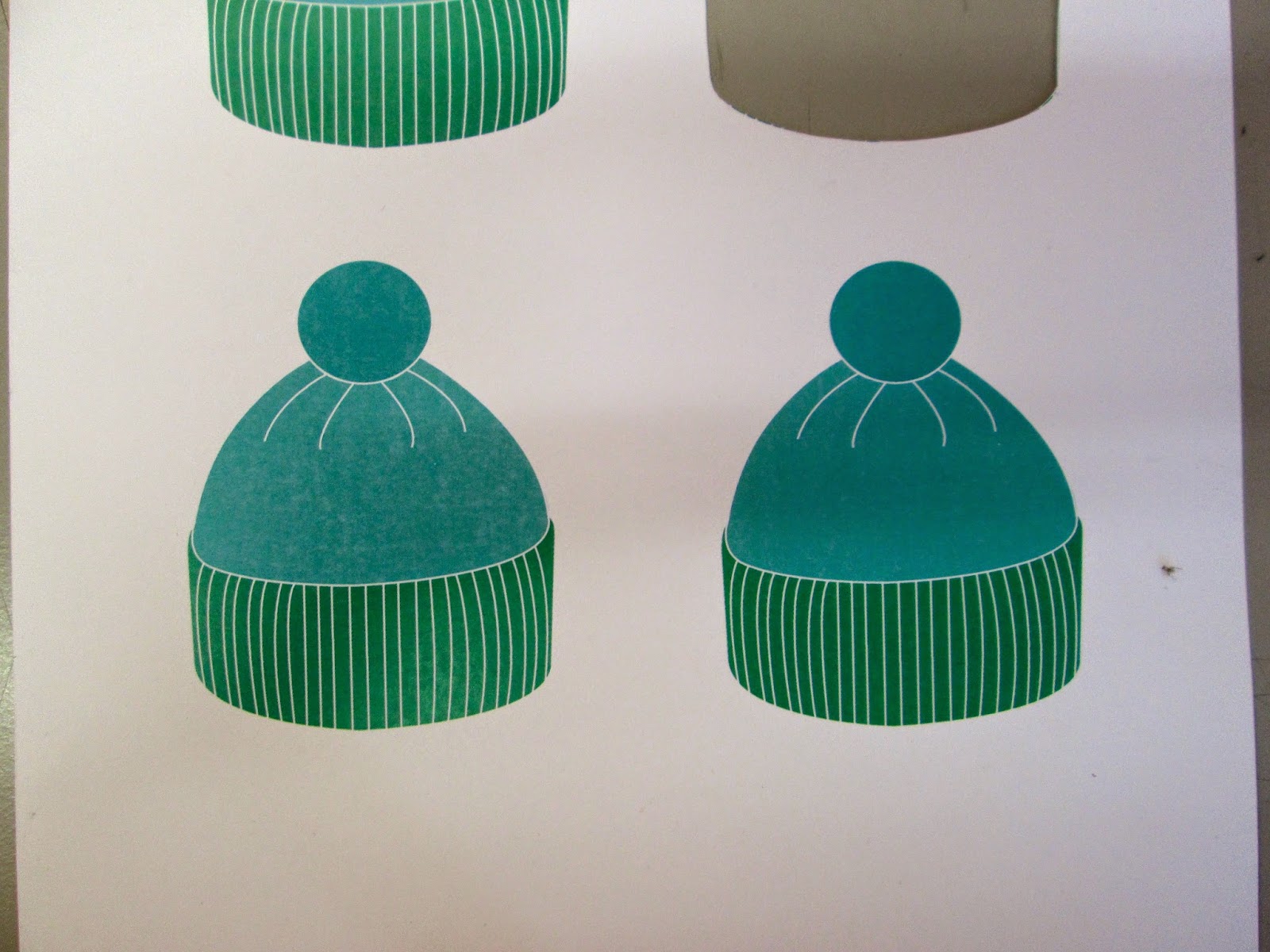
The ones which I felt were most relevant were Wise Owl, Sweet Tooth, Pencil Case and Bobble Hat. Sweet Tooth is because I have a sweet tooth and eat a lot of chocolate. Pencil case was because I am aways being asked by everyone in our year to borrow something out of my pencil case. Wise Owl was because of everything that I have learnt this year and my growing knowledge of the subject. Bobble hat came from the aspect that I like coming up with ideas and concepts and, as the saying goes, you put your thinking cap on, except that I don't wear caps but I do tend to wear Bobble Hats, especially when I haven't washed my hair!
From this, I went onto producing a design sheet on this initial brainstorm of names to see which I would feel most appropriate.
 |
| Design Sheet |
From the initial designs I came up with, I decided that Bobble Hat would be the most reflective of my design in regards to the aesthetic I would produce as it would have quite a simple design to it which reflects my design style. I went onto thinking about pieces of collateral that I could produce and how I would package it alongside a possible layout design for a website that I could propose. It was important that the collateral that I was producing would be relevant to my design practise such as business cards and a portfolio, both in a digital and printed format for prospective clients and employers. Another area I had to think about would be my online presence and how I could have a website of my own in relation to my work.
 |
| Typeface Choices |
I started off my identity by looking at typefaces which I could use. Naturally, my design style is that of using a sans serif font so I wanted to use a typeface which was sans serif but had some personality to it. The typefaces I liked the most were the ones which had the thinnest weight as it reflected my style and I preferred the typefaces which used capital uppercase letters as it gives the impression that I am quite bold design-wise whilst being personally quite quiet. It was between the typefaces Mensch (top) and Ostrich Sans (bottom) but I eventually went for Ostrich Sans as it is slightly thicker than Mensch which would make it much more legible to read for the brand identity.
 |
| Colour Scheme |
From the typeface, I wanted to select my colour scheme. I tend to go for blues and greens within my work so I felt that this was the most relevant colour scheme to use for a brand identity that reflects my design. Not only this but I have just recently started using tints and 1 or 2 colours in a scheme alongside white so I felt that this should be used and considered within my identity.
 |
| Logo Design |
From the sketches that I drew, I took the sketch of the bobble hat and applied it by producing a digital illustration line drawing. From this, I did both a light coloured and darker coloured versions of the hat by using the blue and green colour scheme and felt that the lighter colour scheme was much more fitting to the identity as it was clearer visibly to see. From that, I changed the outline colour from black to white as this is something that has changed in my design practise as I use to do everything with a black outline and now I tend to use white. I added the name of my practise to the bottom of the hat so that it is contextualised but then started playing about with some other designs I had come up with on the design sheet. I didn't feel that they worked as well being mainly type based with a small logo so I went back to the initial design but added in my year of starting as a designer to show when my training started. What I might have to change is the black type as it doesn't go with the white outline for the illustration.

 |
| Identity Development |
I needed to have a contrasting colour to put my bobble hat logo onto in order to have something to work with when producing the collateral which can also go towards the overall design. With the colours for the bobble hat being quite similar, I wanted a colour which would make it stand out so I went for a pale powder blue. I went onto changing the colour of the bobble on the hat as it was too dark previously in the green so I changed it to a rich blue.
To make sure that I have made the right choice, I started applying this colour scheme to producing some business card layouts.
 |
| Business Card Layouts |
The information I felt that was appropriate to go on my business cards would be my email address, phone number and Behance portfolio, alongside my style of design and the areas which I like to work on. For these, I produced small illustrative icons to show what each piece if information was to be used for. I quite liked the layouts that I had produced for the business cards but I felt that they seemed a bit boring. I wanted to be able to have something which was a bit more unique and memorable.
 |
| Business Card Design |
I went onto changing the shape of my business card into the shape of my logo so that it was a bit different and played around with the presentation of the information. Originally the name of my business was on the front but, in the end, I felt that this cheapened the overall design and stuck with having the front plain with the name on the back. What I also did was I added a bolder version of the font I am using as to give an emphasis onto the name of the business thereby making it instantly stand out from the rest of the information thereby, despite it being smaller in size, instantly has priority in the hierarchy.
Building on this, I went onto producing my creative CV. Things that I felt would be necessary to include would be my education, contact details, interests and skills as well as an introduction on myself.
 |
| Skills |
To include my design skills and design interests onto my CV, I decided to show how well I perform on each area to show what I am good at but what I am aiming to improve on. The more bobble hats they are, the better I am at that skill. I felt that this was a simple way of visually highlighting the information and how I would hopefully liked to expand and improve on these areas.
 |
| Working on Layout |
From deciding what information I would like to include, it was a case of trying to get the content to fit. I had put the information against each other so that they didn't reflect but I felt that this comes across as quite amateur and unconsidered. The information is to the point and relevant, for example, my education is down to my foundation and degree as I felt this was the only relevant education information that would be bothered about. I decided to have my logo in the top left hand corner so that it would seem like a professional business and felt like it was relevant to use the bold header font for the different sectors of information.
 |
| Front and Back CV |
I changed all of the layout so that it reads and fits better on the page by making the text content smaller and reflecting the information against each other for a better fit. I decided to makes the text much bigger, especially for the introduction paragraph as I feel like this is the thing that is going to get the readers attention. I made the header font much bigger and added an underline to the headers so that it was emphasised further. For the back, I have a reoccurring bobble hat pattern that further reinstates the brand.
 |
| Experimentation of Background Colour |
I felt that the lighter blue colour when put in context of an actual physical piece of work was quite washed out and slightly harder to read the white font so I had a play around with some darker versions of the same shade which instantly lifted the text from the background.
 |
| Applied Colour to Brand |
Instantly this darker blue allows for the bobble hat logo and the text within the CV to jump out at you and makes more of an impact.
As a designer, I feel like I have learnt a lot this year and I think it would be very relevant of my practise to produce a manifesto. I decided to think of some things that I have learnt this year which has attributed to me as a designer that I could include within my practise manifesto.
The main points which have been relevant to my year of growth is:
- Believe in yourself, even when no one else does
- Edit photographs in Photoshop, thats where they belong
- Procrastination is great, until its thew week before hand in
- Make lots of perfect mistakes and learn form them
- Don't just think about the work, actually do the work
- Keep trying because you'll always get there in the end
 |
| Manifesto Development |
I started off with applying the bobble hat pattern at the back of the CV to a new A3 file. I felt that it would be a great way to keep the consistency throughout. Straight awayI needed room to include the necessary text so I got rid of half of the rows and centred them so that I had some space to work with as well as be able to differentiate between the title and the content.
 |
| Header for Manifesto |
Using the same header style to the CV, I added a main title and an underline to the top corner. Despite this, the underline gave more of an impression that it cut off the bobble hats and the title so that they were separate pieces of work rather than having any cohesion so I decided to get rid of the underline which made it more open.
 |
| Content in Bold |
In keeping with the structure, I made the main body copy in the Ostrich Sans normal font weight but felt that it had little relevance or impact in this way. I decided to make it bold as well like the header so that it had just as much impact and importance. It was integral to the fact it was a manifesto to have this visual impact. I made sure there was no hyphenation by having the content left aligned as, by having it justified was creating unnecessary spacings which I would have to kern.
 |
| Application of Manifesto Design |
I applied this design to all 6 points which instantly gave the cohesive nature of the points being part of a set, which was necessary to them being a collective list of rules. They can work by themselves and keep the brand or be seen as a set so that it is a collective. I decided that these would make great advertising posters for the brand which would be quite obscure and would get people to find out for themselves what it means.
 |
| Invoice Design |
Using the information that we had for the Life's A Pitch brief, I produced an invoice to show how I would charge people for my custom whilst being a designer. The amounts are based on the calculations as a group within the brief. Then I laid this out similar to the CV with the contact information being at the bottom for any queries and the dates and invoice number at the top, making it easier to organise and sort out enquires.
 |
| Invoice Colour Variation |
The problem I had with the Invoice however was how unprofessional it looked with the blue background and how it would cost a lot in printing costs if I was to constantly be printing stuff off with a full colour background. With that, I took inspiration from my manifesto posters and applied that style to my invoice so that I had colour on a white background which was much better. I was conscious of it being illegible but I printed it out to test it out and it seemed fine.
 |
| Letterhead |
I decided that it would be much more professional if I produced a letterhead to go alongside the invoice because if you were to get communication from a business, you would expect a letter contextualizing the payment. I reflected the style of the invoice with the letterhead so that there was some connection between the two and would aid legibility of text.
The only trouble I had at this point was the fact that my text is naturally, all uppercase when in real life, it would make it much easier and seem more professional to have lowercase and uppercase type.
 |
| Collateral with Lane- Narrow font |
To do this, I chose the font 'Lane-Narrow' because it is quite a thin font which reflects the same weight and style of 'Ostrich Sans'. Instantly, this made all of my body copy much more inviting and warming to read, giving a much more friendly tone of voice which I think reflects my personality much better.
 |
| Net for Envelope |
With this, I decided to design and produce the net for an envelope to go alongside them so that I would be able to carry the brand with the communication, having a coloured front and back so that it would stand out from any other piece of post and that the client would know that it would be from me.
 |
| Stickers for Envelopes |
Once I had designed the envelope however, I decided it would be pointless to do because I could just get a normal white business sized envelope and add the logo to the bottom corner and this would again, be costing me lots to print. So that I would be able to do this in real life I decided to produce some stickers as part of my business needs so that I would be able to do this.
Based on the initial sketches I did on the design sheet, I had drawn up some packaging designs for the branding. The one that I felt would give a smart and professional aesthetic would be a folding out file which would be great for slipping in and out any paperwork and drawings and could be used to take work to and from clients.
 |
| Net for File |
I made a net for the file which is pretty simple but would keep everything in place.
 |
| Inside/Outside Portfolio |
I decided to apply the pattern from the CV onto the inside of the file and have the outside plain. I then changed this to have the logo on the front with the word portfolio so it was instantly understood as to the purpose and what they were looking at. From this, I added the blue background so that it was more in keeping with the inside and added the information paragraph from the CV to the inner flap so that it introduced the audience to everything within. Due to the scale of it however, it would have to be produced on A2 despite the folder being to fit in A4 work.
Having called the file my portfolio but not having any work within it of my own to show, I thought it would be quite relevant to produce a short little booklet of my work which they would be available to view.
 |
| Front, Back and Introductory Double Spread |
For the portfolio I used the same front and back as the file, making them and inserting them into Indesign as Illustrator files, and had the manifesto points I had produced on the first double spread so that my design principles and information are straight away highlighted and informed as to the work in the portfolio.
 |
| Page Layout Throughout |
 |
| Exceptions to the Layout |
For the actual pages with my own work, I decided that it would be best to prove how strong the work is by allowing it to speak for itself. From this, the only information I decided to include would be the title of the brief and a very short brief description of what I had to produce/what I produced. I kept the style of these pages the same throughout with a white background and a short header and body cpu, similar to that of the Invoice and Letterhead. In regards to the image sizes, I tended to keep the layout all of the same with a main image on the left and two smaller ones on the right, however, when the image called for it or there wasn't enough images, I would change this to two large images. I think this helped keep the quality of the imaged and, again, allowed for the images to have the most of the impact which is the most important when it comes to a portfolio, working for them rather than for the portfolio being succinct.
I was happy with the overall preview of the portfolio as it shows only the work which has been the most successful from being a designer and I think it would show it in a positive, encouraging light. It is quite brief but I think this is necessary as the audience will judge you and the work straight away regardless of the amount you show so I think keeping it short and sweet is the way to go.
To go alongside the ideal of having a printed version, I thought it would be very relevant to have the portfolio available as a digital PDF version as a lot of people would go straight for the digital version on a computer. I decided to accommodate this by producing a CD slip case with a burnt copy of my portfolio to view.
 |
| CD Slip Case |
Again I produced a net and applied the branding to the netting so that the viewer will instantly know whose work they are viewing and who to contact about work with details being on the back.
 |
| Burn Portfolio PDF to CD |
I bought a CD-R and burnt the portfolio as a PDF onto the CD so that it was ready for instant accessibility.
I went onto printing my collateral, however, this didn't work out very well for me and I had a bad time of it, not because of anything that I had done but because of the printers themselves. All of my work would either come out in the wrong colour shade blue and things that were double sided would print the wrong way up.
These problems affected the file packaging, the envelope, the CD slip case, the creative CV and the business cards in particular.
I was very angry about all of this because I would have thought that this was something that would be quite straight forward for a printer and I wasted a full day on all of these mistakes. Not only this but this mirrors last year where I had the same issue on the same brief! I couldn't believe it.
All I could do was calm down and try and salvage what I had and make it work for me. I decided to have the Invoice and Letterhead not double sided so that it would be fine from their printing. I would use the one side of the file and make my own which isn't double sided. I decided not to produce the envelope and would instead have the stickers within my pack as stickers which can brand envelopes rather than having blue envelopes as this would still go with my brand.
 |
| CD Slip Case |
With the CD Case being one sided, I was able to produce and craft the net to make it ready to put the CD inside.
 |
| File, CV, Invoice and Letterhead |
 |
| Printed Stickers |
 |
| File Packaging |
This is the file I produced from the mistakes made from the printers. I produced the file using a net and crafting it myself in a stiff white card before applying their one side and cutting it down myself so it fitted. Using the stickers I had printed, I applied one to the inside seen as I wouldn't be able to have my introductory paragraph on the inside.
 |
| Business Cards |
The business cards I thankfully managed to get printed off through one of the other students, with them being printed on a thicker card for durability. I had to cut them out very carefully as they are a custom and not regular square shape. This made it a challenge to do but my crafting skills have been improving lately so I was up for the challenge.
 |
| A3 Posters |
On the other hand, my advertising posters came out very well and I was pleased with the outcome of them as they seemed very strong and would make an impact. Alongside this, I produced my portfolio book by adding a pamphlet stitch to the binding which I had never done before and felt that this came out very well.
Website Design:
Another area I would need to consider would be the online presence I would need to deliver so that I would be able to garner a larger worldwide audience access to my work and my services.
 |
| Front Page |
I started off by producing a Homepage which was in the style of a landing page. Many people do not like landing pages but I am a fan of them as it acts like an introduction into the website. I decided to have the logo for the brand in the center of the page as large as I could with a centre navigation bar along the top of the screen which surrounds the main logo. The page links are along the top in the navigation bar and would be roll over buttons which would turn the blue/ green colour of the brand identity.
 |
| Work Page Development |
Initially, I wanted my website to reflect the design identity of my brand by having a row of bobble hats along the screen with an image of the corresponding work within the shape of the bobble hat. I managed to achieve this by using the Clipping Mask tool technique on Illustrator. I felt that the amount I had was too many and continued to have smaller numbers with bigger hats but then I just had to admit defeat- aesthetically, it looked shocking.
 |
| Website Development |
I decided that it would be a better idea to work with the images in an easier shape like a square so that I would be able to manage the layout better but it still wasn't working out. I think it might be the navigation bar being along the top so I will change this. In regards to the other pages, I wasn't sure what I should include in them but the information that I did have for the contacts page was small that I have decided to get rid of this page and just have the information placed elsewhere.
 |
| Development Work Page |
In the end, I tried to go along the lines of something that was simple in regards to layout and easy to follow. I changed the orientation of the page links so that the navigation bar went from being along the top to the left hand side. Alongside this, I put my contact information at the bottom of the navigation bar which made much more sense then having it own page. Instantly this gave me much more space to work with, especially when I made the heading sizes smaller. Using this space, I placed images of my work in an even size for all which instantly made the work the main focus of the page instead of the layout. In a way, I think this is how it should be because the layout is subtle and works to enhance the impact of the work.
 |
| About Page |
I was much happier with this layout and decided to continue with it throughout my website. For the About section of the website, I thought it would be nice to use the collateral that I produced for this brief to visually represent it whilst having the excuse to showcase some more of my work. This made for the layout to be consistent yet having the information like this made it so that I could have no written information about me.
 |
| Inclusion of Written Text in Navigation Bar |
Taking inspiration from the fact that I had put the contact information within the margin navigation bar, I decided to put the information about myself within it so that I could have a more personal engagement with it. This made much more sense to me visually and keeps with a clean aesthetic. The trouble now is that the difference in colour on the title which is orientating the audience is making the word difficult to read.
 |
| Different Orientation |
I went back to putting the headers in white which was much clearer so I just needed a simple way to differentiate the orientation. Going with the brand identity of using an underline for emphasis, I added this to the page orientation which automatically made a much more clearer addition.
 |
| Layout of Individual Br |
For the website to have any purpose, I need to be able to visually show how I would present my work as single projects. I continued with the use of the columns by having a title, information and then a short paragraphed description of the project itself in the space as the room within the navigation bar is taken up by a orientation description of the website section.
For the work, I made the image as large as I could whilst having some space to breathe so that it looked professional and was instantly eye-catching. The trouble was that, for the moment, I only have on image for the page.
 |
| Rotation of Images |
At the bottom of the page, I decided to include a gauge which would allow me to have a number of images on a page. The numbers would indicate the number of images to view available and the huber with a heavier weight would indicate the number of the image they were viewing.
 |
| Next Image on Work Page |
As you can see, the images would then be on rotation or could be selected to view which would be shown by the next number in line being a higher weight.
 |
| Blog Page Layout |
The last page I have to consider is the idea of having a Blog page. I was wondering whether I would be able to link my college blog or my Designer Dose blog to be included in this page, however, it would probably be quite unprofessional to do this so I thought it would work as a general studio activity and inspiration blog.
I laid out the page in the same style as the individual brief pages but to me, it seemed really empty for a blog page. I considered having a banner or other information on the top of the page but this is already present within the navigation bar so I don't see any point repeating what is already there.
 |
| Scroll Down Older Posts |
I added to the blog page by having an earlier blog post underneath it, showing how the blog page could be scrolled down to view previous posts.
 |
| Content of Blog Page |
I had previously used Lorem Ipsum for the text to show what it would look like but decided to add in actual information as a real website wouldn't use Lorem Ipsum. I also decided to include design sheets that would be shown in regards to the work that I had produced so that any followers of the blog and possible clients could see the way I work and the style that I approach work.
 |
| Homepage Re-do |
The final thing I had to do was go back to my homepage because It was still of the original layout of the top centre navigation bar.
 |
| Roll Over Work Selection |
I realised that, despite designing all the pages, I hadn't worked out how the user would know what piece of work they had selected or were hovering over. I decided that it would probably be best to have the colour of the brand covering the image and the title of the brief with a short description over the top. I did this by saturating the image I wanted in Photoshop and adding a photo filter of my dark blue brand colour.
 |
| Designed Web Pages |
Altogether, my web pages work cohesively and have a consistent aesthetic, however, I think this would show better if I had the chance to produce this. I feel that I am able to show my work in a positive light in this way as well as be able to show my working capacity in a professional manner. Following this, I mocked up all of the pages in Photoshop to produce a professional looking website that could be used.
Final Product:
A range of printed collateral promoting myself as a designer using a professional brand identity to work by as well as a proposed website design.
 |
| Website Mock Up |
Following on from this, we had to produce a presentation of up to 5 minutes in length. We were given 3 main questions that we had to fulfil in the presentation: Who are you? Where are you going? and What do you want to get from PPP?
I decided that I wanted to have a structure to my presentation and decided it would be a good idea to include my manifesto as part of my presentation so as to structure it accordingly. This would also give me the opportunity to review my year as a designer and how far I have come.
I decided that I would present myself as my brand identity from this brief before leading into the points of my manifesto and talking about what I had learnt good or bad through the year. Following on from that, I would be able to discuss where I am going and my future before finishing off with what I would like to have through PPP.
 |
| Notes for Presentation Structure |
Using this structure, I wrote out a script that I felt would be useful for the presentation so that I would have a defined vision of each slide and produced the design in accordance with it.
I felt that it was appropriate to include my own briefs within the presentation throughout, even when talking about the future and PPP, so that it was clear that it had come from my own experience as to my informed decision. Also, the pages themselves had barely any text and were mainly visuals so that I had no choice but to think for myself and talk to the audience as the presentation itself would lend me no support in that sense.
I felt that the presentation went quite well except I was very nervous beforehand and I think that came across. I have a very conversational tone and speak like I am having a conversation with the audience which is probably not the most professional but is the most comfortable way for me to be able to speak to a large group of people.
Overall, I felt that this was a brief that was quite nice to revisit from last year because I feel like I have changed a lot since this time last year, in regards to design as well as what I like. What I would like to do in regards to improving the brief would be to continue to develop this through the next year or so so that I can keep my brand reflecting me as I develop. I would also like to take the website proposal and make it live, either by using a template or, preferably, making it myself in Dreamweaver.