As we have finished the Design Skills Module, we had to complete a Self- Evaluation of the whole Module to discuss how it went and to reflect on the work we have produced (see pictures).
OUGD403 Design Skills Module Self- Evaluation
I think I was very thoughtful in regards to my answers and I gave alot of consideration to what needs improvements, my strengths and my weaknesses.
We had to present our fully finished 5 envelopes and mailshots with the Mailing List and lay them out for a different group of people to crit. As we would crit a group of peoples work, they would be critting ours. We did it in pairs which was more comfortable as it allowed us to discuss with someone else what we were thinking.
This is the feedback that I got for my work (see pictures):
Crit Sheet 1
Crit Sheet 2
Crit Sheet 3
Some of the feedback I got was quite constructive as I was given suggestions of how I could evolve my project and I got to see how it could be seen from an outside point of view which is something that you can't have when your making it whereas other comments were very dismissive and clearly they hadn't considered any of my previous briefs work and why I had produced what I had produced.
Self-Evaluation:
How did you approach the brief? - I approached the brief with the intention that I was going to make my product as similar to the posters I had previously produced as it was a continuation of the previous brief and needed to work as a series. In regards to the product itself, I came up with intiial ideas before settling on a mixture of what I had come up with as a final choice and then set out to make it with as much emphasis on quality as possible.
What was your thought-process behind the brief? - With the approach that I intended, my thought process was that I was going to use the same imagery, type, media and processes so that I could answer the brief as much as possible. Due to the fact that I was hand-rendering this mail shot, I wanted to make the product seem so exclusive and full of quality that someone wouldn't want to throw it away and instead would be interested in the reason and message behind it.
What worked?/What was Good? - I felt that the imagery of the envelope and the visual aesthetic was very striking despite being a bit morbid and serious in its depiction. It made sure that the mail shot has a very specific identity and targetted a very specific audience.
What didn't work?/ What was Bad? -I had quite a bit of feedback saying that the font was illegible which I disagree with as it is legibleand understandable but I can understand that it may be difficult to read on a smaller scale and was better suited on the posters than on the envelopes/mail shots in regards to the size and therefore the readability.
What would you change?- I would prehaps change the mail shot and maybe make something bigger which has more information on it and that addresses the audience more personally.
For my Context of Practise Progress Tutorial, I met with Richard to discuss my Progress within the Context of Practise programme.
Copy of Tutorial Feedback Sheet
Issues Discussed at the Tutorial:
Avoid using the first person tense, such as using the word 'I' or terms like 'I Think...' as it makes the writing seem weak or unconfident even though it is clear that I understand the subject matter
Use quotes to back up your analysis
Avoid using a conversational tone
Try to find more graphic-focused examples
Perhaps read "Graphic Design and Post Modernism" by R. Poyner
Extra Additional Work- Consider adding web links to lecture notes to show other research
Generally good Writing style
Student Action:
Consider going over Blog making improvements
Evaluation:
I think it would be beneficial to add in the extra research to strengthen my research within my blog and I will definately consider adding more quotes within my work as I hadn't even considered it beforehand. Also, I will try to stop using 'I' and 'I Think' as I didn't know that it gave the impression that I was unsure or had a weak argument.
How did you approach the brief? - I approached the brief in an informed and focused way due to the fact that I had done thorough research into my subject matter therefore I could produce an informed opinion and present it to an audience. I wanted to communicate to the audience the reasons behind Cyclists Doping but I didn't want to do it in a way that would be too shocking or off putting for the wider audience so I constantly had that in the back of my mind when considering what design to do.
What was your thought-process behind the brief? - My thought-process behind the brief was that I wanted to communicate properly to the audience and be able to put the opinion across to a person who doesn't know the story. Therefore, it was important for the work to be image driven as I knew that having the story encapsulated within one image with no type would be the hardest in regards to communication.
What worked?/What was Good? -The unity and flow of my posters was what was good about my brief because I managed to encorpoate all the aspects neccessary within the poster, such as the type and image combining as one, therefore making sure that it works as a whole and isn't disconnected or disjointed.
What didn't work?/ What was Bad? -All of my Illustrator attempts at producing my posters were dire in regards to visual quality and skill as they didn't have an professional aesthetic to them. The only positive I can take from trying it out is that I used it as an oppotunity to practise using something I'm not very good at and try to improve.
What would you change?- I would perhaps change my image poster as I have tried ot contextualise it as best as I can but i'm not sure if a wider audience would get the message if they didn't know the context. Also, I didn't intend for the imagery to seem as morbid as it does with the use of the IV Tubing Blood Type. It's a great concept but maybe it would be an idea to develop it if I had the time.
How did you approach the brief? -I approached the brief with the ideal that I would try and make the alpabet in the most simple way possible with maximum communication and minimum fuss as I don't have alot of expereince with using the Illustrator programme.
What was your thought-process behind the brief? - My thought-process was to trace an original letter so that it would give me a template to work from. I wanted my letters to be consistant in style and appearance and therefore this was a top priority in regards to my thought-process.
What worked?/What was Good? - The detail that I have managed to put in the letters without overcomplicating the concept is what I like most about my alphabet and was probably the biggest success of my brief. Also, I like the grid that I managed to produce after having several attempts because it made my final alphabet alot cleaner and aided the clarity of the typeface.
What didn't work?/ What was Bad? -What didn't work was the original design that I came up with for the typeface as the grid was too confined and the letterforms were inconsistant which meant that, on the whole, it just didn't work. It wasn't until I had fully developed and improved these problems that the actual typeface began to look like a unified font.
What would you change?- I think I would change the letterforms by perhaps making the shattered pieces of each letter slightly larger as it is slightly more difficult to see them at a small scale then if they were larger on the screen.
For my Progress Tutorial, I met with Fred to discuss my Progress on the course so far and if I had any problems.
Attendance:
Nothing wrong with my attendance as I have attended every day so far.
General Comments:
My blog is very detailled and that I have already taken ownership of it- can tell it's a 24/7 project
Images are not left blank and are annotated
Easy to follow and in order
I asked Fred about my use of my 1 rough working note book that I put everything in and asked whether it would be beneficial to buy seperate books to make them more organised as all the pages are starting to fall out. It was suggested that I get seperate notebooks and a larger sketchpad/ start working on large sheets so I come out of the small scale I like to work from.
Blogs:
I asked if Lecture Notes had to have images with them because I don't put images with mine due to the fact that, in a lecture, I dont have the images on me therefore they would not be part of my notes. Due to the fact that I type up my notes and that I could justify my reasoning, I don't neccessarily have to. Just maybe 1 or 2 if it's an important point.
Current Progress:
I am progressing well but I am to be make sure that I take regular breaks and have some time off so I don't have a breakdown from the consatnt workload!
Also, I am to make sure that my large amount of annotation doesn't take over the time I need for my design practise work as that is more important.
Evaluation:
My tutorial went very well and I agree with the points that Fred made about my time management and note organisation, however, I cannot gaurentee that I will stop working and take a break! I'm always constantly trying to improve my work to the best of my ability yet I do appreciate his feedback and will take all of it onboard.
In PPP1, we discussed that there are 5 key areas that Graphic Design is used for (which is not a definitive list):
Information & Way FindingData & Information to help others, Understandable Structured & Organized, Innovative Devices & Creative Layout, Facts & Statistics- A lot of Research and No Emotion
Branding & IdentityBrand (Overall Image of the Corporation), Identity (Visual Aspect of the Brand) & Logo (Icon used to Identify the Brand) that needs to be of a Global Language.
Publishing & Editorial DesignOngoing development of a body of Information, Accross digital and print format, "Above the line"/"Below the line", Playing with the format and body copy, Relationship between text and image
Product & PackagingProduct effects the approach to the Packaging (Relationship between the Product & Packaging), Relationship between the Budget (High & Low), Packaging Protection
Retail & Promotion To promote Information to get people to do something and change Habits, Adding Value, Brand & Identity in a consumer, Unified Company, Large Scale Environmental Graphics, In Store Graphic Design
For the Study Task, we had to find 5 different websites/blogs for each section of design to research into its meaning, write a 50-100 word statement defining our understanding of that particular area and then find 10 examples of each, stating why each image is an effective piece of design for that area.
Information & Way Finding involves doing a public service by aiding the understanding and distribution of information and providing it in an understandable way to ease the everyday life of people in a fast moving living environment where information is needed efficiently and fast. It spans medias,scales and environments as this information can take on any media and any form, from digital to environmental graphics
"QV Melbourne Carpark Wayfinding Graphics" (2009) by Latitude
Latitude Group, Melbourne (2009) "QV Melbourne Carpark Environmental Graphics" [weblog] Available from http://latitudegroup.tumblr.com/ (Accessed 25th November 2012)
Latitude- These are effective as the Environmental Way-finding Graphic Designs are innovative and useful in it's manner at directing and aiding the audience with information in a clear and playful manner. The use of the neon bright colours could be seen as tacky by some but they make the messages easy to locate and easy to see from a large distance- particularly due to the large scale size of a car park.The choice of a sans serif font also allows the fluidity of the letters to run into each other flawlessly so it is more successful in the design.
Emma Cook- Cook takes on an interesting and funny approach to teaching people the alphabet by making it relevant to Graphic Design and the things that revolve around the work life of a Designer. The illustrations are quirky and playful, with a visual aesthetic that reflects the professionalism of the job as well as making the flashcards informative to those who haven't been trained in the field of Graphic Design so they can understand some aspects of it better and making them effective at communicating information.
Herbert Lester- This illustrated vintage-style map focuses on the picturesque aspects of Copenhagen where it looks at the food scene aspects of the city, highlighting places to visit, cafes and food specialties. The style of the map is in keeping to the visual style of a traditional town, making the city seem quite accessible and relaxed, giving it a laid back atmosphere to appeal to tourists, with the map seemingly effective in its authenticity and honest perception of the city.
Stefano Agabio- This Infographic poster depicting an average day in the life of Agabio highlights how we use the time that we have in a day and how much time we waste as well. The fact that it is a poster that could be relevant to a lot of people, allows for the audience to participate and recognize how they spend thier time. The use of symbols and time frame depicted in the infographic contextualizes the audience and the key code at the bottom of the poster aids the interpretation of the information, making it effective at displaying information.
Categories: Poster, Pictogram, Graph
"Graphic USA" (2010) by Daniel Blackman
Blackman, D. (2010) "Graphic USA" [Internet] Available from http://dblackman.com/graphic-usa/ (Accessed 18th December 2012)
Daniel Blackman- The unique way that Blackman is presenting way-finding around the city of Chicago makes for an interesting and alternative presentation of information as he uses a logo style composition and aesthetic to keep the style simplistic yet meaningful. This is effective as it doesn't rely on arrows or roadsigns and instead uses the shapes and pictograms within the visual style meaning that the audience has to put more thought into what the map means and where it is leading them.
Categories: Pictogram
"Typography Deconstructed Poster" (2011) by Drew Binkley at 38 Pages
Beast Pieces (2011) "Typography Deconstructed Poster" [Weblog] Beast Pieces 8th February Available from http://www.beastpieces.com/page/4/ (Accessed 18th December 2012)
Drew Binkley at 38 Pages- This letter pressed poster has a clean and specific presentation in order to best present the information that it is trying to give in the most effective manner for the audience. The clear division of the 2 halves of the poster allows for the information to be presented in 2 ways; a glossary of terminology and a visual demonstration of the rules to see examples of how they are in use. The letterpress media used to produce this gives a classy and sophisticated aesthetic which makes it unique from most information- based Graphic Design.
David McCandless- Creating an unusual format to present information is how McCandless makes boring information seem interesting by appealing to the audiences likeness for visual stimuli. The unique format allows for the poster to function effectively by presenting information through shapes, colours and diagrams rather than totally relying on words. The fact that this is done with digital media links well with the subject matter of data and keeps the whole project consistent throughout in its message.
Brandculture- These environmental graphics are unusual in thier format as they are placed on the ground rather than as signs on a wall but work just as effectively, allowing the user to follow the wayfinding like a treasure map to get to thier destination. The content to the wayfinding system is simple yet functional which is like the style used to produce these graphics, taking inspiration from technological media and digital culture so it is reflective of the clean yet innovative design.
Cartiledge Levene- Due to the minimalistic content of the signage used, this wayfinding system relies on a format based on common signage already used to guide the audience around the building but it is the sleek yet powerful aesthetic design that makes the information successful in its purpose. The bright yellow squares of colour make the signs easy to spot amongst the different levels which aids to the consistancy of the building as well as providing a part of the identity of the building.
Frost Design-This traditional approach to wayfinding and environmental graphics shows a tried, tested and trusted method of effectively getting people from one destination to another. The use of columns and wall designs allow for the audience to have clear understanding of thier purpose and provide the user with orientation of thier surroundings, as is the function. The disjointed, contemporary aesthetic choice of the signage gives the impression that the museum is up-to-date and the colouration adds strength to the overall visual presentation, making it accessible to a wider audience.
Branding & Identity involves the presentation of the client and how they are percieved by thier consumers. It usually includes having a global sign or logo that is instantly recognised as synonymous with that company with other aspects of environmental graphics and collateral that reinforces the message that the company is trying to give to its customers.
Push- This effective brand identity that came from the team at Push gives the Old Chicago Restaurant a feeling of authenticity and homeliness due to the vintage diner style aesthetic and print stock used to produce the merchandising. This classic look looks more refreshed and anew instead of tired as it fits in well with the company philosophy and the choice of sticking to muted colours allows for a mature appearance to appeal to a larger mass audience.
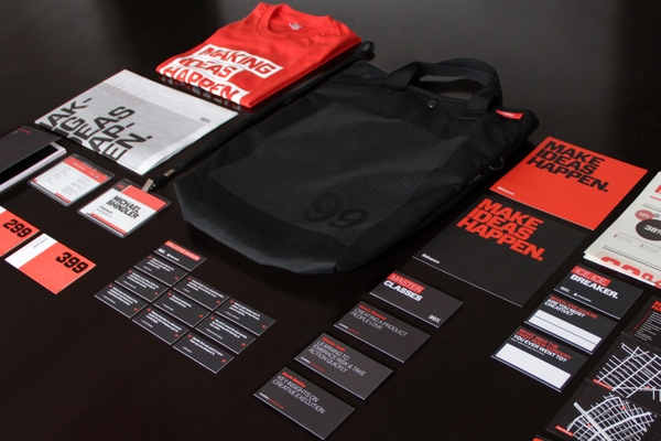
Matias Corea & Raewyn Brandon- The multitude of media is extreme for this campaign for the 99% Conference as it encompasses branding, collateral, video and web so that the whole identity has been considered. The minimalistic concept for the brand is in keeping with the philosophy of the company and this is reinforced by the format and layout choices along with the colour scheme framework and typographic presentation, making the campaign as effective as possible.
Josip Kelava- Creating a consistent and flowing identity for the restaurant has been successful for Kevala as she has managed to effectively separate Common Man from its competition with a homely and rustic interior that's reflected in the design choices. The modern brown and blue colouration choice contrast without clashing and the vintage signage make it appealing to all workers due to the traditional aesthetic.
Categories: Restaurant, Business, Consistency
"Everybody Loves You" (2012) by 25ah
25ah (2012) "Everybody Loves You" [Internet] Available from http://www.25ah.se/projects/you-stockholm (Accessed 20th December 2012)
25ah- This brand identity for a high end hairdressers influences the reputation of the company as the identity looks sophisticated and chic due to the minimal style and elegant typeface. The choice of muted, neutral colours gives a cool, sleek feel to the branding and the content of the collateral reflects the high culture presentation of the hairdressers itself.
Categories: Business, Visual Identity
"Caffetera" (2011) by Alexandr Chernov
Chernov, A. (2011) "Caffetera" [Weblog] 22nd September The Behance Network Available from http://www.behance.net/gallery/CAFFETERA/2185707 (Accessed 19th December 2012)
Alexandr Chernov- This sophisticated brand identity for a take away food packaging company has an aesthetic of metropolitan life as it focuses on a minimalistic yet mature approach to presenting fast food, making the 'Caffetera' brand more high quality dining then a normal take away food. The multicoloured narrow striping adds a stroke of colour without being ostentatious and the fact that the format is in the style of a road map reinforces the message of being sophisticated when on the go.
Categories: Restaurant, Branding
"Not Myself Today Campaign" (2012) by Blok Design
Blok Design (2012) "Not Myself Today Campaign" [Weblog] 13th June The Behance Network Available from http://www.behance.net/gallery/Not-Myself-Today/4212141 (Accessed 20th December 2012)
Blok Design- This identity design by Blok Design stands out almost instantaneously due to the simple imagery yet powerful idea behind the campaign. The function is to raise the profile of the campaign which is achieved effectively by the confrontational use of emotive words attached to these bright coloured circles which are eye-catching and present a clear format to work in. The campaign spans interchangeable media such as merchandise, website exposure, billboards and design installations in order to reach as many people as possible thereby making an effective attempt to help a good cause.
Categories: Branding, Campaign, Consistency
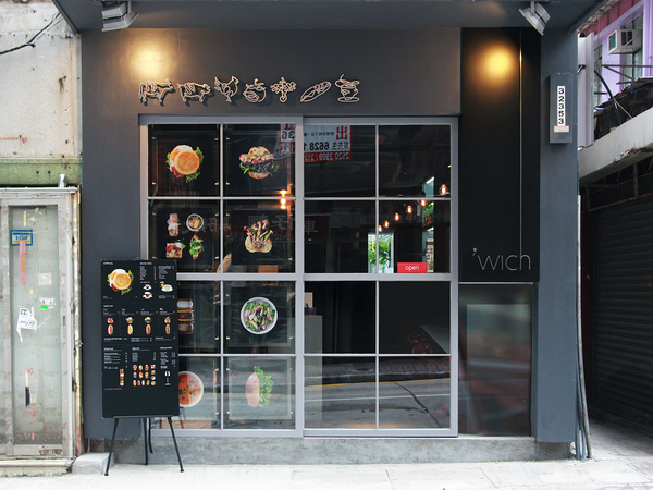
"'wich" (2012) by BLOW
BLOW (2012) "'wich" [Internet] Available from http://www.blow.hk/?p=1031 (Accessed 20th December 2012)
BLOW- What made this identity stand out effectively was the subtle detailing that have been put into the overall designs that gives the brand an aura of elegance and consideration. The light weight typeface and colour tone gives the impression of exclusivity and high quality that is reinforced by the contrast in the black and tonal colour features throughout the identity and packaging. The inclusion of these designs in all aspects of the cafe, such as the environment, uniform and signage, presents a uniformity and unity that other concept restaurants haven't done.
Bravo Company- The simple idea behind the concept of the identity for this non-profit organization stems from the philosophy of the company and therefore it encompasses all of the intention and message behind the organization through just the imagery. The inclusivity of the organization is reinforced by the design choices as the layout and format of the designs are interconnected and together, highlighted by the chain link visual chemistry of their design image.
Woody Harrington- This fictional concept of a literature cafe gives the impression of a classy and sophisticated atmosphere based on the content of the collateral and the design choice of having an old English, vintage, retro style. The format of having products done in a printed media, using stamps and printed aesthetics, effectively adds to the aging visual quality which gives the cafe an authentic and quaint feel.
Cast Iron- This identity is effective in regards to the traditional aesthetic and beautifully crafted, embossed prints that are completely reflective of the trade that the client works in. The monochrome and tonal colour scheme keeps the appearance traditional and classic while the mixture of typefaces upon the branded products emphasizes the studios speciality. The format of the embossed, printed paper adds an honesty to the work and also gives the client a feel for the style of work that Jack Sinclair does, thereby effectively promoting his work via just a business card design alone.
Editorial & Publishing Design concerns the relationship between text and image and the best way to communicate a large amount of information to a mass target audience. This usually means that the format, presentation, image placement, text layout and colour choices are all considered before publishing either on a printed or digital media. This can also stretch into designing front covers, main segments or whole publications.
"Publishing Is Dead- Long Live Publishing" (2011) by Elin Svensson
Svensson, E. (2011) "LONG LIVE PUBLISHING" [Internet] Available from http://www.elinsvensson.com/projects/longlivepublishing (Accessed 26th November 2012)
Elin Svensson- Svensson uses visual imagery effectively to highlight the message he wanted to get across for the Grafik Magazine front cover he was commissioned. The theme of publishing and print allowed him to produce a double page spread front and back cover with a 3- Dimensional heart symbolizing the love of physical prints while incorporating the poles in a lino-press to highlight the never-ending importance of print in our lives.
Jessica Hische- These beautiful book covers manage to keep the classic aesthetic that would be associated with the title books yet she modernizes them with her choice of layout and colour. Her font choice reflects the personality of the book, decorating them with ornate patterns or illustrations to make each one individual, whilst having a consistancy throughout the series so that they link effectively together and have a visual correlation.
Categories: Print, Book Covers, Publishing
"Popular Lies About Graphic Design" (2012) by Craig Ward
Ward, C. (2012) "Popular Lies About Graphic Design" [Internet] Available from http://www.wordsarepictures.co.uk/ (Accessed 17th December 2012)
Craig Ward- The fact that Ward has taken not just an editorial page or a front cover but a full book and played around with the format, grid layout, composition and typography shows the commitment and full scale of work that has gone into producing an effective design within his book. The way that the layouts correspond to the topic at hand gives the audience physical visual examples of the topic which allows for easier understanding from author to reader.
Categories: Layout, Presentation, Print, Body Copy, Publishing
House Industries- This classy book is printed in a good quality stock and ink which gives it a quality finish and texture which you couldn't get from a normal CMYK colour print. The way that the prints take up the full page gives a confident aura to the book, making it stand out and pop from the page it is printed on. the fact that each page is like this, with bright colours, patterns and bold types means that each page is individual and allows for the audience to make a new discovery every time.
"Nya Upplagan Art Direction" (2010-2011) by Marcus Garde
Garde, M. (2010-2011) "Nya Upplagan- Art Direction" [Internet] Available from http://www.bachgarde.com/html/works/nya_upplagan_1.html (Accessed 18th December 2012)
Marcus Garde- The consistancy and grid layout that gives this publication its identity is overlapped and layered in a subtle way by Garde's Art Direction. The choice of having rectangles and columns being repeated throughout the placement of the magazine contents in regards to the body copy, photographs and colour makes the Publication seem smart and considered, giving it an effective modernist aesthetic.
Categories: Print, Editorial, Layout, Body Copy
"Australian Financial Review Power List" (2009) by AFR Creative Team
Editors (2009) "Australian Financial Review: Power List" [Weblog] 22nd October Grids Available from http://www.spd.org/2009/10/australian-financial-review.php (Accessed 18th December 2012)
AFR Creative Team- The approach to producing this editorial seems to be based around the idea of experimenting and creating a layout that hasn't been done before in a magazine that appears serious and professional. The typography is varied yet works in the grid layout that has been curated to give the magazine some structure. The composition juxtaposes the serious photographs of professionals that it is alongside giving the publication a refreshing burst of energy, making it seem more friendly and accessible to people who wouldn't usually pick up a copy of this magazine.
Categories: Print, Editorial, Layout
"Times New Roman" (2012) by Pedro Javier Arbelaez
Arbelaes, P.J. (2012) "Times New Roman" [Weblog] 3rd October Behance Network Available from http://www.behance.net/gallery/Times-New-Roman/5367119 (Accessed 18th December 2012)
Pedro Javier Arbelaez- Despite the fact that this is more of a poster rather than a publication, this piece of editorial design sees a strong correlation between the Header text and the Body Copy, using each other to structure the overall piece therefore making it an effective piece of design. The way that they interchange between each other adds to the overall composition and placement decisions made by Arbelaez so that the overall design has a relationship within all of its components.
Jan de Vries & Stefan Zimmermann- The modernist and minimalist aesthetic of the magazine layout gives the impression of a serious and professional magazine that should be taken seriously, aiding the brand identity of the magazine. The publishing of the magazine has been done on a good quality stock which aids the clarity of the papers contents and type highlighting the quality magazine that it is aiming to be therefore adding to the effectiveness of the overall editorial design.
Categories: Print, Layout, Body Copy, Editorial
"Kwadraat Braden" (2012) by Spin
Spin (2012) "Kwadraat Braden" [Internet] Available from http://spin.co.uk/latest-work/kb/ (Accessed 18th December 2012)
Spin- This book is based around the work of Designer Pieter Brattinga and his families printing business so it was important for the presentation and layout of the overall book to be effectively reflective of the style and work produced. The layout is odd in regards to image and body copy relationship and the unusual format of the contents yet the individualism of the editorial design means that the published book itself catches the viewers eye and cannot be ignored, especially with the colour choices and large scale type adorning the front cover.
Cardon Webb- The vintage style and musically influenced aesthetic gives a timely feel to these novels, with the choice of simplistic patterns aiding the authenticity of the front cover. The off-white background adds warmth to the brighter, pastel shade that accompanies it, enabling the cover to seem more friendly and warm. The handwritten, script typeface goes well with the black and white photograph on the front cover thereby making the cover look like a jazz record sleeve.
Product & Packaging involves the relationship between the contents of the package and how the package represents the contents to a wider audience in order to appeal to them. Depending on the intention of the distributor, the packaging can be used for aesthetic decoration or for function of protection yet the main interconnection is the format of the contents effecting the format of the packaging: They have to work together to work as one.
"Jooze Fruit Juices Packaging Design" (2010) by Yunyeen Yong
Yeen, Y. (2010) "Jooze Fruit Juices Package Design" [Internet] 28th September Available from http://www.yunyeen.com/search/label/Package%20Designs (Accessed 12th November 2012)
Yunyeen Yong-These cute and youthful juice boxes are clever in their shape and size due to them being based on fruit segments. This allows for the packaging to visually show the flavour of the juice whilst subliminally encouraging healthy eating as it introduces different fruits effectively to the target audience of children. The unique packaging creates a great brand identity for the Jooze company as it makes them appear child-friendly and appeals to the family market.
Categories: Food & Drink, Audience, Packaging, Function
Porsha Marias- The Eco-friendly packaging for organic chocolate company 'Pana Chocolate' has a rough and raw feel to the box so that it fits in well with the ethos of the company, highlighted by the choice of the colour brown not just for its link to the colour of chocolate. Each individual flavour has its own colour and character illustrated on the box so they could easily become a collectors item based on the emphasis on quality that effectively comes from the packaging design.
Alex Creamer- This innovative and forward thinking packaging design gives a high quality and value to what would be just an ordinary object, transforming its status and making it an effective piece of design. The replication of the tower gives the packaging structure and the detail that has been included (such as the arching in the building) adds to the realism of the subject matter.
The Heads Of State- The shape and size of the packaging produced by the Heads of State is effective as it allows for the Wondermade Marshmellow company to produce the marshmellows in a certain size therefore aiding the presentation of the overall product and producing a specific and individual aesthetic for the company as a whole. The candy pastel colours are in keeping with the childish yet vintage style of the product which is aided by the printed stock choice for the packaging, giving it a classic feel.
Categories: Food & Drink, Packaging, Function
"Trafiq Food Packaging" (2012) by Kiss Miklos
Miklos,K. (2012) "Trafiq" [Internet] Available from http://kissmiklos.com/trafiq (Accessed 18th December 2012)
Kiss Miklos- The food packaging design for the restaurant Trafiq makes the food look a lot more sophisticated and classy than normal take-away food packaging. The innovative and forward-thinking methods of folding allows for a considered and thorough approach to designing the presentation of the food, giving it the appearance of being high quality and upper class. The monochrome colour choice helps this impression and the compartments to put the food in seem a thoughtful, welcome inclusion to the overall design.
Categories: Food & Drink, Packaging, Audience, Function
Hat Trick- This product takes the game of chess and changes the forms of the typical pieces and uses letters as notation for the pieces, making it easier for new players to learn how to play yet at the same time being beautifully presented and crafted so that it could be a collectors item. Its clever how Hat Trick have used Uppercase and Lowercase to define the pieces and thier status in the game as well as using scale to thier advantage. The choice of sans serif font Champion emphasizes the simple and clean aesthetic which is in keeping with the rest of the style of the product and the packaging.
Campbells Soup Co. & Andy Warhol- Playing on the iconic status that was given too them 50 years ago by Warhol's original paintings, Campbells Soup Co. have posthumously released new designs that were made by Warhol and presented them as collectable, limited edition packaging. The fact that they have been brought out means that they want to promote larger sales of the product which the brash and over-the-top colours are effective in making sure the cans stand out and catch the consumers eye.
Broadbase- What's interesting about this concept is the fact that the product and the packaging functions merge together as the packaging for the product is the product itself, such as the unique format of the icing syringe which is a clever product/packaging concept that adds quality and value onto the set itself. The 60's vintage style works well with the product range being aimed at kitchenware as it adds a touch of luxury and glamour to the iconic housewife of the 60's.
Clark Orr & Demetrius May- Appealing to the clientele of the clothing company, this youthful and fun approach to clothing packaging shows how boring a folded t-shirt really is. The vibrant colour scheme and unexpected packaging choice effectively aids the reputation of the clothing company as quirky and unique. The format of presenting it as treat food emphasizes the fact that the company want consumers to treat themselves to thier products.
Michael Hildebrand- Acting as the product and the packaging, these invitational cards are festive yet classy due to the typeface chosen integrating effectively with the overall traditional yet modernized appearance. The double-sided format allows for the invitation to complete its function at presenting the necessary content of information, yet it does this in a minimal fashion, instead leaving most of the space to be taken up by the visual decoration
Retail & Promotion involves all aspects of the consumer experience and the way the company wishes to be perceived by the consumer. This does include the shopping environment, however, it can involve other areas, for example, events promotion. This can take on the form of shop displays and poster campaigns in order to beat off the competition.
Studio Xag- The fact that the format of the shop window can change depending on the size and area available is interesting as it shows a level of sensibility amongst the barrage of bright lights and mismatched patterns. The design choice of the typography shows the glitz and glamour accossiated with the high culture branding and how the client is original and unique within the fashion market. The window is very eye catching and the fact that the inclusion of the shoes is only evident when you get closer to the window shows how the sign draws customers to the shop.
Categories: Window Display, Promotion
"Cioccolato" (2012) by Savvy Studio
Savvy Studio (2012) "Cioccolato" [Weblog] 10th January The Behance Network Available from http://www.behance.net/gallery/CIOCCOLATO/2839981 (Accessed 20th December 2012)
Savvy Studio- This patisserie plays on appealing to the consumers sweet tooth by displaying the brightly coloured custom made cakes in a large plain white shop so that they cakes are ostentatiously advertising themselves through a large, see-through shop window. The furniture is reflective of the decadence of the shop itself with a custom made table that has dripping chocolate from the side emphasizing and encouraging the self-indulgent nature of the consumers. The format of the white shop is clean allowing for the layout of the cakes to act as the shops decoration, shamelessly self advertising and showing the companies confidence in thier product.
Goodwill Revival- This blast from the past shows how store layout use to be compared to how it is now as- and it hasn't changed a bit. The format is that racks are laid out in columns, sectioned out and in order of what would be the most eye-catching in order to encourage the most sales whilst having the largest range for the customers to choose from. Its effective as it is arranged to be able to have the largest volume of product to appease all consumers- based on function and purpose rather than aesthetics.
Y & R Dubai- These promotional posters are quite tongue-in-cheek but show quite a confident and strong overall brand identity as it gives the impression that those who wear Harvey Nichols products are so exclusive that wearers have to fight off competition. The posters themselves are simplistic in thier style which allows for the products to speak for themselves and sell themselves whilst the colour palette is muted, pastel shades which are reminiscent of jewels, emphasizing the luxury of the brand itself.
Categories: Advertisement, Promotion, Audience
"Fred Perry Westfield Stratford City" (2012) by Buckley Gray Yeoman
Yeoman,B. G. (2012) "Fred Perry Westfield Stratford City" [Internet] Available from http://www.buckleygrayyeoman.com/project/fred-perry/ (Accessed 20th December 2012)
Buckley Gray Yeoman- This exclusive and mature aesthetic for the store design is reflective of the brand itself, as it effectively communicates the simplicity and mature nature of this classic brands clothing wear. The large amount of space and minimalistic layout of the shop allows for the regal center piece of leaves in the shape of the brand logo to take center stage, giving the company connotations of being fashion royalty.
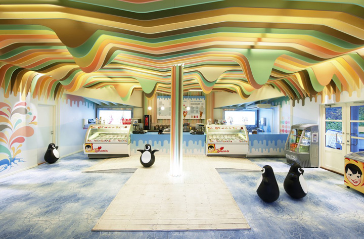
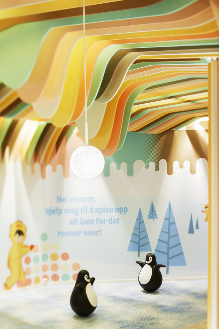
Scenario Interior Architects- The playful content of the interior reflects the trade nature of the client as it tries to intice trade into the store by attracting target customers of children, with the family friendly format. The over-the-top colours and ostentatious store aesthetic presents the castle like a winter wonderland, in particular regard to the floor graphics that create the illusion of broken ice. Even though the store is functional, it is imaginative and has no boundaries which is exactly how thier target market sees the world.
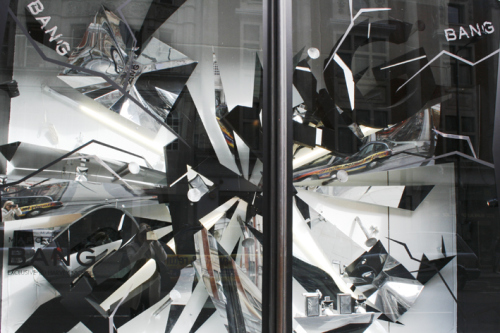
Harvey Nichols- The visual dynamics of the store window function effectively as it gives a visual interpretation of the word of the product they are advertising thereby making it more likely to stay in the public conciousness making them want to know more. The black and tonal colours appeal to a masculine market adding to the dynamics created by the textures within the design format of broken and destroyed objects. Based on the angle you look from, there is a 3-Dimentional element to the window design which makes the effects seem as though the 'Bang' is coming towards you which is inclusive of the audience.
"Henry C. Beck and the London Underground Diagram" (1975) by Ken Garland & Accossiates
Ken Garland & Accossiates (1975) "London College of Printing" [Internet] Available from http://www.kengarland.co.uk/KGA%20graphic%20design/lcp/index.html (Accessed 17th December 2012)
Ken Garland & Accossiates- These promotional exhibition posters were created over 40 years ago yet they still look as contemporary and relevant today. The imagery is clean, simplistic and instantly recognizable as to the subject matter therefore making the message obvious for the mass audience. The information for the exhibition is tucked into the top left corner in a readable and legible font, making it easy for the audience to take in the information and go to the exhibition. The fact that the colours and type are interchangeable so that they are relevant to the area the exhibition is in is clever and thoughtful, making it effective in its presentation of communication.
Categories: Promotion, Advertisement
"D'Expresso" (2010) by Nema Workshop
Nema Workshop (2010 )"D'Expresso" [Internet] Available from http://nemaworkshop.com/#D-espresso (Accessed 21st December 2012)
Nema Workshop- This unusual layout for a shop provides a quirky image to customers as the format has been turned upside down, with bookcases being turned on thier sides and providing a wall and floor graphic that makes the cafe appear cultured and intellectual. The design doesn't make the shop look like a coffee shop yet that is what will probably intrigue people into finding out for themselves what the store actually is. The earthy tones and brown furniture is rich and sophisticated therefore making it seem Eco-friendly.
Categories: Audience, Shop Decor
"Quiksilver, 585 Boardriders" (2012) by Verdego
Verdego (2012) "Quiksilver, 585 Boardriders" [Internet] Available from http://www.verdego.net/#585-BOARDRIDERS (Accessed 21st December 2012)
Verdego- The content of the store is based around the outdoors so Verdego have brought the outdoors in by including plants into the store design and working with having the store look as natural in its aesthetic as possible therefore not painting walls to cover the bricks and by using wooden stands. This means that the ethics of the store and the message behind the ethos of the branding have been visually represented and this is reinforced by the colour scheme, reminiscent of the outdoors with blues and greens prevalent.