We were put into Groups and, having being given a list of each PPP1 task we have had to do so far, we had to make a list of what we needed to do as a Group. I was in Group 1.
Study Task 2:
- Minimum of 5 images- add to this?
- Get responses from people
- As a group, we need to have the minimum amount for each group
Study Task 3:
- Get responses from people by commenting
- How many Images are needed? (Not Specified)- Add to it by making 5 examples for each area of interest minimum
- As a group, have 5 images for each area
Study Task 4:
- Evaluate each of the websites recorded
- As a group, have websites identified and have relevant images to go with the topic
Overall, need to:
- Put links to Image Sources
- Add annotations to images
- Put relevant and contextual comments, not just whether we like the images or not
We have set these targets as individuals and as a group and we need to have them complete for 2 weeks time where we have to present these tasks to our Group members.
From this, we had to fill out a questionnaire/ spreadsheet. We had to fill the first 2 pages worth of columns with answers regarding to where your performance is now and where your at. The other page was for where you want your focus to be and where you need to improve/build on.
 |
| Spreadsheets/ Questionnaire on Where Are We Now? |
As you can see, I think I need to improve on a lot of areas of my practise. There is always something that you can improve on and I think the Study Task will make me think about this with more focus.
Study Task:
Evaluate all of the work you have done so far this year.
List 10 things that you have learnt about yourself as an individual and as a learner;
- Personal development and individual journey
- Strengths and weaknesses- Be specific and give examples
Use images from your own work to illustrate your point
 |
| Initial Idea comes out better that the Final Piece- Alphabet Soup: Typeface |
1. A weakness I had at the beginning of this course was that my Final Piece was always weaker than the initial idea that I had in the first place. To a degree, it still happens but the quality of my work has been steadily improving recently An example of this would be my 'Alphabet Soup: Typeface' brief where the intention and idea behind the concept was good but when produced as a full typeface, it didn't work out as well as it was unclear and not very ornate.
 |
| Handmade Card-cut Tetris Alphabet |
2. A Strength of mine is that I can produce work using hand-made methods. This is a skill I had to adapt to and focus on improving due to the fact that I didn't know how to use digital processes or other printing methods, such as when producing my summer brief. However, this also means that I don't have to rely on these forms to produce work so I see it as an asset.
 |
| First Software Piece by Choice- Illustrator Poster Advertisements |
3. A weakness I have is that I shy away from things I don't know, understand or feel confident doing. I've been trying to combat this by trying new things so that I can familiarise myself with them. For example, I produced my first piece of work using Illustrator by choice from the induction for the second group 'How To..' Studio Brief project. Having that support network and need for consistency within our work made me push myself.
 |
| Example of my Design Sheets for Ideas- Typogateaux |
4. I'm strong at coming up with a lot of ideas and trying to apply it to the brief given. This way, I can explore a wide range of ideas and come up with the best possible outcome in order to apply it to the topic and answer the brief, as shown for the 2 design sheets I produced for the 'Typogateaux' studio brief.
 |
| Print Screens from my Work in the Software Inductions |
5. I have been inducted into some software programs and printing techniques which I have never either used or heard of before which adds to my individual journey as it had meant that I have become familiar with some forms of production. I haven't had the opportunity to use them to a full extent but I wish to expand on what we learned.
 |
| Correspondence for Research Purposes |
6. This isn't a design-based point but I managed to contact people in order to expand my research points. This is something I wouldn't normally do and is a weakness of mine so the fact that I did by e-mail and phone for the 'Research, Collect, Communicate' Studio Brief is something that I need to continue to push and expand on. It's a little thing but something I am proud of.
 |
| Baseball Cards using Quality Printing & Stock |
7. Before coming onto this course, Stock was something that I had never considered before in regards to producing work. I didn't realise that there were different types of paper and thicknesses and how the stock can affect the appearance and quality of the work produced. This also goes for the printing quality of a piece of work, evidenced by my Baseball Cards that were produced for the 'Research, Collect, Communicate: Product' Studio Brief.
 |
| Pen Drawn Simple Communication Shatter Letters |
8. Something that I have learnt for myself is that the fact that the work needs to communicate is the most important aspect of the work. Sometimes I have tried to make something more impressive or complicated then it needs to be when the most simple and understated way of producing the work turned out to be the most communicative and therefore the most successful as shown in my 'Alphabet Soup- Visual Thinking' Studio Brief.
 |
| Illustrator Shatter Alphabet |
9. Something I need to improve on is my time management. not necessarily about getting briefs done but in regards to how long it takes me to produce work. To me, it takes me a long time to produce a good quality piece of design that I am happy with, especially using digital methods (which I am currently focusing on). For example, the 'Alphabet Soup- Illustrator' Studio Brief took me a week to produce when it would have took others a lot quicker to produce my alphabet. I need to get quicker at producing this work so that I can make a larger quantity without loosing the quality. So far, I've begun to learn a few basic shortcuts so I'm quicker.
 |
| Photoshop Postcards |
10. Another thing I need to improve on my skills within Photoshop based on the induction that we had. When producing the 'Software Induction: Photoshop' Postcards, I found it difficult to use and confusing. From this, I felt that the quality of my work suffered for it therefore I would like to have the opportunity to improve on this, at least so I can use the basics confidently.
List 10 things that you have learnt about yourself as a designer (subject, discipline and profession);
- What do you see yourself doing?
- What do you want to focus on?
- What are you interested in? Or not?
- Might be a mixture of things or something specific
- Need to start making decisions
- Certain objects, audiences, areas?
- What areas do you want to know more about?
Use images to illustrate every point from Studios, Designers, Practitioners and Industry stating why it is relevant, who made it and what its for. Use own work to compare and contrast with designers work.
1. I like all aspects of my design choices for a piece of work to have some sort of context to the topic or theme. I prefer to have the image work as a whole rather than as separate entities so it is consistent and uses the whole design to get the message across.
 |
| Inclusive Whole Imagery |
Due to the fact that this is the style that I like, I have tried to present it in a few of my design pieces, however, it is most appropriate on this poster where I have incorporated an image along with some text that work as a full image as they are all connected and hold a context within the theme of the work, which in this case was Blood Doping in Sport.
 |
"Power To The Individual" by Noma Bar
Dutch Uncle "Power To The Individual" [Internet] Available from http://www.dutchuncle.co.uk/illustrators/noma-bar/portfolios/portfolio (Accessed 5th February 2013)
|
I am a big fan of the work of Noma Bar and have mentioned or referenced him several times in my PPP Blog as I like the way that he incorporates all the elements of the work into one image which is why he is relevant. He makes a huge impact into how he presents the message he wants to communicate, with power and boldness. As you can tell from my work, I have tried to use this same method and, in a way, I was successful as I managed to translate a news story into one image but it isn't as clean or clear as the way Bar does it.
2. I don't like the idea or have any interest in producing large scale way-finding, environmental graphics as I don't feel comfortable working to the degree of the scale that normally goes with the territory.
 |
| Attempt at Way-finding Environmental Stye Graphics |
I have attempted to produce way finding graphics on a small scale which was successful for the brief at hand, particularly as they were to be used as poster advertisements rather than working environmental graphics, but I didn't feel as though they were something that I felt excited to produce.
 |
| "Lost and Found" (2006) by BrandCulture BrandCulture (2006) "Lost and Found" [Internet] Available from http://brandculture.com.au/portfolio/worldsquare/ (Accessed 5th February 2013) |
BrandCulture Communications are a studio who base most of their work on environmental graphics and way-finding systems to add to the identity of the corporation they are working for. They use simple instruction and clear symbolism and connotation to aid the interpretation of the way-finding which is why they are relevant. The way we have approached the work is similar in regards to keeping the communication and the minimalism of everything else key yet there's is more successful as it is cleaner and less cluttered.
3. I would like to learn more about the area of Web Design as it is something that I have never come across, done before and have no experience in. I know it is an important aspect of design, particularly in this day and age, so it is an area which I would like to learn more about. One day, I would like to be able to produce my own working website.
 |
"FFF- Form Follows Function" (2013) by Jongmin Kim
Kin, J. (2013) "FFF_ Form Follows Function" [Internet] Available from http://cmiscm.com/#/handicraft/72 and can be experienced at http://fff.cmiscm.com/#!/main Accessed 7th February 2013) |
The work by Interactive designer Jongmin Kin is relevant as it shows a clean and minimalist approach to web design, putting into practise the principles of Graphic Design in a different setting. It's purpose for the solo work is for their to be an experience within each interactivity presented in the browser, in particular paying attention to the different interactivity that you can participate in, with examples shown in the print screens above. This makes it fun and interesting for the audience as they don't know what to expect, highlighting the experimental aspect of the design. I don't know a lot about web design but this caught my eye for the layout and simplistic use for the audience which means that it creates a piece of design that is unforgettable.
4. From looking at Design Blogs, I always find myself attracted to food packaging or branding and identity for restaurants and food chains. They always seem to be what I collect for PPP Tasks and what seem to always catch my attention. From this, I think it might be an idea to investigate into this and look into producing my own attempts into this market as I haven't produced some work in this area yet.
 |
"Italio Modern Kitchen" (2012) by PUSH
PUSH (2012) "Italio Modern Kitchen" [Internet] Available from http://www.pushhere.com/case-study/italio/ (Accessed 5th February 2013)
|
I like the work that the agency PUSH does on this type of client/ audience as they have their own approach to producing identities but every identity they produce is completely different, based on the ethos of the brand and the message they want to get across to the customers which is why they are relevant. This gives the impression that they do a lot of research and put time into learning about the brand, its audience and responding to it in a unique yet corporate manner.
5. I like producing work where the topic is of interest to me and where I have a high amount of knowledge into the context of the work. This would include areas like music, TV and books where my personal interests lie but this can also include topical themes that are relevant to the time, like current news stories and debates on current issues.
 |
| Topical Mailshots |
I feel that as a designer, we need to be able to take on topics that are relevant to the public domain as we need to be able to communicate different points of view on these issues. I have tried to do this with the Lance Armstrong Mail Shots which give an opinion, highlight issues around the topic and are educative to the audience through the design.
 |
"Sedation Pill" "We Own The Future" and "Let Fury Have The Hour- Film Poster" (2012) by Shepherd Fairey
OBEY (2012) "Sedation Pill" "We Own The Future" and "Let Fury Have The Hour- Film Poster" [Internet] Available from http://www.obeygiant.com/archives (Accessed 7th February 2013)
|
A reference to this is within the designer Shepherd Fairey's work and his socio-commentary and political stance that he takes within his design work for 'OBEY'- even the tagline for the movement is 'manufacturing quality dissent since 1989'. His work is motivated and driven by his comments on the world around him, such as 'Sedation Pill' where he comments on the complacency and indifference of American's on topical issues. Our work is similar as it gives an opinion on a topical problem, using imagery that is striking and uncompromising.
6. As a designer, my style of work is simplistic and practical. I like my work to have a distinct purpose and function so that it has reason behind its inception. I like to keep things as simplistic as possible and i like to have the communication and intention of the work at the forefront of the work. This means that I tend to stick to using only a few colours and 1 or 2 typefaces per design aesthetically.
 |
| Simplistic Style |
For my Baseball cards, I used one typeface and a minimal amount of colours when producing the designs and layout. The only time excess colour was used was for illustrating people but the general consensus for the design was that it was to be functional and simple so that the purpose of the baseball cards was at the forefront.
 |
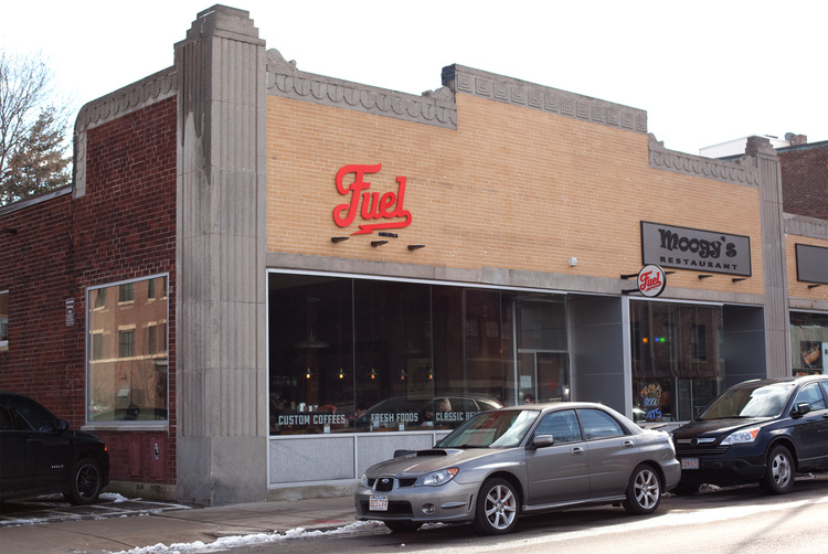
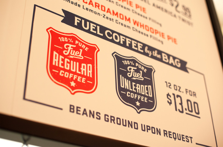
"Fuel" by Commoner, Inc.
Commoner, Inc. "Fuel" [Internet] Available from http://portfolio.commonerinc.com (Accessed 7th February 2013)
|
The work of design studio Commoner, Inc. is relevant as they make a point for the imagery and style of their designs to be purposive and honest to the message they want to communicate. They keep the imagery contained and functional whilst having a traditional aesthetic which matches the clients that they work for. As shown in the 'Fuel' coffee shop brand identity, they use minimal colours and typefaces whilst managing to present a desired message to the consumer, giving a classy appearance and strong ethos for the shop. Both mine style and Commoner, Inc. style is similar in approach as well as producing the work neccessary.
7. I could see myself being someone who works in an agency or as part of a studio as I like the idea of being able to have a team of people who I can work alongside who would act as a support network. I think I would be the most successful at coming up with good ideas and concepts for others to produce work from, however, I want my skills set to become just as strong practically.
 |
"Laforet- Grand Bazar" (2008) by Pixelgarten
Pixelgarten (2008) "Laforet- Grand Bazar" [Internet] Available from http://pixelgarten.com/index.php?/old-here/ (Accessed 7th February 2013)
|
What drew me to Pixelgarten was the fact that they are a small organisation which seems to be a lot of fun, animated and based around creating strong ideas and making them come to life, so that the designers as well as the audience are enjoying themselves. Its a very imaginative approach to creating graphic design whilst still fulfilling the brief and I think they are relevant because it is a studio which seems to work as a team who work to produce great concepts and strong ideas, making the impossible possible. This would seem like a nice, positive and productive environment to work in.
8. I'm very focused for working to deadlines and feel that I have very good time management in regards to completing my briefs, which I see as a strength of mine as a designer, particularly as I have learnt that as a designer, you need to keep on top of everything. I think this would make me a strong designer in areas such as Editorial and Publication based on this strength. I haven't ever produced something based on this discipline so this might be something that I look into.
 |
"Print Magazine" by Spin
Spin "Print Magazine" [Internet] Available from http://spin.co.uk/latest-work/print-magazine/ (Accessed 7th February 2013)
|
The studio Spin have a portfolio filled with publications and editorial works that have been designed with clever colour effects and manipulations of text, layout and body copy. The fact that they managed to make these contributions means that they are clearly a design studio who is respected, not just for their work, but their ability to work to deadlined, reliability and organisation. An example of this is of the editorial work done for the design magazine 'Print' where they have worked to put their own stamp on the magazine.
9. Something I have learnt about myself as a designer is that Crits are not necessarily a bad thing. I never use to like Crits or find them particularly helpful as I felt that they were quite attacking and I would come out of them deflated. I now see Crits as a chance to ask questions about my work and get feedback on my work in order to see if there need to be any improvements made, especially from a fresh perspective.
 |
"Windows 8 Packaging Design" (2012) by Wolff Olins
Baird, R. (2012) "Crit* Windows 8" [Weblog] 8th November The Dieline Available from http://www.thedieline.com/blog/2012/11/8/crit-windows-8.html (Accessed 7th February 2013)
|
Perhaps unconventionally, I haven't used a designer, studio or agency to illustrate a relevant point but instead have used the web blog The Dieline, who frequently put up designers work on their website and have a critique segment within the blogs make-up, encouraging users to have their say as well giving designers an insight into how their work is being perceived. This is similar to the way we work as we have to present our work and have it analysed by people from outside the loop.
10. As a designer, I need to improve on my quality of work as I feel as though, currently, no one would want to employ me to work for their company based on the skills I have and the work I currently produce.
 |
| Poor Quality Based on Lack of Skills/ Knowledge |
I need to get better at producing work to a high standard using software and becoming very confident at using them as currently, as shown by my Photoshop Postcards, my skill levels are not where they need to be as of yet. I need to also improve and entertain the idea of using printing processes to produce work in order to increase my skill set.
 |
"Cranky Pressman Promo" (2011) by Daniel Blackman
Blackman, D. (2011) "Cranky Pressman Promo" [Internet] Available from http://dblackman.com/cranky-pressman/ (Accessed 7th February 2013)
|
Daniel Blackman is relevant to this as he works in a simple style creating bold, inventive ways to present an idea. This may not be the most conventional visual but it does mean that it is imaginative and unique. Blackman uses a lot of different processes and manages to produce a high quality piece of work every time which is why he is relevant to my point. This ability to be reflexive and open in regards to producing design makes him a good choice of designer. There is a distinct difference between the quality of my work and the quality of his work so I would like to improve on this.