
From the 10 overall statements we had to make for our Study Task, we had to print them and cut them out to A5 size for the session.
 |
| Illustrator Set Up For Print |
.jpg) |
| Cut Out Images and Text |
1st Person:
 |
| Person 1 Professional Image Choices |
- Use of Image Manipulation and Photoshop for Bright Colour
- Works using Grid and Structure
- May want to go into Brand and Identity as a specialism
- Likes to experiment with type, composition, layout and imagery
- Likes to work with vibrant colour schemes
 |
| Person 1 Personal Image Choices |
Personal:
- Has trouble with time-keeping or time management
- Fashion- conscious into popular brands. Perhaps has a footwear collection.
- Strong, close-knit family bond with friends and relatives
- Strong personality- uses to decorate and document aspects of their life
- Likes to keep up-to-date with design. Likes contemporary, current design
2nd Person:
 |
| Person 2 Professional Image Choices |
- Use os structured aesthetics and simple concepts
- Limited Colour Schemes (Maximum of 2-3 colours)
- Maybe wants to go into Editorial and Publication
- Likes to work by digital means for type and image
- Focused audience communication on instruction and informing content
 |
| Person 2 Personality Image Choices |
- Likes Fantasy (Lord of the Rings fan) and other mystical genres
- Drinks a lot of water- maybe health conscious
- Finds solace in Countryside visits and long walks
- Accepting and sociable person. Likes to get to know people and make friends
- Likes embarrassing pop music (golden oldies!)
We then had to report back on our assessments based on the images to our group members. The first Person was Rinesh and we got most of his points correct. We got one pair of images in the wrong groups but our reasoning was pretty relevant to him. The second person was Ellen whose all image sets and reasoning was all spot on.
When reporting back on my images, the pair who had mine were very strong on my personality and gave the same reasoning that I had. There were a few things that weren't right for my practise, however, I had based my answers on the future and where I am now so it was understandable that they found it harder. Regardless, there reasoning was fitting to my practise so they did well.
Associative Communication
We went onto discussing about how we should view ourselves as a Commodity or a Product that someone wants to have or use. This would mean you would be working smart as well as working hard to get yourself out there into industry.
By associating ourselves with something that is already there, others can relate to us in this way and see how we want others to perceive ourselves. This is seen as Associative Communication and another way of using Symbiotic.
Study Task:
We were given a sheet with 11 questions on which we have to answer using the personal and professional identities that we have been looking into, equating into 22 answers. For each response, we need to find design- based information that clearly illustrates what you mean.
1. If you were a book, what would your subject be and who would read you?
Personal: If I was a book, I would be a slightly dog-warred self-help paper back book that would be lovingly read by someone over and over again like a long lost friend. I would want to use the contents of the book to help someone or make someone feel better.


 |
"Book of Art" (2012- 2013) by Issac G. Salazar
Salazar, I. G. (2012- 2013) "Book of Art" [Internet] Available from http://www.isaacgsalazar.com/#/home (Accessed 16th March 2013)
|
The use of a positive typographic message that is used to produce the contents of the slightly old novels highlights how I would want to effect someone with a positive message. The fact that the words have been produced by folding the corners references the habit of folding your place in the book which emphasises what happens to well loved and well used books, making good use of this to produce some unexpected ornament.
Professional: If I was a book, I would be a newly published coming- of- age novel, the first published from an up- and- coming author who is starting their career. The author would be nervous about making an impact with their novel so they would present it in a clever and innovative packaging so they gain a large audience and following.


 |
"Jacket and Bookmark" (2010) by Icoeye
Icoeye (2010) "Jacket and Bookmark" [Internet] Available from http://www.icoeye.com/blog/?p=125 (Accessed 16th March 2013)
|
The book cover sleeves that have been produced use a vertical image from the novels that protrude outwards to form a bookmark as well. This variation into the book cover's possibilities and purpose as well as giving a fun and friendly visual makes the necessary impact on the readers imagination to wonder what happens in the story.
2. If you were a package, what would you contain and who would open you?
Personal: If I was a package, I would be an embossed, printed takeaway pizza box that would contain a homemade, fresh out of the oven vegetable supreme pizza which would be opened by hungry vegetarians who also like pizza.
Personal: If I was a package, I would be an embossed, printed takeaway pizza box that would contain a homemade, fresh out of the oven vegetable supreme pizza which would be opened by hungry vegetarians who also like pizza.


 |
"Dominoes Handmade Pan Pizza" (2012) by CP+B
CP+B (2012) "Dominoes Handmade Pan Pizza" [Weblog] 17th October The Dieline Available from http://www.thedieline.com/blog/2012/10/17/dominos-handmade-pan-pizza.html (Accessed 16th March 2013)
|
The printed packaging contains a warm product which I think reflects my personality as someone who is easy going and warm inside who aims to bring people comfort. Also, I am pescetarian so I wouldn't have meat on a pizza.
Professional: If I was a package, I would contain the blueprints of an invention that was yet to be discovered that would be held within a padlocked briefcase surrounded by bodyguards. It would be opened by some unexpected passer-by who would unleash it upon the world.
 |
"G3 Carbon Fibre Briefcase" (2007) by Nikola Knezevic Industrial Design
Nikola Knezevic Industrial Design (2007) "G3 Carbon Fibre Briefcase" [Internet] Available from http://www.nikoladesign.com/portfolio.html (Accessed 16th March 2013)
|
This briefcase is sophisticated and very professional in its appearance which reflects my professionalism and approach to producing work. The fact that it can be shut and locked shows the importance of the contents of the packaging and the fact it is within a briefcase highlights the professionalism within my working practise.
3. If you were a shop, what would you sell and who would buy from it?
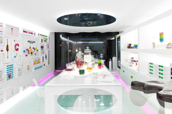
Personal: If I was a shop, I would sell individual, delicious sweets and unique confectionary within a modern sweet shop, decorated with environmental graphics. They would be bought by culinary connoisseurs who have a good palette and can tell quality from the taste of the chocolate.


 |
| "Cioccolato" (2012) by Savvy Studio Savvy Studio (2012) "Cioccolato" [Weblog] 10th January The Behance Network Available from http://www.behance.net/gallery/CIOCCOLATO/2839981 (Accessed 20th December 2012) |
The modern yet futuristic feel of the interior gives the shop an eclectic look, which reflects on the product by making it seem out there and different. As a person, I eat a lot of chocolate and think that it would be amazing to have a chocolate shop of my own.
Professional: If I was a shop, I would be a stationary shop that sold sketchpads and supplies as well as electronic- based media and have a quality print service. It would be a specialist supplier aimed at those within the industry, professionals and students.


 |
"Stationary Shop" (2012) by Puntdefuga
Puntdefuga (2012) "Stationary Shop" [Weblog] 26th July The Behance Network Available from http://www.behance.net/gallery/Stationery-shop/4561237 (Accessed 16th March 2013)
|
4. If you were a poster, what would you promote and to whom?
Personal: If I was a poster, I would promote a reasonably-priced indoor, one day alternative music festival that would have an indoor market and food court. It would target music-goers but specifically young people as the prices would be targeted at being inexpensive so it wouldn't cost all of the student loan.
Personal: If I was a poster, I would promote a reasonably-priced indoor, one day alternative music festival that would have an indoor market and food court. It would target music-goers but specifically young people as the prices would be targeted at being inexpensive so it wouldn't cost all of the student loan.


 |
"Typography Gig Poster/ Flyer" by Ziarographics
Ziarographics "Typography Gig Poster/ Flyer" [Internet] Available from http://www.ziarographics.com/portfolio/typography-gig-poster/ (Accessed 16th March 2013)
|
Professional: If I was a poster, I would promote a visiting lecturer talk to happen at an educational facility which would target designers of all levels to go along to the talk.
 |
"Bad Typography Is Everywhere/ Good Typography Is Invisible"(2008) by Craig Ward
Ward, C. (2008) "Bad Typography Is Everywhere/ Good Typography Is Invisible" [Internet] Available from http://www.monoscope.com/2008/12/craig_ward_bad_typography_is_e.html (Accessed 16th March 2013)
|
5. If you were a brand, what would be your values be and where would you show it?
Personal: If I was a brand, my values would be for the designers to have creative control and for their to be equality amongst the workers. I would have the company being of a humble, small yet tight knit scale which would be true to itself in regards to the products it produced. The ethics of the brand would come first.


 |
"Rat City Beer Co." by Commoner, Inc.
Commoner, Inc. "Rat City Beer Co." [Internet] Available from http://portfolio.commonerinc.com/#/ratcity/ (Accessed 16th March 2013)
|
Professional: If I was a brand, I would become a commercially successful brand with values being for good quality design and high-end opulent products. This would be important so that the customers knew they were getting quality work which would strengthen the reputation of the brand.


 |
"Tiffany & Co." by Pentagram
Pentagram "Tiffany & Co." [Internet] Available from http://www.pentagram.com/work/#/all/luxury/newest/298/ (Accessed 16th March 2013)
|
6. If you were an exhibition, what would you show and where would you show it?
Personal: If I was an exhibition, I would be a travelling pop-up exhibition showing iconic, ground-breaking film posters which would be available for all to view at local cinemas.
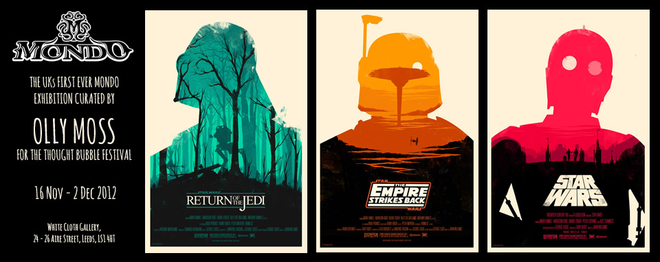 |
"Mondo Exhibiton Curated by Olly Moss" (2012) by Olly Moss
Mondo (2012) "Mondo Exhibition Curated by Olly Moss"[Internet] Available from http://thoughtbubblefestival.com/mondo-exhibition/ (Accessed 16th March 2013)
|
Professional: If I was an exhibition, I would be a design exhibition that would be solely based on student/ graduate work which would target professionals, studios and agencies in order to aid employment and work placements as well as promote up-and-coming designers. It would be shown in a large studio space in a high-rise building in the capital city.


 |
"BFA Exhibition Invitation" (2012) by Jordan Alessi
Alessi, J. (2012) "BFA Exhibition Invitation" [Internet] Available from http://cargocollective.com/jordanalessi/BFA-Exhibition-Invitation (Accessed 16th March 2013)
|
7. If you were a leaflet, what information would you contain and who would read it?
Personal: If I was a leaflet, I would be a flyer for a gig with information based around the band itself, the venue, date and time that the venue doors would open. They would be given out to fans to read so they would know where and when the gig was but also, so they can promote it themselves.
 |
"Fall Out Boy" (2006) by Brian Ewing
Ewing, B. (2006) "Fall Out Boy" [Internet] Available from http://www.brianewing.com/portfolio/Rock-Posters/fall-out-boy (Accessed 16th March 2013)
|
Ewing is influenced by the music and culture that he is surrounded by which comes across in his screen-printed posters, leaflets and flyers that promote alternative bands. I am heavily influenced by what I listen to which means that I can identify with Ewing's style and use of classic imagery.
Professional: If I was a leaflet, I would be a how-to information leaflet on 'How to use Adobe Software', written in an easy-to-understand format and tone of voice which would be given to and read by people who have never used software before.
 |
"Brochure & Leaflet Mock Up" by Graphicriver
Graphicriver "Brochure & Leaflet Mock Up" [Internet] Available from http://graphicriver.net/item/brochure-leaflet-mockup-photoshop/123174 (Accessed 16th March 2013)
|
8. If you were a sign, what would you show, to whom and where?
Personal: If I was a sign, I would be a traditional, slightly dusty Americana road sign on a highway showing the route number to motorists on a road trip or to tourists who are travelling around America.
 |
"Road Sign Nevada" (2012) by Ralf Herrmann
Herrmann, R. (2012) "'The Design of a Signage Typeface"[Weblog] 19th April ilovetypography Available from http://ilovetypography.com/2012/04/19/the-design-of-a-signage-typeface/ (Accessed 16th March 2013)
|
Professional: If I was a sign, I would be a Public Information pictogram style sign with simple yet effective imagery and little yet specific wording. My signs would be available everywhere in public places on a large scale which would be used by a global audience.

 |
"Airport Signage" (2012) by Tom Nulens
Nulens, T. (2012) "Airport Signage" [Weblog] 22nd March The Behance Network Available from http://www.behance.net/gallery/Airport-signage/3447813 (Accessed 16th March 2013)
|
9. If you were an app, what would you do and who would use you?
Personal: If I was an App, I would be an energetic, fun game that would go from humble beginnings to a viral sensation overnight. I would entertain the public in boring situations and I would be used by people who have access to a smartphone.


 |
"Temple Run" (2011) by Imangi Studios
Imangi Studios (2011) "Temple Run" [App] Available from https://itunes.apple.com/gb/app/temple-run/id420009108?mt=8 (Accessed 16th March 2013)
|
This continuous, freedom- based game is addictive and entertaining, simple to use and doesn't take a lot of skill which is why it is so successful. As a person, I'd like to find that I was quite fun to be around and entertaining while at the same time, I have an addictive personality in the sense that once I start something, I'm hooked.
Professional: If I was an App, I would be designed to help people remember things they need to do. I could be used by anybody but particularly older people or people who have mental illness, which means that I would have a simple design and easy function.


 |
"Remember The Milk" (2011) by Remember The Milk
Remember The Milk (2011) "Remember The Milk" [Internet] Available from http://blog.rememberthemilk.com/2011/05/introducing-remember-the-milk-for-ipad/ (Accessed 16th March 2013)
|
10. If you were a blog, what would you be about and who would follow you?
Personal: If I was a Blog, I would be a visual diary full of photos where I would record aspects of my life as well as record areas of my life. I think it would be inclusive of people from all walks of life from all of the world who would be able to gain an insight into how I live as well as allow me to leave a diary for future generations to look at.

 |
"Life & Travels" (2002-2013) by Mr. Cup
Mr. Cup (2002- 2013) "Life & Travels" [Weblog] Graphic Exchange: The Blog of Mr.Cup Available from http://www.mr-cup.com/blog/category/life-and-travels.html (Accessed 16th March 2013)
|
Professional: If I was a blog, I would be an informative specific design blog that would focus on a specialist area which would be either Brand and Identity or Product and Packaging. I would be followed by people who were enthusiasts of Packaging and Brand Design as it is quite a specific target audience subject.


 |
"Lovely Package" (2008-2013) by Lovely Empire
Lovely Empire (2008-2013) "Lovely Package" [Weblog] Lovely Package Available from http://lovelypackage.com/ (Accessed 16th March 2013)
|
11. If you were an event, what would it be and how would you promote it?
Personal: If I was an event, I would be an extravagant, over-the-top Mad Hatters Tea Party which I would promote through social networking and media, campaigning to encourage people to hold their own parties as well.


 |
"Mad Hatter's Tea Party"(2012) by Lyndsey Loves
Loves, L. (2012) "Mad Hatter's Tea Party" [Weblog] 9th April Wordpress Available from http://handcraftedblog.wordpress.com/2012/04/09/mad-hatters-tea-party/ (Accessed 16th March 2013)
|
This extravagant and visceral production into making the event with the extraordinary detail shows the eye-catching and sometimes overwhelming amounts of colour and pattern that surrounds the tea party yet it is this eclectic, weird miss-mash of aesthetics that makes it successful in its intention.
Professional: If I was an event, I would be the Main Event on a Wrestling Pay-Per-View as the underdog going against the champion for the title and winning. It would be promoted via word of mouth and progress rapidly, turning into a widespread media, television and viral campaign.
 |
"World Wrestling Federation" (2012) by Damien Weighill
Weighill, D. (2012) "World Wrestling Federation" [Internet] Available from http://damienweighill.com/2012/01/word-wrestling-federation-page-match/ (Accessed 16th March 2013)
|