Wednesday 11 December 2013

Studio Brief 3: Designing for Print and Web Interim Crit

For the Crit, we were to discuss the Re-written Brief that we were to have produced for our chosen ISTD brief. If we had an initial ideas or designs, we had to show them as well.

Re-Written Brief
We were put into groups and we had to present out brief to the group. I also decided to discuss the initial ideas that I had and the idea I have decided to go with, which is of a seafood restaurant called Swash.

Any feedback that I got I had to record on a Crit Feedback Sheet.

Crit Feedback
The main piece of feedback I was given was to decide what area I was going to focus on, print or web. I had been finding it difficult to decide because I enjoyed doing web but I like making branding products so I hadn't decided yet. I spent a lot of my allotted time discussing with the group what they felt would be a better focus as I was quite torn and they felt that restaurant branding handed itself to print collateral.

The actual concept of the seafood restaurant the group found interesting and felt that I could play on that quite a bit. I had thought about maybe having an illustrated character for the kids menu so that they could identify with it and make it fun but they felt that if I did this, I would have to have that menu separate as it would take away from the sophistication of a middle class restaurant.

Based on the feedback given to me during my crit, I have decided to focus my attention on Print Collateral as I feel like there is a large array of ideas to work with for a restaurant.

Tuesday 10 December 2013

Studio Brief 2: Designing For Web Final Crit and Self Evaluation

For the Final Crit, we had to have the physical website available to view and use on our Laptops as well as showing 5 Design Boards in regards to the development that we have done.
Work Presented For Crit
We had to put our work out and leave the room for the other Group to Crit, then visa versa so that we would all get anonymous feedback regarding our work. Amongst what we left out were some questions that we wanted feedback on, giving the crit person something to work form as well as giving you the feedback you want. These were my questions:
  1. Could my Design Boards be presented in a better fashion?
  2. Does the Scroll Bar help or hinder the aesthetic of the website?
  3. Is the Website relevant to the intended purpose for the target audience?
  4. Could it be more user friendly in regards to the experience for the target audience?
  5. is the written content appropriate and the language relevant to the target audience?
We were then able to read the feedback that was left for us from other people to take on board. This was my feedback:
Crit Feedback
Generally, I got some good feedback, however, what was unhelpful was that I was given suggestions but not actually told how to produce what they wanted.

Generally, everyone commented on the appropriateness of my website for the target audience and the usability, particularly in the way that I had presented my content with illustrations. These elements gained a high amount of approval from my Feedback. Minor suggestions in regards to this was having the Font Lowercase which I can't do as the Font only comes in Uppercase and including Breadcrumbs to my pages for orientation, however, I already have orientation and links to the before and next pages on my web pages so this would probably make my pages more confusing if anything.

One thing some of the feedback sheets suggested was that I had too much writing on my Design Boards and that I should shorten it down or break up the amount of text. I was also encouraged to add the colours for my logo onto my colour scheme. Personally, I don't feel as though I have a lot of writing on their but I will amend this regardless.

An enlightening piece of feedback from 2 people was to re-write my paragraphs so as to have them more story-like and longer sentences. Also, someone said to have a grid to make the text easier to read. Im not sure what this means but I have interpreted it as having the images and text gridded so they have more of an equal amount of spacing together.

I had mixed comments in regards to my scroll bar with many saying it made my website easy to use and made the content easy to read whereas some said that it took away from the aesthetic as it stands out. I was given the suggestion by 2 pieces of feedback to make the scroll bar into arrows however i wasn't given any advice on how to achieve this which didn't help.

Overall, I found some of the recommendations helpful but it would have been more helpful if the comments came with ways of doing the changes as I don't know how to do them. I am happy with the general consensus that it is successful and good, however, so I know that I have been on the right track.

Self- Evaluation:
  • How did you approach the brief? - I approached the brief with enthusiasm as it was something new and refreshing. I have been wanting to learn how to do web design since I started the course so I was excited to try it out.
  • What was your thought-process behind the brief? - My thought-process behind the brief was based around the content/ subject matter of Chocolate which dictated the content and the audience of children which dictated the aesthetics and presentation of information as well as the way the website worked.
  • What worked?/What was Good? - What was good was being able to learn a process and develop it by being able to put what we learnt into practise. This meant that I was able to put some time to actually getting to know the software a little and play around with it. I especially liked the coding aspect of the production as I found it interesting and found myself not being able to stop doing this brief until I had made the website because I had become so submerged into coding.
  • What didn't work?/ What was Bad? - What was a shame about the brief was my lack of knowledge at this present time as I had come up with a great website concept but my lack of skill and understanding wouldn't make it plausible for me to produce. This meant that I had to produce a condensed, simpler version so I hope that as I continue on, I will continue to be able to improve and develop my skills to make more grander and elaborate web designs.
  • What would you change?- I would change the way that the website scrolls as I wanted the website to be as linear as possible and allow it to scroll freely. Instead i had to add a scroll bar which isn't greatly aesthetically pleasing despite its function.

PPP2: Visiting Lecturer- Matthew Tweddle and David Eccles from Numiko

Numiko are a Web Agency within Leeds who design for screen. They work primarily for the Public and Entertainment Sectors and Design things that are of use, not with the intention of selling a product.

Common perspectives of Graphic Web Design:
  • Too many limitations- Limitations are disappearing with the development of Typography, Responsive Grids, Scaling Vector Graphics, Connection Speeds, HTML5/Canvas/Open GL
  • Need to be able to Code- Designers don't need to be able to Code. It is useful to know but isn't essential as you will be able to pick stuff up along the way.
  • Designing websites must get boring- Web Design is constantly evolving due to technological advances so there is something new to do every time
  • Lack a formal understanding of Design- It's a maturing industry with Design being taken seriously.
  • You need to move to London- You don't!
They have done work for:

Nesta Charity
- "Make Things Do Stuff" Campaign
- Production of a Visual Language
Water Aid Charity
- Branding needs to be considered when making for Web
- Illustrations of a Story
Lewis Hamilton
- How Layout and Type translates onto screen
- Bespoke, editorial style to the Layout
National Lottery
- Illustrations of an Entire Typeface
National Statistics
- Illustrator made Info-graphic
Channel 4 Documentary
- Full screen Experience
- Different Layout
IPTV
- Designing for TV
Film 4
- 30 year Celebration Timeline
BBC
- Using a Framework called a Gel- when companies want to keep the consistency throughout the sites

Discover- Define- Design- Develop- Deploy = Research- Idea- Design- Make- Apply

Understand the Audience
- Who the audience are? What they need? Understanding their digital lives? What the organisation needs from the digital platform?

"There is nothing more dangerous than the right answer to the wrong question"
- Peter Drucker

Personas- Fictional people created who you can design for with statements of their needs

Write a Creative Brief which is for everyone to refresh- 3.000 pages with lots of designers having to do them so there are guidelines put in place for everyone to follow on any particular brief

Wireframing and Grid system for the Website is to work on all platforms
- Like you having to make 3 websites- iMac, iPhone and iPad
- Make web guidelines so the same thing is applied in the future by all designers

Will meet with Clients and show them the key developments in the project- Designers as well as Project Managers will go to meet them

Why they want Graphic Designers:

  • Typography is Key Online
  • A Knowledge and Understanding of Designing for Brand
  • Unique Layouts and Concepts
  • Iconography
  • Illustration

Typically it takes 2 to 3 days for a Proposal piece, 3 weeks for Design and 6-8 weeks in Front End Design

Look for Designers who have a wide range of skills which can be demonstrated

Tuesday 3 December 2013

Studio Brief 1: Design For Print Final Crit and Self Evaluation

For the Final Crit, we had to have physical examples of what we had been doing, showing layouts, content and prototypes of the work.
Work to Present for Crit
We had to put our work out and leave the room for the other Group to Crit, then visa versa so that we would all get anonymous feedback regarding our work. Amongst what we left out were some questions that we wanted feedback on, giving the crit person something to work form as well as giving you the feedback you want. These were my questions:
  1. How can I make the poster designs more consistent/ connected with the newspaper style?
  2. Can you recommend a 80gsm newsprint stock or where I could get some from?
  3. Does the publication work succinctly? Would it hold interest?
  4. Reading the articles, is the Tone of Voice appropriate?
  5. Are there any other areas I could cover within the Newspaper?
  6. Would the images and newspaper work having a red colour filter on the images or just kept as they are?
We were then able to read the feedback that was left for us from other people to take on board. This was my feedback:
Feedback from Crit
For me, personally, I felt that I got a mixed quality of Feedback from the 3 sources that I had.

One person's feedback was incredibly helpful in regards to answering my questions and providing me with feedback in general. I was provided with a website which I could use to print off my newspaper onto newsprint. I would find this incredibly helpful as it would give me an outlet to use if I can't print it outside college, especially as it has been recommended from a fellow student. It was suggested that I perhaps try out the visual effect of having as filter as it would be cheaper to produce than having a 4 colour process yet they felt that the images are fine as they are. A point of consideration that was mentioned was how I would get people to keep the newspaper, making it more desirable as newspapers are seen as disposable. Also, they suggested that I change the layout of one of my pages so that it fits in with the rest of the paper due to the column amounts. To make the posters succinct, they mentioned about making the colour scheme the main feature to connect it, suggesting having a bellyband or plastic magazine packaging to keep it all together. This gave me the idea of perhaps using rope if I was to print a couple so it is like a genuine amount. This feedback has given me a lot to think about and has helped clear up some of the questions, especially the one about the newsprint.

The second piece of feedback gave me a couple of things to work with, suggesting that I look into traditional newspaper layouts where text is to the left and work in columns with centred imagery. They like how the images look now and say it is experimental and consistent.

The last piece of feedback I felt wasn't helpful as I was accused of plagiarism, giving me the comment of liking the idea of a red filter but 'it would be better if they were my own images'. All of the images ARE my own images and I found this quite offensive. They said the illustration was out of place and I needed to combine it all together but didn't suggest how and said the logo has too many details in the prints so they don't work favourably. I can understand that this is due to the A5 size of the prints that are being shown so this would be different on the larger scale that it is intended for.

I found the crit was helpful just for the invaluable feedback from the first person as this information has helped me out in regards to production of my work. I think this Crit didn't work in the sense that the people who were giving feedback didn't know the full story of the work but in a sense, this makes sure that your work an speak for itself and hold its own and I think it managed to do that.

Self- Evaluation:
  • How did you approach the brief? - I  was a bit worried about this brief because i knew that there would be a lot of content and research that would be going into it. Despite that, i knew it would be good because it would mean that I would be learning as the brief went on. 
  • What was your thought-process behind the brief? - My thought-process for this was based on the context of my presentation/ concept of the brief idea and I focused on that approach.
  • What worked?/What was Good? - What was good was the primary research I undertook during the brief as it meant that I managed to try some new processes that I had never done before meaning that I was learning new skills all the time. This has given me a bigger appreciation for printed ephemera because I know the amount of effort that is put into it. The amount of things that I learnt about print during the brief was good as it means that I understand better about stock and print processes.
  • What didn't work?/ What was Bad? - What was bad about the Brief was that I never really connected to the brief. I found it very hard going in regards to producing the work and the subject matter. I just couldn't get my head around it so I found it difficult to get on with. My time management wasn't very good for this brief either which didn't help.
  • What would you change?- If I was to change it, I would change my approach to the brief and I would improve on my time management. I have learnt from this and plan to work on this in the next module. Also, I would produce a screen printed poster rather than a digital poster so as to get the physical aspects of print across to the audience. I would also have the newspaper itself screen printed, however, in regards to time and actual production, this would be very time consuming and couldn't be achieved in real life.

Thursday 28 November 2013

Studio Brief 2: Designing for Web Interim Crit

For the Crit, we were to discuss how we were doing with the Designing for Web brief and where it was going. We had to get up in front of the group (I was in Group 4) and present what we had done so far.

In my crit, I discussed my idea briefly giving a general overview and discussing how I was approaching it. I showed all of my design sheets and mentioned that I had started coding my Homepage.
What I presented for my Crit
I managed to get a lot of positive feedback in regards to my idea, approach and the fact that my website has a solid purpose.

I was asked what my target audience was and I stated that it was ideally for a Infant to Junior School Pupil who had been asked as homework from school to do some research into Chocolate, making it educational and informative. This was seen as a very focused and specific audience to work with which would influence my design choices. I had mentioned that I had wanted to do a very complex story-style website but had ended up simplifying it down to some pages which were all the same which I felt took away from my initial ideas but I was told that this would be great for the audience as it would be easy for them to understand and use the site, making it more friendlier than the original intention I had.

At the same time, I got some very valuable feedback as there are room for improvements. One great piece of feedback was the use of language that I would need to consider as it would need to consider understanding of a child. For example, production would perhaps be too complicated so maybe use the term 'making'. It was suggested to maybe have a look at the Cbeebies website for influence into how I should approach this.

The decision to use illustrations by myself was well received and was told to do flat-colour illustrations and perhaps have a different colour background for each section so it is clear when the user has changed from section to section. Another great suggestion I got was to select a better, larger typeface which would ideally be friendly, rounded, sans serif and lowercase to aid the audience in connecting with it.

After this Crit, I put these comments into practise (See Design Practise Blog)

Tuesday 26 November 2013

PPP2: Visiting Lecturer- Evolution Print

Evolution Print are a Sheffield-based Print House which use both Litho Print and Digital Print to produce large amounts of prints or bespoke print jobs.

- Aluminium Plates and Full Colour Prints that can produce 1500 sheets an hour
- CTP Computers to Plate System
- Single sheet of cut paper of different sizes- SRA2 (The size of 16 A4's) to B1 (720x1020) in size but you must remember to leave a 20mm bleed around your work
- They won't print anything less than 70gms and will go up to 450gms
- They don't do a spot varnish or laminate and Binding is out of house
- They use 3 paper types: Gloss, Silk and Uncoated
  • Uncoated is flatter, gives a hands-on organic feel but doesn't give a sharp image
  • Gloss and Silk is sharper and usually for corporate
  • Uncoated bulks up heavier in stock than in Silk- gives a hands-on quality whereas Silk is more compressed and thin
Differences between Litho and Digital Printing:
  • Litho is better quality yet it is more expensive
  • The maximum size for a Digital print is 2 pieces of A4 (SRA2) which is very limited
  • Digital inks are powder based so you can feel the poster on top of the surface whereas Litho uses vegetable inks
  • Litho allows you to use an extra, pure spot colour whereas Digital is a full colour process
Digital Costing Charge
- Click charge means a charge per sheet
- 5 to 10p for black and white or 30p for a colour sheet on just one size
- Litho is cheaper to print on a large scale

Litho Costing Charge
- Litho has an initial fixed cost based on Make Readies (£60) and Plate Costs for a Full Colour (£100)
- Make Readies include getting the inks to the right levels and printing 200 practise sheets to get the prints to the right standards

Printing Methods
- Work and Turn- One side printed and then you turn it so it goes on the back
- Sheet Work- One side printed then completely different on the other side (8 Plates more expensive)

Produced work for:
- Judge Gill
- Pete McKee
- Manchester City Football Club
- Lee Goater
- Activision
- Design Republic
- Manchester Modernist

Basic Mistakes made by Graphic Designers before Printing:
  • Bleed- 3mm include Crop Marks and Trim
  • Separate all Designs individually
  • Don't send books as spreads, send as single pages- send as PDFs as well as original artworks
  • For books, send covers separate
  • If Spot Colours are not needed, set the to CMYK. Spot Colours don't print transparent- set as an Overprint
  • Foils/ Separations/ Perforations- Set as a Spot Colour and Overprint so it can clearly be seen on the file
  • Use correct image sizes and at 300dpi
- To save money where making a booklet, work in either a set of 8 or 16
- Using just 1 or 2 colour allows for it to be less expensive
- Consider whether you are going to see the benefit of using an expensive stock if it is going to get 
  covered in ink?
- They use cylinders rather than tins for ink so they can be reused and have less waste and water used
- They do work for charity as it is their corporate responsibility
- The inks and plates used are bought from local supplies but the paper isn't 
- Coloured stocks are available but you can also use a white stock with a coloured tint behind it

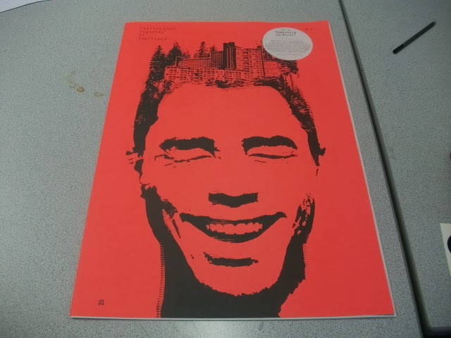
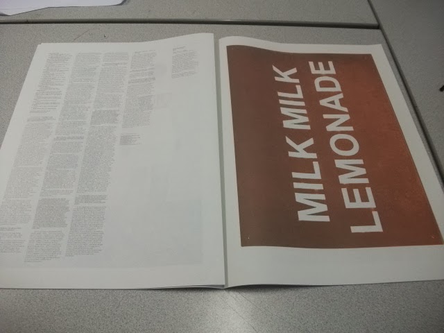
After the talk, we had the chance to take some free samples away. I managed to get myself a business card and a large scale promotional publication. This meant that I was able to physically see and feel for myself the quality of the prints they produce.


Business Card


Large Scale Promotional Publication
As a year group, it has been suggested that we may get the opportunity to visit Evolution Print's Printing House in Sheffield to see for ourselves how they operate on a day-to-day basis. I think this would be an amazing opportunity if it actually came through as it would help our understanding so much more by visually being able to see the processes they use.

Tuesday 19 November 2013

PPP2: Designer Dose Blog

In regards to my own research into designers which interest me, I have been producing a blog that I started as part of a collaborative group brief in the middle of first year called Designer Dose.

What started out as 5 of us putting up a post every day ended up with me posting to it once a day with a new design inspiration which I would find interesting. I have been using this blog for over the past couple of months.

Designer Dose 

I put my name as a tag on each blog post to show which ones I do with the title and images of the work and the name of the designer. Also, so as to make sure that I give the full reference to the designer I put a link to there work/ portfolio. If this isn't available then I put a link to the place where I found the work so there is at least some reference.

Update: 

Up to this point I have been putting a blog post a day on the site making it over the 1 year anniversary mark which I feel is a very great achievement. However, my laptop broke over the Easter holidays and all of the account information I had for all websites was gone. From this, I have not been able to remember what the details were to get into the account so Ive not been able to update it since Easter Holidays.


Current Blog Activity
It is only in the last few days that I have been able to get onto the website as I managed to get all of my account info back as I had backed it all up. As you can see, in my absence, the amount of views that my inspiration blog has been getting has been great and I have gained more following.

I am going to continue back onto doing my blog because I feel that it is a great rich resource of information that I have been collecting showcasing all of the designs that I am into. I have even included Design Studios that I have contacted, like Robot Food who I have contacted in regards to a visit.

Monday 18 November 2013

PPP2: Visiting Lecturer- Matthew from GF Smith

GF Smith are a Paper Merchant who purchase paper from all over the world and sell the paper on within the UK

Paper Merchant
- 60% of Paper is from the Lake District in the UK
- 120 year old independent British brand
- High Quality and well Respected

Specifications
- Think about the product you are making and consider the stock beforehand
- Physicality provides a personal touch- nice quality and makes an impact
- Business Cards, Letterheads, Brochures, Envelopes and Packaging, ext.
- 1 million hand-made Envelopes a year
- Designers buy from the Printer and the Printer buys from GF Smith

Products
- Can select either of the Black & White and Colour
- Printing a colour on a piece of paper would look unprofessional and would have white edges
- The dye is the perfect shade and even throughout
- There are 4 Variants available:
  • Colorplan- 50 Colours, 8 Weights and 25 Emboss Texture
  • Smooths- Creams, Whites and Blacks
  • Textures- Nice for Cover Stocks
  • Specials- Wood Pine, Metallics, Fibreglass Inspired
"Good Printer, Good Design, Good Stock- You've got a Good Design"

Factory Services
- 4 Paper Machines Half a Mile Long
- Handmade Envelopes
- Cut Sheets to Size
- Packaging Prototypes

Beauty In The Making Exhibition


"Beauty In The Making Exhibition" (2012) by MadeThought x GF Smith
MadeThought x GF Smith (2012) "Beauty In The Making Exhibition" [Internet] Available from http://www.septemberindustry.co.uk/madethought-gfsmith/ (Accessed 18th November 2013)

- Showcase Brand
- Live Paper Making and Envelope Making

From the talk, we were given the opportunity to have a look and feel of some of the samples that Matthew had brought with him:

Fine Coated Paper Leaflet by Studio Makgill


Fine Coated Paper Brochure by Studio Makgill


Mohawk Navajo Uncoated Paper Brochure


GF Smith's Colorplan Swatch Book/ Notebook by MadeThought


Colorplan Swatchbook

Softy Textured Paper Notebook


Specialist Paper Swatch (Metallics and Fluorescence) 
Textured Papers


Master Specifier (2011) by Sea
Being able to physically experience the stocks for ourselves, getting to feel them and see them in action and how they have printed was great. Don't get me wrong, its good when someone comes in and talks to us but its even better when we are able to get involved as it makes it easier to understand and makes it more interesting. We have been offered the chance to order some samples of paper for ourselves and I will defiantly be taking advantage of that. This will make for great research for the stock element of the Design for Print Research as well.