
Wednesday 20 May 2015
PPP3: Time Management for Second Semester
For the second semester, me and Emily decided to record the time that we had on an A3 calendar so as to keep a track of what needed to be done and manage our time effectively just like we had done for the first semester as it was an effective way of keeping track of time.
As the semester went on, I continued to add new things that would happen onto the calendar and record the times I would be working on the weekend so I could see if I had a chance to do some work over the weekend. I felt that being able to see when I had booked things made for a visual diary and time frame to work to.
 |
| Calendar for Second Semester Time Management |
Wednesday 13 May 2015
PPP3: Studio Visit- DBA Presentation at Thompson Brand Partners Studios
The members of my DBA group have been approached by Ian at Thompson Brand Partners Studio through Amber to see whether we would like to go and visit their studio to present our work to them.


We were very surprised yet quite proud and excited by the prospect of being able to visit a studio and present our work to them, especially because someone has thought that a piece of work we have done is good enough to show to the rest of their team.
From the initial email contact, Adam went on to organise a day and time for us to go and visit as he is organising a placement with them. Before the visit, we met up as a group and managed to get some practice in before we presented it to the studio.

While on the visit, we presented our presentation to a few of the designers who in turn asked us a lot of questions and gave comments and feedback about the work that we had produced. A lot of the things that they pointed out were things that we hadn't actually considered at the time, such as the angle of the chevron in the logo and how it doesn't point directly north and, in a way, gave us a completely fresh perspective which would have been very handy at the time of designing for the brief.
In regards to feedback, we got a lot of positive comments towards our work, not just about how our work was very cohesive and how it was consistent in visual quality the whole way through, but how we worked together as a team. We were told that it was very obvious just from looking at the work that we clearly worked very well together as a team. This was more obvious as we had managed to come up with an idea that we all agreed would be the best and work with that rather than us all wanting our ideas to be used, which we were told was a great trait to have if we could identify other ideas better than our own and putting the success of the team before our egos.
Perhaps what was the biggest compliment of them all was that we were told that we should all have this brief within our portfolios as this was a piece of work that could easily get you a job. That was quite a proud moment for us all as a team as this is what we want to achieve and aim for at the end of our degrees so to suggest that this piece of work is strong enough to do so is quite overwhelming. With that, we were advised to present the brief in a way in which would allow us to describe what elements we had done individually as well as as a group so that this way it would allow us to discuss it from our individual experience.
Following the presentation, we were given a tour around the actual studios which are small but extremely clean and open with a friendly atmosphere. Also, Ian asked us all to give our email addresses to him so that we would be able to stay in touch. He offered to look at any portfolios we had to give feedback and told us to contact him if we have any questions. I think it is lovely that he is so welcoming and helpful to students as this would be some invaluable help and I think I am going to take up his offer nearer the time of the end of year show when putting my final portfolio together.
 |
| Initial Organisation |
From the initial email contact, Adam went on to organise a day and time for us to go and visit as he is organising a placement with them. Before the visit, we met up as a group and managed to get some practice in before we presented it to the studio.

 |
| Visiting with our Presentation |
In regards to feedback, we got a lot of positive comments towards our work, not just about how our work was very cohesive and how it was consistent in visual quality the whole way through, but how we worked together as a team. We were told that it was very obvious just from looking at the work that we clearly worked very well together as a team. This was more obvious as we had managed to come up with an idea that we all agreed would be the best and work with that rather than us all wanting our ideas to be used, which we were told was a great trait to have if we could identify other ideas better than our own and putting the success of the team before our egos.
Perhaps what was the biggest compliment of them all was that we were told that we should all have this brief within our portfolios as this was a piece of work that could easily get you a job. That was quite a proud moment for us all as a team as this is what we want to achieve and aim for at the end of our degrees so to suggest that this piece of work is strong enough to do so is quite overwhelming. With that, we were advised to present the brief in a way in which would allow us to describe what elements we had done individually as well as as a group so that this way it would allow us to discuss it from our individual experience.
Following the presentation, we were given a tour around the actual studios which are small but extremely clean and open with a friendly atmosphere. Also, Ian asked us all to give our email addresses to him so that we would be able to stay in touch. He offered to look at any portfolios we had to give feedback and told us to contact him if we have any questions. I think it is lovely that he is so welcoming and helpful to students as this would be some invaluable help and I think I am going to take up his offer nearer the time of the end of year show when putting my final portfolio together.
Wednesday 6 May 2015
PPP3: Progress Tutorial
As it was coming up to submission time, I was able to have a tutorial with Amber about how I was getting on.
We discussed the briefs that I had altogether and jobs that I still had to do, such as send off my yearbook photos and start my design context publication.
Alongside this, we discussed things such as my attendance, which is great at 100%, as well as the amount of work I do at my job on a weekend which gets in the way of my work.
It actually helped to have a conversation with Amber as it helped me put things into perspective and reassured me despite my worry about submission.
 |
| Progress Tutorial Form |
Alongside this, we discussed things such as my attendance, which is great at 100%, as well as the amount of work I do at my job on a weekend which gets in the way of my work.
It actually helped to have a conversation with Amber as it helped me put things into perspective and reassured me despite my worry about submission.
OUGD603 Submission Boards Tutorial
We were able to sign up for tutorials to be prepared for the submission that was coming up so that we could see how much work we needed to do and how prepared we were.
To be prepared for the crit, alongside the briefs that I had already produced design boards for, I made some quick boards to show how far I had got with the rest of the briefs that I had been doing or been involved with.
I presented the design boards that I had produced so far alongside these boards so that I could get some feedback.
I was really disappointed to be told that my design boards for the briefs I had done were completely wrong and I would have to re-do them. It was annoying to me because we had to go back to doing design boards like we had been in first year when in second year we had been told that was wrong and had learnt to make them more professional. Now I was being told that being taught that was wrong as well and I was incredibly frustrated. having said that, I know that my tutors were only saying that because they wanted me to get the most out of my boards. From this, I asked if I could have a follow up tutorial so that I could have a go at implementing all of the changes necessary, which included development and research pages and consistent layouts for all boards, and make sure that I had fulfilled the criteria necessary of my boards.
The following week, I went to the tutorial with boards done for two briefs, the first being my Parish Pub brief and the second some new boards for the Luxury Chocolate collaborative brief. I was told that these boards were much better as they showed the development of the work and how it became what it is. I was relieved to find that I was now presenting them in the way that was needed and I will be continuing to do this for the rest of my briefs.
To be prepared for the crit, alongside the briefs that I had already produced design boards for, I made some quick boards to show how far I had got with the rest of the briefs that I had been doing or been involved with.
I presented the design boards that I had produced so far alongside these boards so that I could get some feedback.
 |
| Design Board Feedback |
The following week, I went to the tutorial with boards done for two briefs, the first being my Parish Pub brief and the second some new boards for the Luxury Chocolate collaborative brief. I was told that these boards were much better as they showed the development of the work and how it became what it is. I was relieved to find that I was now presenting them in the way that was needed and I will be continuing to do this for the rest of my briefs.
Friday 1 May 2015
PPP3: Contacting Something More Studio for DBA Placement
For winning the DBA brief, the members of the group had been told that we would be able to have a placement at any of the participating studios, however, after a while, we still hadn't heard anything back about it.
A few of us decided that we would instead contact the place that we wanted to go to in order to get a placement organised for after our college course.
I had decided very early on that I wanted to do a placement at Something More, the same studio who came to do the Ministry of Wonderful brief with us earlier in the year. The reason I wanted to do a placement there was that I knew that they had seen earlier in the year the work that I can produce when working independently as well as seeing that I can work in a group collaboration as well. This was important to me because I don't have a lot of confidence in my ability but I knew that they had seen what I can do before so this made me feel more comfortable with the idea of working with them. Not just this, but I liked the idea of having a placement in a small studio which is establishing itself and I liked the idea that I could be apart of this, as well as being in Duke Studios which means that I could see about getting more contacts whilst I was at my placement.


I was really excited when I got a reply back saying that they would like me to do my placement there as this is something that I have been struggling to get all year and now I feel as though all of my efforts to contact places as well as get involved in the college love briefs has been worth it. I would love to have the experience of working in a studio and feel that this would be a great place to do this. The fact that this is now something that has been organised for after college ends means that I have something to focus my design work towards as well as a plan of action for after college as well as continuing to try and contact places I have been to to organise placements with them.
A few of us decided that we would instead contact the place that we wanted to go to in order to get a placement organised for after our college course.
I had decided very early on that I wanted to do a placement at Something More, the same studio who came to do the Ministry of Wonderful brief with us earlier in the year. The reason I wanted to do a placement there was that I knew that they had seen earlier in the year the work that I can produce when working independently as well as seeing that I can work in a group collaboration as well. This was important to me because I don't have a lot of confidence in my ability but I knew that they had seen what I can do before so this made me feel more comfortable with the idea of working with them. Not just this, but I liked the idea of having a placement in a small studio which is establishing itself and I liked the idea that I could be apart of this, as well as being in Duke Studios which means that I could see about getting more contacts whilst I was at my placement.


 |
| Correspondence with Jon at Something More |
Monday 27 April 2015
PPP3: Yearbook Entry
For the yearbook we have been asked to send some images of our work and a paragraph about ourselves so that they can be put into the yearbook for the end of year show.
 |
| Email Received |
 |
| Given Layout Chosen |
We were given 4 layouts to choose from and I chose this layout because a lot of my photographs are usually taken for landscape so I felt that, despite it being not the most interesting layout in the world, it would be the best option to fit the images that I have.
 |
| Yearbook Layout |
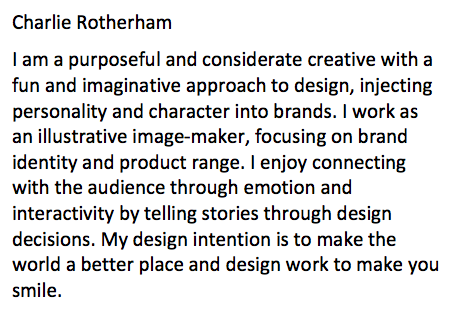 |
| Paragraph for Yearbook |
I really hope that I have presented myself in the most professional light and that it will give the right impression towards prospective employers and clients.
Friday 24 April 2015
Design Context Publication Crits/ Tony Broomhead Crit
We had sign up crits to be able to get some feedback on the design publication that we have to produce for Extended Practice. I thought that it would be really beneficial for me to get some feedback on my ideas as I had ben struggling to come up with some ideas for the book.
I discussed the problem I had with Tony and the other people who were in my crit and they liked the idea that I was trying to put myself into the book. One remark that was made was that I should do a little componant piece about what makes me me because apparently my personality influences my design. I had never thought about this before but having someone else notice this about my work and telling me this, it made me want to include my personality as part of this publication.
Having said that, this then brought about the idea of a cookbook where I could present a recipe of how to make me. I would be able to have myself as a person and how it reflects in my design and how it goes into my work. For the content, I would be able to talk about individual ingredients that are personality traits and have separate chapters showing how I work towards a brief. This would allow for me to be able to have my own work as content and have a concept towards the book, which is how I work as well thereby reflecting my methodology.
I found the crit very helpful as by having this conversation, I now have some direction as to where this can go and I felt like I wanted to get onto working towards the book straight away, having found a renewed sense of enthusiasm.
 |
| Ideas for Book and Feedback Notes |
In the crit, I discussed the ideas that I had but how I was struggling to be able to come up with the content for them. I was told that all of my ideas would make sense and that they would answer the brief well as it ties into what my interests are and what I do.
The brand guidelines idea was well received but I discussed how I knew that I would struggle presenting myself in this way. The interactive book idea was very similar to this one yet gave it an easier approach to produce content for. The most successful idea was the storybook idea as I had just completed the YCN submission and this idea was very similar so this would allow the idea to apply to an actual brief I've done so it would be contextualised.
Having had this crit, I was glad that I had some re-assurance on my ideas and that I had been answering the brief correctly. Despite this, I was still struggling because I just couldn't think of any way in which I could approach these ideas.
Following on from this, we were able to sign up to another crit were we would be able to get feedback from visiting professional Tony Broomhead, who is an architecture lecturer at Sheffield University.
 |
| Feedback Notes from Tony Broomhead Crit |
Having said that, this then brought about the idea of a cookbook where I could present a recipe of how to make me. I would be able to have myself as a person and how it reflects in my design and how it goes into my work. For the content, I would be able to talk about individual ingredients that are personality traits and have separate chapters showing how I work towards a brief. This would allow for me to be able to have my own work as content and have a concept towards the book, which is how I work as well thereby reflecting my methodology.
I found the crit very helpful as by having this conversation, I now have some direction as to where this can go and I felt like I wanted to get onto working towards the book straight away, having found a renewed sense of enthusiasm.
Friday 10 April 2015
PPP3: Correspondence and Studio Visit to Music Studio
I was told about a possible studio visit and portfolio review session that was being organised by another student at Music in Manchester.
I knew as soon as I heard about it I wanted to get involved as this would be another contact that I can make and would continue to add to my experience in talking about my portfolio and my presentation skills. Also, I haven't been on a studio visit with a group of other people from college so this would be a new experience to go with other people.


I emailed Dan Lancaster, a Senior Creative at Music, to let him know of my interest in the day itself. Soon, I was contacted with the necessary day information with the day consisting of a 45 minute individual portfolio review and chat and an hour long presentation and question/answer segment. I am very excited that this event has been organised as it will be nice to learn more about how the studio works and the range of people who work there.
When I arrived at Music, I was quite overwhelmed by the studio itself as it is the largest studio that I have visited so far and it encompasses a whole floor, even having an astro turf roof terrace which, its fair to say, we were all pretty impressed with. The studio is really open and comes across as very contemporary and experimental with the various quirks it has, such as the vinyl date and time calendar.
Portfolio Review
We got to meet Dan who was very welcoming and during my portfolio surgery, I got a lot of feedback on the work that I had produced for each individual project.
For my Parish brief, we were discussing audience as I had managed to be honourable of the current audience whist being open and inclusive to a new audience. Also, it was liked that I had produced a little icon for the brand and had managed to produce a range of products that sticks with the feel of the pub itself.
For my Swell Vaporisers brief, Dan saw a different approach to it as he saw the packaging and visual as being very Japanese- style minimal packaging and i-dent yet saw the logo design as very 20's/50's influence which he said was very disjointed but liked how they strangely worked well together. To the degree where the project comes across like I have taken an existing brand and produced work for it instead of coming up with it myself. Even though I found this quite odd, in a way I took it as a compliment that my brand came across as looking like an already established brand. To expand the brief, Dan suggested producing my own e-cig product design from scratch so that it worked better with the brand as a whole.
For my Zephyr Air brand, Dan really liked the concept and brand visual for the brief but he felt that the product design didn't do the concept justice as it came across as very industrial so to improve this, it would be better to produce something that was a reed diffuser or a bubble or straw to inhale.
The Dr. Me live briefs were well received as having great visuals that made you want to listen to the bands or see them live.
For my Chester Zoo brief, I was told that the work needed to be more playful and fun, especially with the typeface, as it is too sincere for the audience which, in turn, comes across as uninviting and not encouraging. Despite this, it showed a balance of existing brand and application of a conjoined brand.
For my Print Project brief, Dan felt that I had a great concept and approach as it gave a fresh perspective on information which wasn't boring. He suggested expanding this into an online campaign like a blog to go alongside this.
For my BEAR brief, Dan felt it had great concepts and fitting illustrations that was playful and suited the audience as it was imaginative and thus appealing to children.
For the Studs Lonigan brief, it had very simple visuals but it draws you in making you want to watch the film.
For my National Trust brief, Dan liked the concept and the emotional aspect of the concept and thought that the inclusion of an app was very fitting. He felt that the brief could be expanded by producing a campaign promoting the work.
I felt that it was great getting some feedback for all of my projects from Dan because he definitely brought a lot of ideas to the table from a perspective that I hadn't thought of. I'd never considered trying to produce a actual physical product before so this was another level which I would be able to take my work into so I was very thankful for his input. Any feedback is great to contribute to making my work stronger or to influence my future projects to keep improving myself.
Presentation and Q&A
After the first set of portfolio reviews, we were given a presentation into Music itself, how its run, the people who work there and the type of work that they produce.
The name Music
- Brings people together
- All encompassing and means something individually to everyone
- Changes mood and inspires people
- It can be complex or simple
- They are ranked 6th in the UK for creativity by Design Week Magazine
They have a mixture of different people who work in-house
- 3 Directors who own/run the company- deal with the business side
- 2 Associate Directors - Run multiple projects at once
- 8 General Creatives- can do anything- people who are adaptable in the work they produce
- 3 Digital Creatives- Motion design and photography
- 1 Copywriter- Big projects and strategy
- 1 Art-worker- Vets all work for print and web before its done
- 5 Client Services- Work alongside the designers and the clients
- 1 Administrator who organises everything
Everyone is all mixed together in the studio and they swap places every three months so they get to know people more
- Designers see themselves as Creatives as they apply a lot of different skills to what they do everyday
- They have no set style or discipline without being influenced by trends or style. It's about reacting to projects and being confident in it.
They want similar like-minded clients
- Chinese Art Centre- Use of typography to reflect the costume instead of a logo
- London Fashion Week- Re-pitching for it. Making a statement producing something that is interchangeable
- Manchester City- All creative works for them in regards to big scale projects, like advertisements and interior graphic environments
- Phones 4 u- Homely coffee shop style interior layout presentation
- Chester Zoo- Copyrighting- Animated and Distinctive as it doesn't rely on a pattern so its adaptable
- 'The Office Is Dead' 54 Princess Street- Lots of installations and crazy ideas
- British Fashion Awards- Trophy each year- Physical product
- Promotional Book- Moments in Time, Film Scenes, Quotes, Work- Mail out for Clients
- Clients shouldn't be feared or shunned- be honest, open and frank
- Clients have pre-concieved thoughts about how to answer the brief- understand the fundamentals of the problem
- It's good to question everything- Don't follow the trodden path
- A lot of meetings 80% desk work, 20% not desk work- it's important to get out
- Not restrictive as long as you hit the deadline
- Big projects- Encouraged not to isolate yourself and constantly get feedback
- Idea Jams- Big brainstorm on worm projects
- Juniors work with a Senior- Juniors do the work that is put in front of them and Seniors over-see it and put together presentations
- Juniors are encouraged to question what they do and go beyond what is asked of them
- Presentations and articulating yourself- Documenting your decisions and every reason you do something
- Contracted hours- 9 til 5.30 but its normal for people to stay late, especially if there is a presentation or deadline
- Mixture of actively going after work and presenting, tender and word of mouth
- Encouraged to do internships and keep visiting places
Discussion with Ed
After the presentations, we were encouraged to stick around and take advantage of being there. Whilst I was there, Anna, Sam and myself got into a conversation with Ed, another Senior Creative.
I asked him whether he could show us some of the work that he had been working on that day and he talked through some of the projects that he is currently working on. It was great to be able to see the work in progress, particularly the iconography that was being produced for various briefs, and the diversity of the briefs that they were working on.
I asked Ed a lot of questions about working at Music and talking about the work they do. He talked about how they are constantly working on different things and different projects so it's difficult to get bored. They expect juniors to have a years worth of experience yet he started through a 6 month internship at Music and worked his way up. As a Senior, he tends to have a meeting in the morning with the other Seniors about what work needs to be done and splits up the workload amongst everyone else depending on deadlines and priorities. Juniors don't have a lot of responsibility to start with but as they continue, they tend to build it up, especially with presentations.
Before we left Music, I asked Dan about whether they've ever had the chance to collaborate with other studios seen as they are situated in a block of studios surrounded by other creatives. Dan began to talk about how creatives can work with other people in other studios as long as it doesn't affect the work for Music. He told us about how the roof garden was going to be a collaborative brief but it didn't go through unfortunately.

I sent Dan an email a few days later to thank him for organising for a group of us to visit and about how valuable the feedback is.
Overall, it was quite overwhelming yet exciting to see the scale of the work that Music produce and the professionalism of it but it only makes me want to continue to better myself as I'd love to be able to work in a studio like theres. They were incredibly friendly and welcoming and they have a beautiful working space and I had an amazing time while I was there. It really makes me want to aim high and see if I can get into a studio like this. Apparently they will be coming to visit the college for when we have our end of year show and, in a way, I find this a little bit intimidating because I don't want to produce something terrible and unimpressive yet, if anything, I will take this as a challenge to produce work that I can be proud of.
I knew as soon as I heard about it I wanted to get involved as this would be another contact that I can make and would continue to add to my experience in talking about my portfolio and my presentation skills. Also, I haven't been on a studio visit with a group of other people from college so this would be a new experience to go with other people.
 |
| Correspondence with Music |
 |
| Surrounding Studios alongside Music |
Portfolio Review
We got to meet Dan who was very welcoming and during my portfolio surgery, I got a lot of feedback on the work that I had produced for each individual project.
For my Parish brief, we were discussing audience as I had managed to be honourable of the current audience whist being open and inclusive to a new audience. Also, it was liked that I had produced a little icon for the brand and had managed to produce a range of products that sticks with the feel of the pub itself.
For my Swell Vaporisers brief, Dan saw a different approach to it as he saw the packaging and visual as being very Japanese- style minimal packaging and i-dent yet saw the logo design as very 20's/50's influence which he said was very disjointed but liked how they strangely worked well together. To the degree where the project comes across like I have taken an existing brand and produced work for it instead of coming up with it myself. Even though I found this quite odd, in a way I took it as a compliment that my brand came across as looking like an already established brand. To expand the brief, Dan suggested producing my own e-cig product design from scratch so that it worked better with the brand as a whole.
For my Zephyr Air brand, Dan really liked the concept and brand visual for the brief but he felt that the product design didn't do the concept justice as it came across as very industrial so to improve this, it would be better to produce something that was a reed diffuser or a bubble or straw to inhale.
The Dr. Me live briefs were well received as having great visuals that made you want to listen to the bands or see them live.
For my Chester Zoo brief, I was told that the work needed to be more playful and fun, especially with the typeface, as it is too sincere for the audience which, in turn, comes across as uninviting and not encouraging. Despite this, it showed a balance of existing brand and application of a conjoined brand.
For my Print Project brief, Dan felt that I had a great concept and approach as it gave a fresh perspective on information which wasn't boring. He suggested expanding this into an online campaign like a blog to go alongside this.
For my BEAR brief, Dan felt it had great concepts and fitting illustrations that was playful and suited the audience as it was imaginative and thus appealing to children.
For the Studs Lonigan brief, it had very simple visuals but it draws you in making you want to watch the film.
For my National Trust brief, Dan liked the concept and the emotional aspect of the concept and thought that the inclusion of an app was very fitting. He felt that the brief could be expanded by producing a campaign promoting the work.
I felt that it was great getting some feedback for all of my projects from Dan because he definitely brought a lot of ideas to the table from a perspective that I hadn't thought of. I'd never considered trying to produce a actual physical product before so this was another level which I would be able to take my work into so I was very thankful for his input. Any feedback is great to contribute to making my work stronger or to influence my future projects to keep improving myself.
Presentation and Q&A
After the first set of portfolio reviews, we were given a presentation into Music itself, how its run, the people who work there and the type of work that they produce.
The name Music
- Brings people together
- All encompassing and means something individually to everyone
- Changes mood and inspires people
- It can be complex or simple
- They are ranked 6th in the UK for creativity by Design Week Magazine
They have a mixture of different people who work in-house
- 3 Directors who own/run the company- deal with the business side
- 2 Associate Directors - Run multiple projects at once
- 8 General Creatives- can do anything- people who are adaptable in the work they produce
- 3 Digital Creatives- Motion design and photography
- 1 Copywriter- Big projects and strategy
- 1 Art-worker- Vets all work for print and web before its done
- 5 Client Services- Work alongside the designers and the clients
- 1 Administrator who organises everything
Everyone is all mixed together in the studio and they swap places every three months so they get to know people more
- Designers see themselves as Creatives as they apply a lot of different skills to what they do everyday
- They have no set style or discipline without being influenced by trends or style. It's about reacting to projects and being confident in it.
They want similar like-minded clients
- Chinese Art Centre- Use of typography to reflect the costume instead of a logo
- London Fashion Week- Re-pitching for it. Making a statement producing something that is interchangeable
- Manchester City- All creative works for them in regards to big scale projects, like advertisements and interior graphic environments
- Phones 4 u- Homely coffee shop style interior layout presentation
- Chester Zoo- Copyrighting- Animated and Distinctive as it doesn't rely on a pattern so its adaptable
- 'The Office Is Dead' 54 Princess Street- Lots of installations and crazy ideas
- British Fashion Awards- Trophy each year- Physical product
- Promotional Book- Moments in Time, Film Scenes, Quotes, Work- Mail out for Clients
- Clients shouldn't be feared or shunned- be honest, open and frank
- Clients have pre-concieved thoughts about how to answer the brief- understand the fundamentals of the problem
- It's good to question everything- Don't follow the trodden path
- A lot of meetings 80% desk work, 20% not desk work- it's important to get out
- Not restrictive as long as you hit the deadline
- Big projects- Encouraged not to isolate yourself and constantly get feedback
- Idea Jams- Big brainstorm on worm projects
- Juniors work with a Senior- Juniors do the work that is put in front of them and Seniors over-see it and put together presentations
- Juniors are encouraged to question what they do and go beyond what is asked of them
- Presentations and articulating yourself- Documenting your decisions and every reason you do something
- Contracted hours- 9 til 5.30 but its normal for people to stay late, especially if there is a presentation or deadline
- Mixture of actively going after work and presenting, tender and word of mouth
- Encouraged to do internships and keep visiting places
Discussion with Ed
After the presentations, we were encouraged to stick around and take advantage of being there. Whilst I was there, Anna, Sam and myself got into a conversation with Ed, another Senior Creative.
I asked him whether he could show us some of the work that he had been working on that day and he talked through some of the projects that he is currently working on. It was great to be able to see the work in progress, particularly the iconography that was being produced for various briefs, and the diversity of the briefs that they were working on.
I asked Ed a lot of questions about working at Music and talking about the work they do. He talked about how they are constantly working on different things and different projects so it's difficult to get bored. They expect juniors to have a years worth of experience yet he started through a 6 month internship at Music and worked his way up. As a Senior, he tends to have a meeting in the morning with the other Seniors about what work needs to be done and splits up the workload amongst everyone else depending on deadlines and priorities. Juniors don't have a lot of responsibility to start with but as they continue, they tend to build it up, especially with presentations.
Before we left Music, I asked Dan about whether they've ever had the chance to collaborate with other studios seen as they are situated in a block of studios surrounded by other creatives. Dan began to talk about how creatives can work with other people in other studios as long as it doesn't affect the work for Music. He told us about how the roof garden was going to be a collaborative brief but it didn't go through unfortunately.
 |
| Thank You note for Dan from Music |
Overall, it was quite overwhelming yet exciting to see the scale of the work that Music produce and the professionalism of it but it only makes me want to continue to better myself as I'd love to be able to work in a studio like theres. They were incredibly friendly and welcoming and they have a beautiful working space and I had an amazing time while I was there. It really makes me want to aim high and see if I can get into a studio like this. Apparently they will be coming to visit the college for when we have our end of year show and, in a way, I find this a little bit intimidating because I don't want to produce something terrible and unimpressive yet, if anything, I will take this as a challenge to produce work that I can be proud of.
Thursday 2 April 2015
PPP3: Visit to Fieldwork Studio
Following on from my email correspondence with Fieldwork in Manchester, I had organised a studio visit day with them.

The week before I went, I emailed them to confirm that I was still good to visit which I was. I felt that, by sending a quick message, this would be professional of me to double check and make sure that I was expected rather than forgotten about.
The first thing that struck me about Fieldwork was the studio itself and how it is set up. It is a small studio which has both designers and developers working together in the same place so that you can see the work come together, from original designs and ideas to fully formed designs and operational websites. This allows for the studio to have full control over the design instead of handing it over to freelance developers.
I met Loz and went through my portfolio where I got a lot of feedback on the projects that I had within it.
For my Zephyr Air brief, I was told to get rid of the air description seen as it is self-descriptive and that I should come back to the brief as it has a great concept and could be pushed further. For my Parish brief, I was told to try it and see what it would look like without the texture and create texture through stock choices and print methods. For my National Trust brief, Loz suggested taking it even further by expanding the brief to the point where I re-brand the National Trust itself. We spent some time talking about them as a brand and the difficulties faced when producing work for a younger audience. However, Loz also mentioned how I clearly show how I can follow briefs and work well with existing brands which is a good skill to have yet it might be an ideas to try and get out of these zones and go wild on them instead.
Loz commented on something that no one had noticed before. He mentioned that my portfolio has a running theme of sustainability and current issues due to a range of briefs I have that focus on social and green, environmental issues, with examples being my Chester Zoo, National Trust and Zephyr briefs. This is something that I've never considered within my work as I have always wanted to produce work on subjects that matter to me but I felt that it was really good that my work gave this impression.
However, a piece of advice I was given was to start photographing my work in context so that this would give a more convincing and professional finish to my portfolio. I think that this is a great idea because this will give a much more professional presentation to my work. Also, Loz discussed with me how busy small design studios are and how they're time is important so by sending stuff in the post to them is a great way to get through to them.
At the end of my visit, Loz asked me to keep in touch with new projects I would be working on, especially as he wanted to see what I would produce for my final year show.
What I got from my visit to Fieldwork was a sense of ambition because I came out of it knowing that I would like to work in a small studio like this where it is close knit, with people working together as well as separately, learning from each other. Also, I really enjoyed my time in Manchester and seeing the studio itself and I feel like I could see myself working in Manchester in the future. I definitely intend to keep in touch with Fieldwork in the future.
 |
| Correspondence with Fieldwork |
 |
| Surrounding Studios around Fieldwork |
I met Loz and went through my portfolio where I got a lot of feedback on the projects that I had within it.
For my Zephyr Air brief, I was told to get rid of the air description seen as it is self-descriptive and that I should come back to the brief as it has a great concept and could be pushed further. For my Parish brief, I was told to try it and see what it would look like without the texture and create texture through stock choices and print methods. For my National Trust brief, Loz suggested taking it even further by expanding the brief to the point where I re-brand the National Trust itself. We spent some time talking about them as a brand and the difficulties faced when producing work for a younger audience. However, Loz also mentioned how I clearly show how I can follow briefs and work well with existing brands which is a good skill to have yet it might be an ideas to try and get out of these zones and go wild on them instead.
Loz commented on something that no one had noticed before. He mentioned that my portfolio has a running theme of sustainability and current issues due to a range of briefs I have that focus on social and green, environmental issues, with examples being my Chester Zoo, National Trust and Zephyr briefs. This is something that I've never considered within my work as I have always wanted to produce work on subjects that matter to me but I felt that it was really good that my work gave this impression.
However, a piece of advice I was given was to start photographing my work in context so that this would give a more convincing and professional finish to my portfolio. I think that this is a great idea because this will give a much more professional presentation to my work. Also, Loz discussed with me how busy small design studios are and how they're time is important so by sending stuff in the post to them is a great way to get through to them.
At the end of my visit, Loz asked me to keep in touch with new projects I would be working on, especially as he wanted to see what I would produce for my final year show.
What I got from my visit to Fieldwork was a sense of ambition because I came out of it knowing that I would like to work in a small studio like this where it is close knit, with people working together as well as separately, learning from each other. Also, I really enjoyed my time in Manchester and seeing the studio itself and I feel like I could see myself working in Manchester in the future. I definitely intend to keep in touch with Fieldwork in the future.
Wednesday 1 April 2015
PPP3: Client Brief- Victoria Shakes
I have been contacted by a client to produce a logo for his band, Victoria Shakes. They are a small, local band who have recently started playing gigs together, with their main focus being on weddings and sometimes other events.
The direction I was given in regards to what the client wants was that they wanted a band logo which consisted of the band name in full using a classy, joined up font. This would be enclosed in a circle and would have a colour scheme of blue and white. The tone of voice needed to be professional with a classy visual.
I was really excited at the prospect of doing a live client brief as I haven't really had the chance to do one yet. Also, I felt that this would be a great chance to have a go at trying to work on my timing for a brief, as discussed when I went to my studio visit at Tonik.
I started by working on a few sketches as to where I can go with the logo. I wanted to give it a feeling of a wedding brand so I started by working on just have an initial- based logo with the writing on the bottom separately which then moved onto becoming more like a band logo as I tried to find variations on the way I could get the logo to look more like the words were visually shaking.


Following this, I started looking at blue colours that I could use for the brand logo. I initially started with looking at just the generic shades of blue yet I felt that these were way too bright and unconsidered for a sophisticated brand. Following this, I started by looking at tones and hues that were muted and more neutral which gave a more fitting visual.


The direction I was given in regards to what the client wants was that they wanted a band logo which consisted of the band name in full using a classy, joined up font. This would be enclosed in a circle and would have a colour scheme of blue and white. The tone of voice needed to be professional with a classy visual.
I was really excited at the prospect of doing a live client brief as I haven't really had the chance to do one yet. Also, I felt that this would be a great chance to have a go at trying to work on my timing for a brief, as discussed when I went to my studio visit at Tonik.
 |
| Initial Sketches |
 |
| Chosen Typeface |
From the initial sketches, I started by choosing a typeface that fitted the clients wants. The visual needed to be classy yet I didn't want the typeface to be overly done so that it was still readable. A lot of the ones I tried were clumsy or naive which didn't fit the profile of the client yet 'Cylburn' was sophisticated and legible without being too over-bearing.
 |
| Colour Choices |
 |
| Colour Scheme Applied |
To be able to see what each of the colours would look like in practice, I started by making a very simple logo and then applying the different colour tones to the logo. I did this by alternating between a solid colour background and a solid colour font to see what effect would look the best.
|
| Colour Scheme |
The colour scheme that I found the best was a pale navy blue, however, instead of a white, I deviated from the wanted colour scheme to go with an off-white/cream colour which I felt gave a bit more warmth and sophistication to the visual identity.
Following on from the font and colour decisions, I went onto producing logo variations for the band.
 |
| Original Logo Designs |
I started by keeping the logo variations very simple, solely working on just the name of the band and the circle itself, trying to find ways of creating a relationship between the name and the circle and how to connect them together. However, I didn't know if these came across as being a little bit simple. I decided that I needed to try and create more detail so that they had more personality to them.
 |
| Logo Experimentation |
I developed the logo with the ideal that it should be traditional and classy so that it would be something that would instantly be synonymous with the aesthetic of a wedding. That way, the logo would communicate the function of the band and would give the indication of the audience to use them for their wedding. Despite this, I feel like I am loosing the essence of the logo which is essentially a band logo so I want to go back onto developing some logos which are more representative of the band itself.
 |
| Logo Development |
I selected the logos which I felt so far had been the most successful and decided to develop them so that they were more focused towards being for a band. I felt like these were more successful as they had more of a personality to them and the fact that they are all enclosed within the circle gives a more intimate visual.
To present what I had done to the client, I produced some design boards with the range of what I had produced.
This way, it would be clear to the client what I had produced and they would have a range of different styles to chose from.
 |
| Chosen Favourite Logos |
After showing the client, they were very happy at what I had produced and had whittled down their favourites to two. The first one being a very classic, simple logo with the other looking like a record player.
 |
| Typeface Changes |
 |
| Typeface Experimentation |
What the client did ask for as an amendment, however, was the first letter 'S' in the word Shakes was too difficult to read so they wanted it to be more like the one at the end. I stated that this would probably not work on the visual but I would produce it to see what it would look like. I decided to produce a range of variations of the S on the two favourite logos. I left one as it was, a lowercase 's', an enlarged lowercase 's' and a manipulated enlarged lowercase 's'.
 |
| Variation Presentation for Client |
I presented the logos for the client so that they could see the differences between the 's' and how they change the presentation of the band.
http://i0.wp.com/www.moderndrummer.com/site/wp-content/uploads/image1.jpeg
Subscribe to:
Posts (Atom)