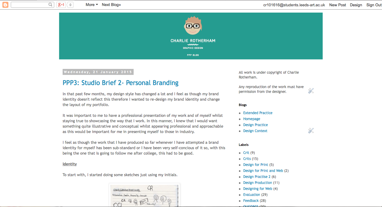
In the past few months, my design style has changed a lot and I feel as though my brand identity doesn't reflect this therefore I wanted to re-design my brand identity and change the layout of my portfolio.
It was important to me to have a professional presentation of my work and of myself whilst staying true to showcasing the way that I work. In this manner, I knew that I would want something quite illustrative and conceptual whilst appearing professional and approachable as this would be important for me in presenting myself to those in industry.
I feel as though the work that I have produced so far whenever I have attempted a brand identity for myself has been sub-standard or I have been very self-concious of it so, with this being the one that is going to follow me after college, this had to be good.
Identity
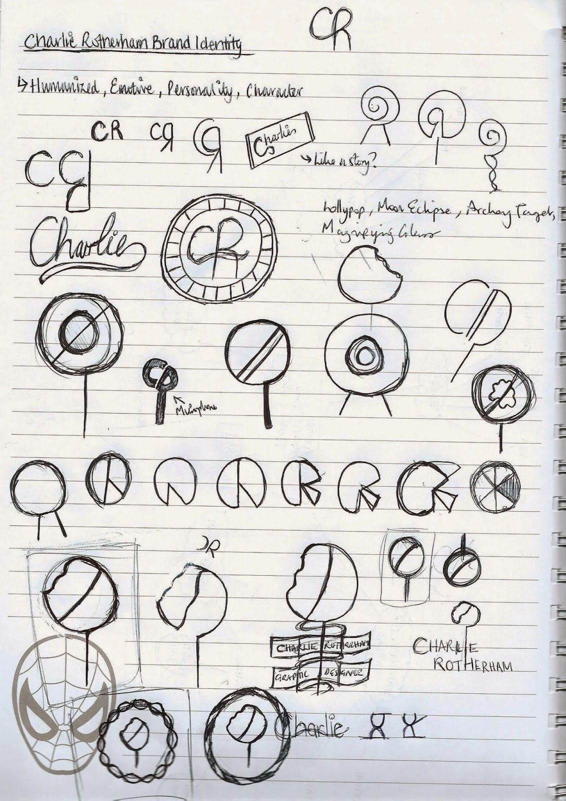
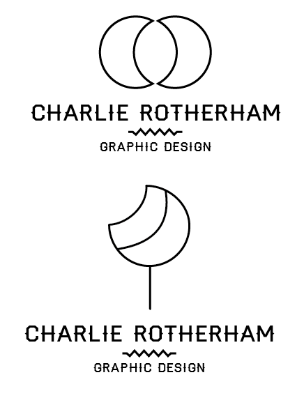
To start with, I started doing some sketches just using my initials.
 |
| Initial Sketches |
What I found from my initials was that I was able to produce visual images with my initials just by changing them into basic shapes of circles and lines. I could make illustrations, such as lollipops and moon eclipses by changing the way I produced the physicality of the letterforms.
 |
| Digital Sketch Experimentations |
I decided to take this approach and produce these design digitally so that I could see if they had the same effect, however, I felt that none of the logos that I was producing were any good. In a way, I felt like I was getting nowhere because there was nothing that was descriptive or gave any personality.
As I didn't feel as though this was working out, I decided to focus on the typeface instead as I felt that selecting a typeface would help provide a personality.
 |
| Header and Body Copy Font |
I tried a range of typefaces which had a very distinctive style so that I would be able to select a typeface which I felt was strong in character. I felt that the font 'Haymaker' made for a lovely header as it was clear with some subtle accents so it was more focused on the details which I felt described my approach to concepts very well. I tried some different fonts alongside 'Haymaker' as I knew it would be too difficult to use as a body copy font. I found that, due to the fact that 'Haymaker' is quite a thick font, I needed a font that was quite dark itself. I felt that 'Klinic Slab' not only helped balance this out but the fact that the font is also quite distinctive and subtle made for a great combination.
After feeling like my choice of fonts gave my brand much more of a personality, I went onto adding the font to the symbols and logos I have been making.
 |
| Development of Logo Design |
I started using circles as the main running theme due to them making up the predominant amount of my initials. I felt that the most successful of the logos was one that looked like a moon and one that looked like a lolly so I decided to work on these ones. Saying that, I had put the text information in circles to reflect the psychical theme but the text wasn't looking very readable. From that, I decided to have it flat so that it would be readable and it instantly seemed more professional. I added the line work so that it split the information up, making it look like triangles to reflect the 'Haymaker' typeface. This made for a much cleaner and mature logo design overall from its development.
 |
| Colour Variants |
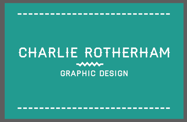
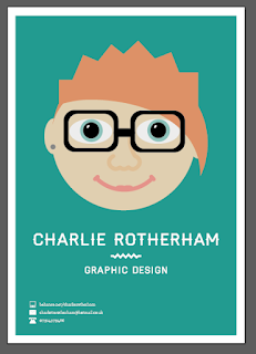
Working on the logo, I knew that it would be ideal to start to applying colour to it so that I would be able to see how it sits on a background. I tend to use blue a lot when I do work and it is always the colour that I go to. I have always felt comfortable using this colour so I decided to work with it. I changed the logo colour to white as this seemed to soften the overall impact of the logo, however, I felt that the colour blue I was using was a bit washed out therefore I tried a myriad of different shades soon settling on a strong teal as it was striking and approachable.
 |
| Typeface Only |
Eventually, I decided that the logo was pointless because it didn't really communicate myself as a person, however, I still really felt that the typeface worked so I decided to try it by itself. I understand that a lot of self brands do not have a logo and work solely off typeface yet, to me, it just seemed very empty to me. This made me feel like I was back to square one.
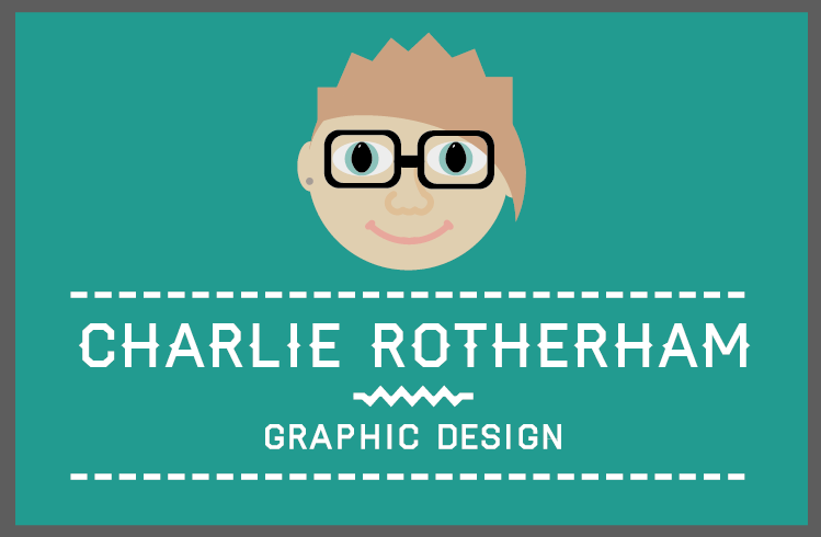 |
| Self Portrait Illustration |
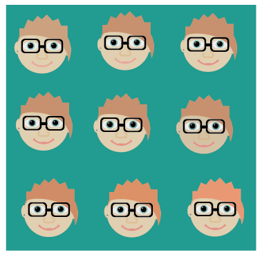
Just for fun, I decided to see what it would be like to make a picture of myself because I felt that the only way that I would be able to have a branding that represented myself would be showing myself. Strangely enough, the illustration came out looking eerily similar to myself yet it also made for a great visual aid. I felt that the idea of having an illustration of me would make for a friendly and personable portfolio due to the fact that it is putting a face to a name, instantly making a connection to the person who it belongs to. As soon as I put it alongside the name and the teal, it clicked and I could straight away see a great icon for my self branding.
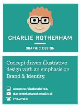
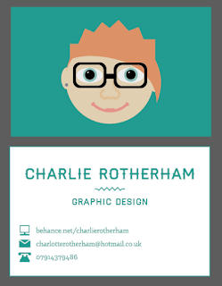
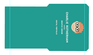
Business Card
From this, I went onto changing the business card
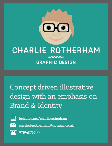 |
| Business Card Design |
The hierarchy of information is shown by the larger text size for the description with the contact information being in a small point size. Different from the previous attempts at making a self brand include the fact that I reworked the icons for the contact information so that they were more like shapes which made for much more distinctive and recognisable features.
 |
| Detailing on Business Card |
I went onto changing the tracking of the number so that it was much more readable as well as making the space between the text and the information larger so that there is some differentiation between the description and the information.
I was really happy as to how well the business card has come out as it looks very professional as well as personable and friendly. I want the card to make the receiver feel as though they can easily contact me with it and I think that this comes across very well.
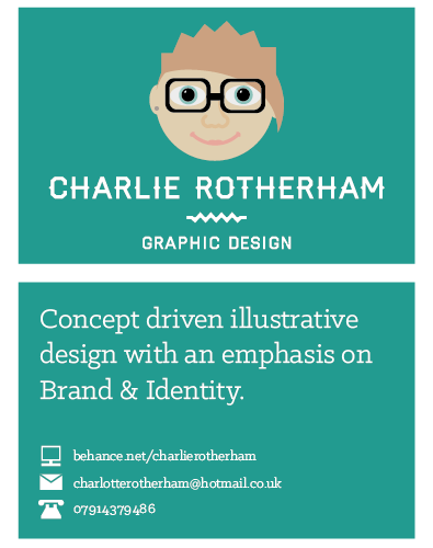
Following from the manifesto presentation we had to do (see PPP Blog Post), I decided that I wanted to change the back of my business card so that it had that description of me rather than the current one because it is more concise and precise as to the style of work that I do.
 |
| Change in Manifesto Description |
This way, this gives much more of a connection between the way I present myself and the way that I view myself and my design work.
Portfolio
For my portfolio, I feel like the book layout of the previous one was very tidy but it just wasn't me. Instead, so I can keep the professional aesthetic, I decided to present my portfolio as a series of design boards. Over the past few months I have got better at presenting my work via design boards and I feel this would be the best layout for me to work with in this sense.
 |
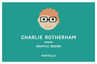
| Front Cover Layout |
I wanted the front cover of the portfolio to reflect the business card so that it was consistent with each other so I kept the style the same.
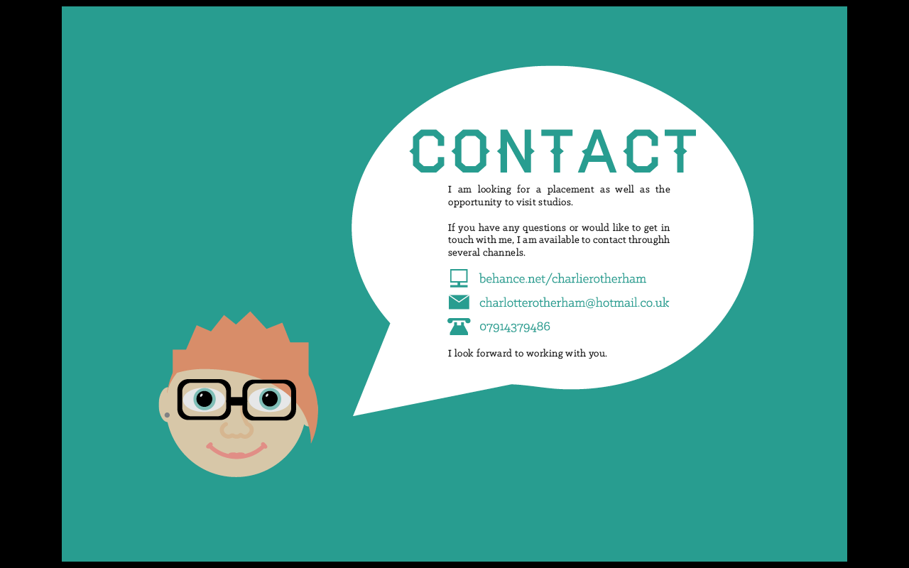
The first thing that people would see in the portfolio would be an introduction about me and what I can do. I wasn't sure how I would be able to present the information sections but I knew that I wanted to use the portrait of myself to convey the information.
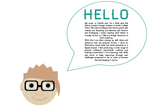 |
| Speech Bubble Idea Development |
I decided to produce a simple speech bubble shape and incase the text that I had written about myself from the previous brand identity inside. I felt that this was quite stark so I decided to make a huge hello text sign so that this will make orientate the reader.
 |
| Application of Speech Bubble |
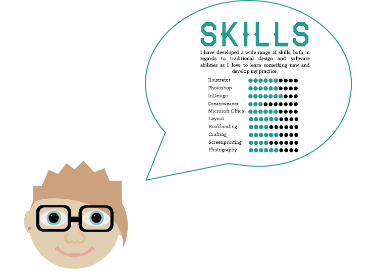
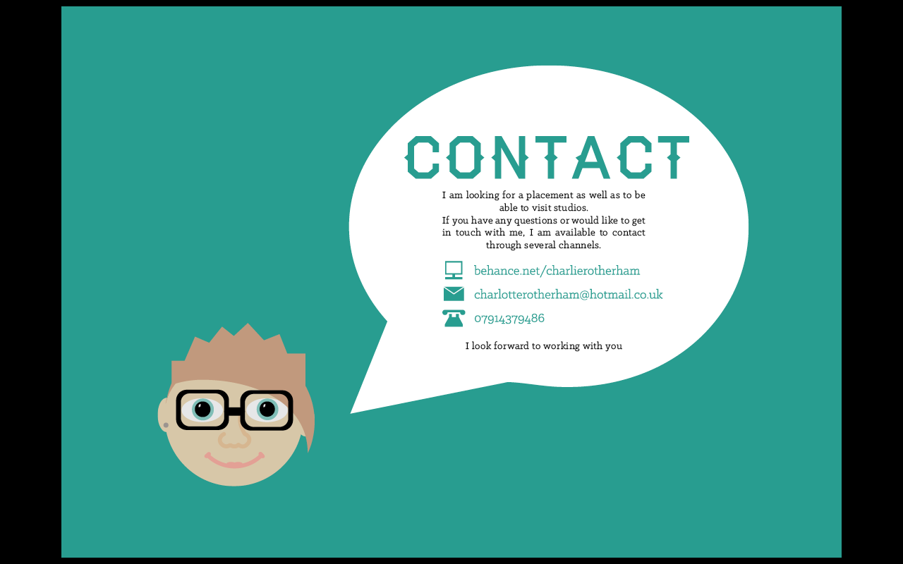
I felt that this would be very well applied to the contact section and the skills section so I applied it to the information. This gave a really sweet impression as it is like the portrait of me is actually talking which gives a novel, sweet appeal.
 |
| Information Slides of Presentation |
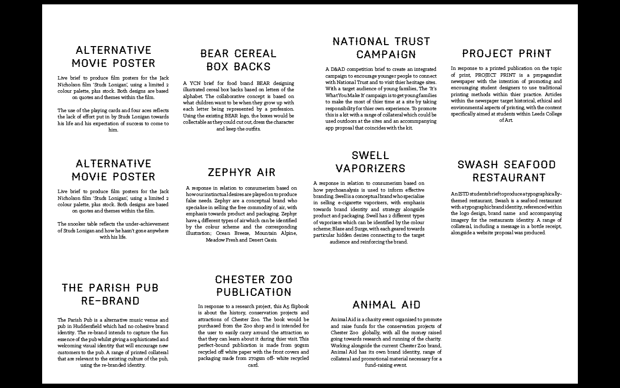
I applied the speech bubble information pieces to the middle of the pages, using a teal background to give it contrast. Alongside the front cover, I made versions with the words 'Competition Work' and 'Self-initiated Work' so that I would be able to distinguish the types of briefs that I had produced work for. I felt that this would be a good idea because that way, I would have a range of different sized briefs throughout the portfolio rather having the best work at the front so that it would be strong throughout. Also, you would be able to see work that I have produced for myself as well as client- led or specific briefs.
 |
| Descriptions |
Using the fonts that I had chosen, I took the descriptions that I had originally used for the old portfolio and changed the fonts, adding some new descriptions for new briefs I am including.
I went ahead with putting the pages together into a PDF document so that I could see what the portfolio looked like as a whole. The images were spaced out with having usually just one or two images to a page as I wanted the work to be the main focus of the portfolio. I felt that having a wide image at the top would make for a nice introductory banner whilst using squares would help for vertical imagery so the shape and size of the images dictated the placement as well as the layout of the pages.
To start with, I felt that my portfolio is much cleaner and professional than any that I have produced before so I felt that already I have improved my presentation of myself tenfold compared to the previous branding attempt. The new approach of thinking of the layout as design boards has made for some boards which are more confident and show the work off a lot better.
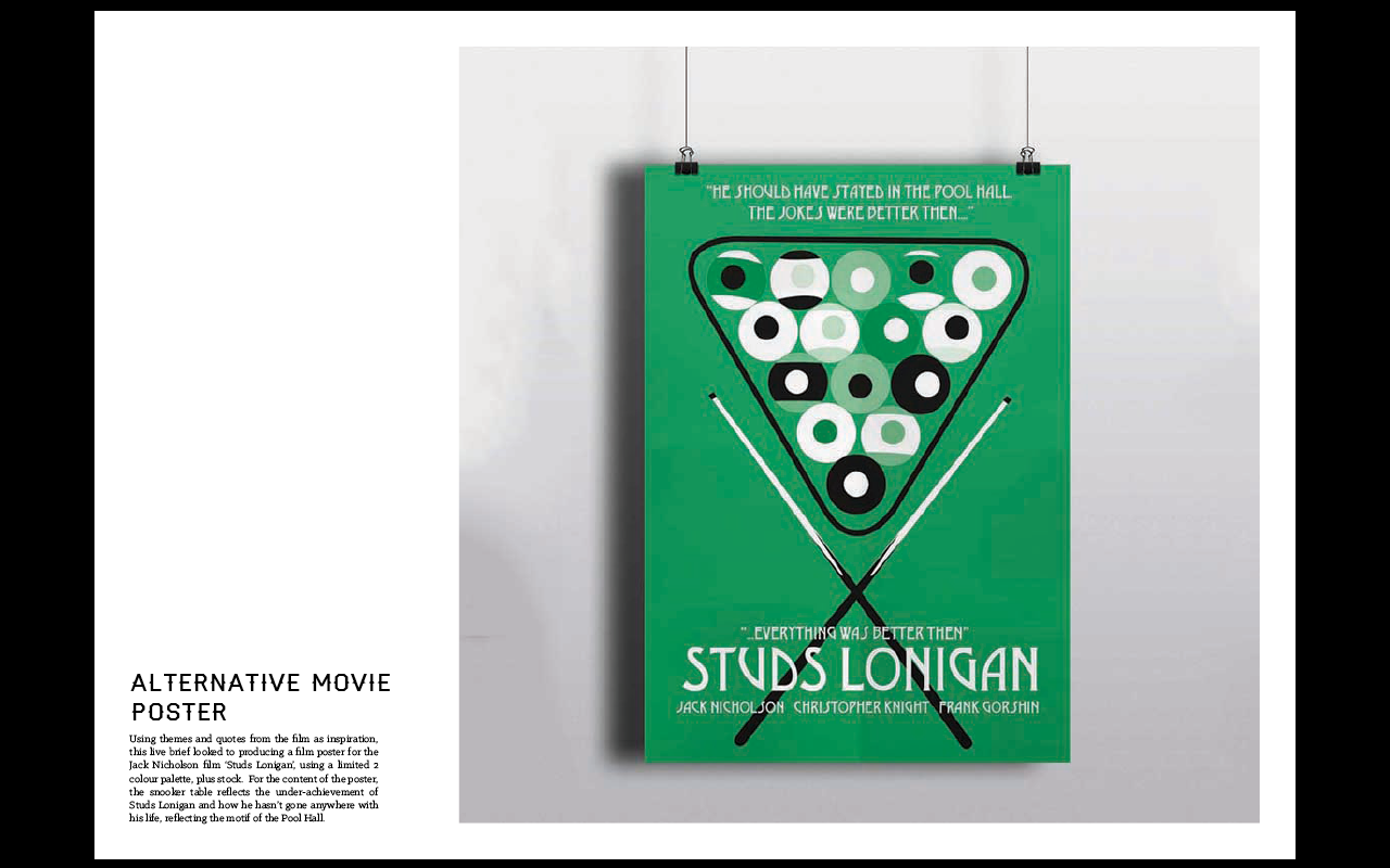
Despite this, I also found some areas that needed improving. The information that I have on the pages seems very generic and rigid which doesn't fit well with the tone of voice that I have produced. The self portrait comes across as quite faded on the teal background when the portfolio is all together so it needs to be brighter. Also, the layout is inconsistent throughout so it would be ideal to change the layout so that it was much more consistent. Another thing I noticed was how the Swash brief images did not stand up to the quality of the rest of the work and stood out for all the wrong reasons. I have decided to get rid of this brief so as to improve the overall quality of the portfolio. Having said that. the last brief looks straight having just one page of its own with a logo so I will expand on this.
 |
| Development of Portrait |
To start with, I developed the portrait of myself by making it brighter and more vibrant whilst trying to stick to the neutral shades that make the portrait more realistic. Through the development, you can see how much more visible and clear the portrait becomes on the teal background.
 |
| Application of Developed Portrait |
I applied the newly developed portrait to my business card which instantly made for a much brighter and clearer visual identity.
 |
| Application of Portrait and Text Alignment Change |
From that I went ahead and added the portrait to the rest of the pages which made for a much more vibrant aspect. Alongside this, I decided to change the justification of the page text to the left which made for a easier read.
I decided to apply this text alignment to the rest of the descriptive information which would go towards changing the placement of the text.
 |
| Text Alignment and Placement |
I was torn between the layout in regards to text placement. I decided that I felt that the text being on the left hand side in a column separate in space from the image was much more professional and spacious with a larger image whereas the one with the text in the top half is much more condensed and doesn't make as much good use of the space available.
 |
| Change of Paragraph Tone |
I re-wrote the text information of each brief to try to make the text much more conversational in tone so as to match the tone of voice of the visual brand identity. This gives a more personal touch to the whole portfolio as it is humanised and enthusiastic, which is what I want to get across.
 |
| RENEW Additional Pages |
I went on to add a few new pages to the RENEW briefing so that it was much more explanatory of the brand concept. This made for a much clear and developed brief that could be shown.
 |
| Adding 1 Day Briefs |
Alongside the RENEW boards, I added the 1 day briefs from the Dr. Me workshops as they are collaborative and show a different style of design than what I would normally do, showcasing a different style that I can work in.
Due to the fact that I had added these briefs with just one image to show for them, I decided that it would be ideal to change all of the first pages for briefs to the square layout so that this way, even the briefs with just one image would be fluid throughout.
I felt that these amendments would make for a more succinct and complete book.
Compared to the original layout, these amendments have made for a more fluid publication that shows my briefs in a much more positive light. It is defiantly much more professionally presented and clearly reflected.
 |
| Additional Project Print Pages |
Saying that, I felt that my newspaper brief was a bit under-represented so I decided to add more images within that whilst taking a page away for the RENEW brief so that it was more contained and to the point.
 |
| Spacing of Images |
Not only this, but I hadn't noticed how the spacing of all the images was different throughout the portfolio. I amended this for all of the images in the portfolio so it was even.
Overall, I am very happy with the way that the portfolio has come out as it comes across as much more professional than anything else I have ever done. I actually feel as though I can be able to send this to places and be able to have a chance of them looking at my work and considering me for a visit. I wanted to show my personality and ability through this portfolio and I think I have done this very successfully. I intend to keep this updated through the rest of the year so that all my work is constantly up to date and represented.
Following on from this, I went on to having a portfolio surgery with a tutor where I made a series of amendments to my portfolio from his advice (See PPP Blog Post).
By working on the feedback, I felt that it was much more focused and condensed.
Creative CV
From the work that I had done on my portfolio and contacting studios, I managed to get a visit with United By Design in York. For this visit, I have been asked to bring a Creative CV. Due to the need that, in order to get a job, I would need to get in correspondence with other places, I felt it made a lot of sense to have one made now rather than later. To be fair, I would be using the portfolio as my creative CV and sending that to people yet it wouldn't hurt to have my own separate CV.
I had a conversation with John as I wasn't sure what to include in the CV and he suggested that the CV should be more about me personally rather than just my work (as thats what my portfolio is for) or what would be on a traditional CV. It should include things like what excites me, my likes and interests. This is to show what makes me different from other people and make it fun. John suggested maybe having a CV like a Zine which I would feel would be a bit difficult to do a full Zine on just me. I'm not that interesting!
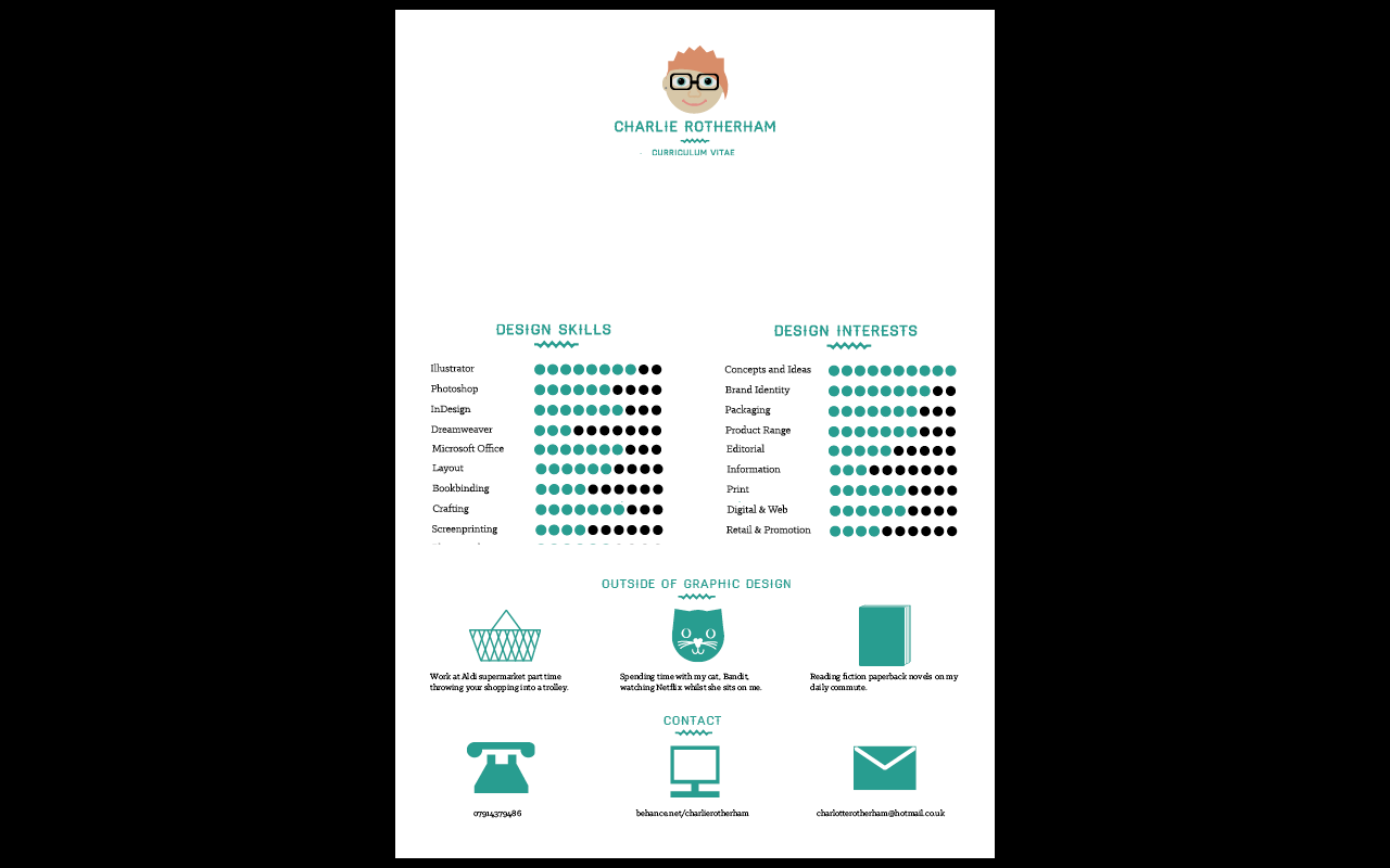
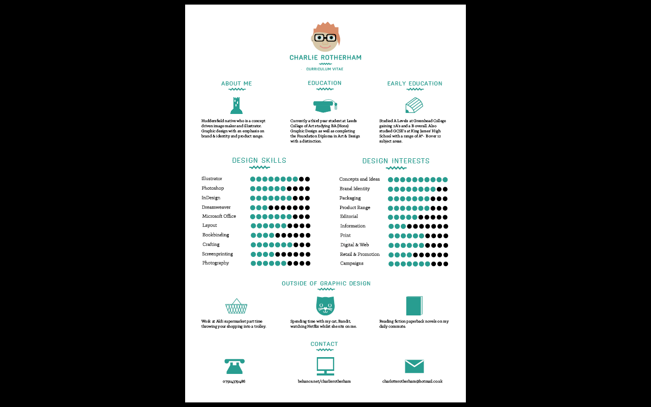
I know from my own experience of trying to get a job that a lot of potential employers tend to make a snap decision about a CV and don't like to have lots of information on a page so I decided to make a very simple CV in an info-graphic style. With this in mind, I decided on a single-sided portrait A4 format to reflect the quick manner of the information.
 |
| Original Categories |
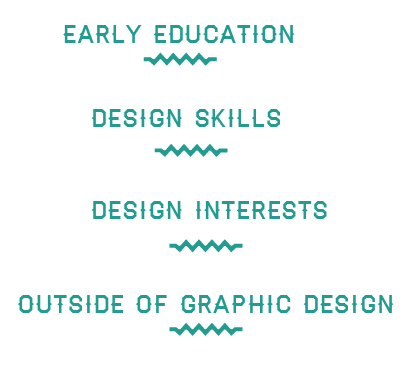
I was struggling to think about things that I needed to include on my creative CV as I wasn't sure what actually made a CV creative. I knew that generally CV's included information on education and work experience but I don't currently have any experience so I decided to make some of the tradtional elements into headers so that my CV had structure.
 |
| Extra Categories |
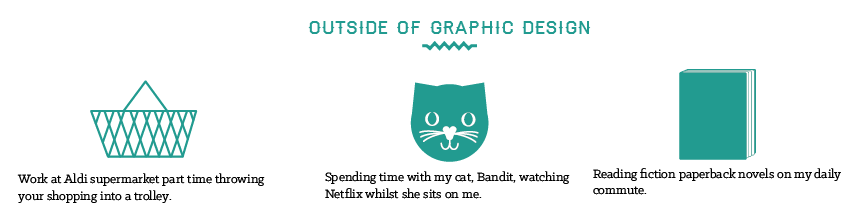
I decided that, to make it more creative, I would add some categories that were relevant to design as well as being a bit more personal about me. So I decided to include a section about what I do outside graphic design so that it has some more of my interests and aspects of my life.
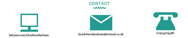 |
| Contact Information |
The contact information I already had on the business cards I felt would be relevant to include on the CV so I took the simple icon illustrations that I had done and laid them out landscape so that they would fit on a portrait A4 format well.
 |
| Outside of Graphics Icons |
 |
| Outside of Graphic Design Information |
 |
| Applied to CV Format |
I felt that the contact information worked really well in this manner so I decided to follow this one with the rest of the sections. I was trying to think of things that I do outside of graphic design so I decided to include a past time (watching TV with my cat), my job (working at Aldi on a weekend) and a hobby (reading fiction novels). This would give a more personable element of my CV and make it a bit more individual and tailored to me as well as giving talking points about myself. I made little icons for each piece of information and laid it out in the same manner.
 |
| Design Skills from Digital Portfolio |
 |
Design Interests for CV
 |
| Added to CV Format |
|
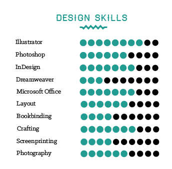
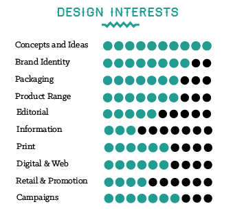
I remembered that for my digital portfolio I had produced a small rating system for my skills in particular areas of design. I thought it would be really nice to put this into my CV as it shows a connection between the two things whilst still being relevant to my design. It simple yet clear. From this, I decided it would be nice to include aspects of design that I have an interest in so that employers would be able to see where my interests lie.
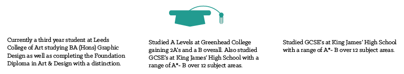 |
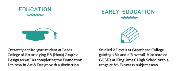
| Education Section |
For the education section, I originally split it up into three sections using a graduation cap icon to show how I successfully completed these elements of education, however, I soon found that I couldn't think of 3 icons that would successfully illustrate my education.
 |
| Split up of Education Information |
I decided to condense my information into two and added a pencil icon for my early education because the pencil is to show the way that I was constantly learning and developing into what I have become.
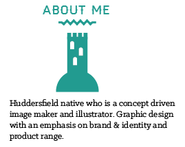 |
| About Me Information |
The last section I went onto doing was the About Me section as it is always difficult to try and talk about yourself. I decided to use the information from the back of my business card to be my about section yet I didn't feel it was personal enough so I decided to include where I live so it adds a bit more of a personal touch. For this, I included an icon of Castle Hill, a known monument of Huddersfield close to my home to show more about myself.
 |
| CV Layout |
I laid out the information as well as I could, trying to keep it gridded and spaced out evenly. I had to make the icons smaller so that they were less overpowering and gave more space over the page. I added a logo at the top so that it would be clear as to who the CV belongs to.
 |
| Business Cards |
 |
| CV |
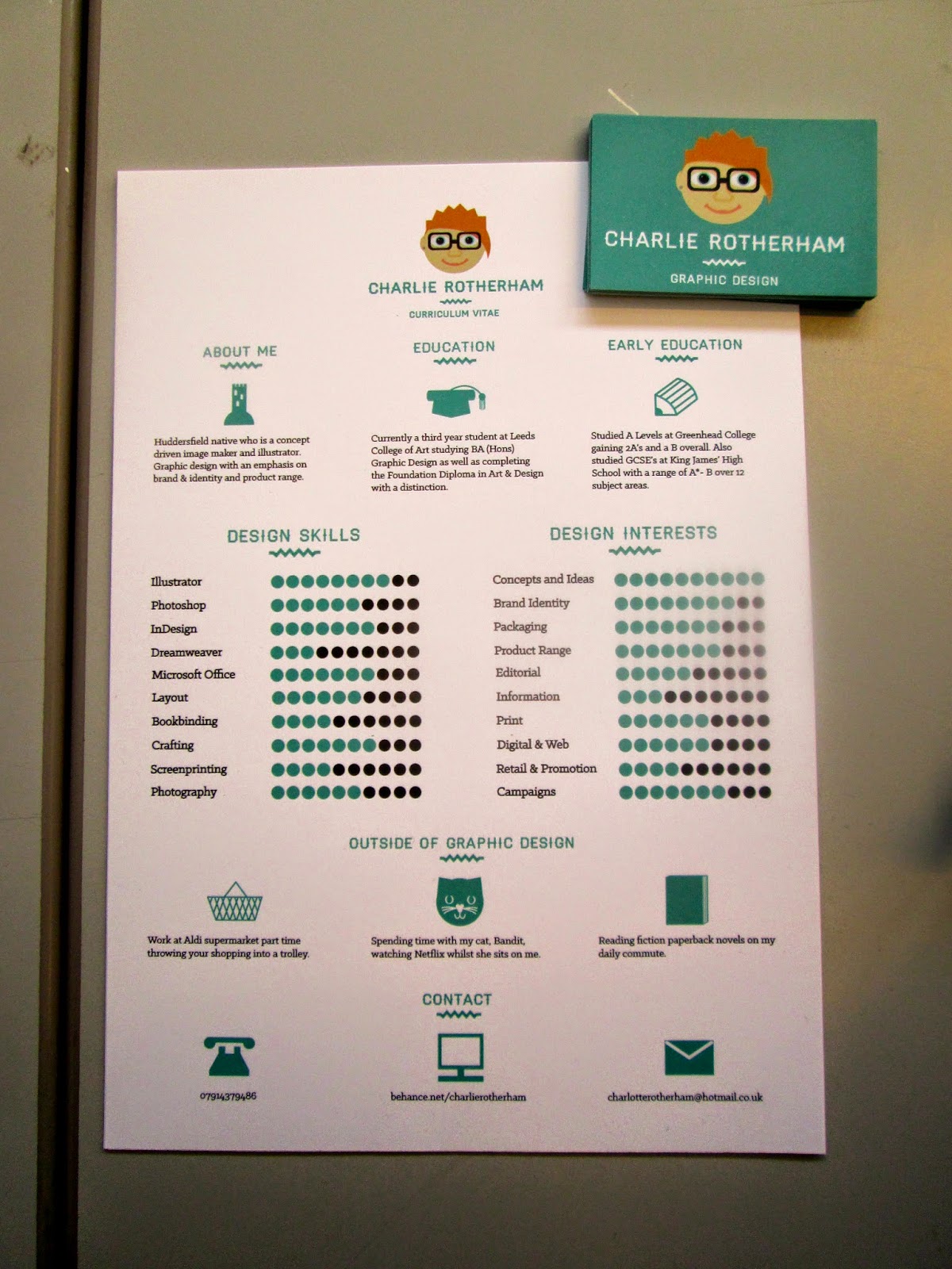 |
| CV and Business Cards |
Overall, I am quite happy with this because I don't do information graphics yet I have managed to produce this, with it being in keeping with my brand identity and illustrative style. What I am also happy about is how you can tell that the business cards and CV is by the same person so you can see some clarity and connection through the visual communication.
At this point, I was in a crit with Tony Broomhead (See PPP3 Blog Post) where the topic of conversation turned to our PPP collateral. Tony suggested that we should only focus on stuff that we are going to use after we finish college because, otherwise, it would be not relevant to what you want to achieve with it. I want to achieve getting a job after college so I decided to take on this advice and focus on producing stuff that would be relevant to getting attention for a job or what I would need in the process of getting a job. This would give me more focus in what I would produce for this module.
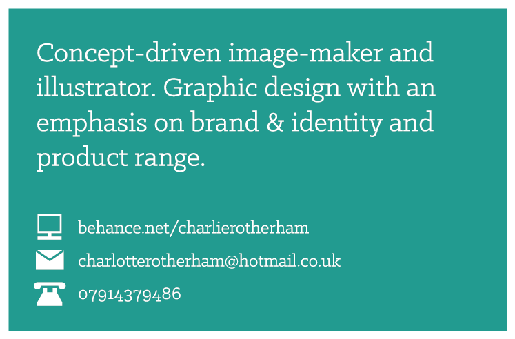
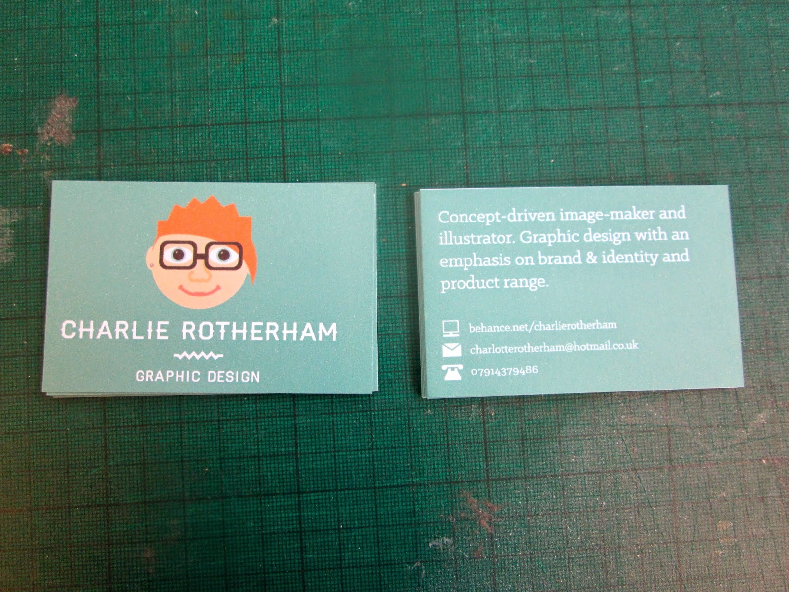
Business Card Re-Design
Eventually, I decided that I didn't like the business card and that it just had too much blue, which came across as overpowering and too much. I decided that I wanted to focus on having white in there to break it up a bit.
 |
| Chosen Design |
I came up with two variants for the front and two for the back based on the original that I had produced. Both of the new backs were white with some blue text instead of the other way around. This was much better as it was clearer and more professional. I decided to go for a front cover with just the icon of my brand and nothing else as this was more inviting and ominous with having all written information on the back laid out with plenty of space so that it was readable and clear.
Cover Letter/ Thank You Letter
After having a few studio visits under my belt, I felt that it would be relevant to produce a cover letter for the CV I had produced earlier for jobs and a thank you note that I can send to people to say thank you for allowing me to visit or intern. I know that many of the studios I have visited have said how much that they have enjoyed getting in the post so this would be a nice touch.
 |
| Content for Cover Letter |
I started by writing up what would be good to include on a cover letter, trying to keep a professional tone of voice.
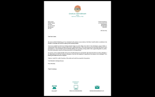 |
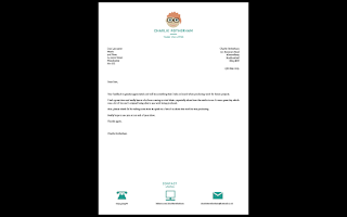
| Layout for the Cover Letter |
From this, I went onto laying it out on a portrait A4 format, the same style as the CV I had produced. To stick with the identity that I had already created, I produced a logo for the top of the Cover Letter which mirrors the information on the CV. I toyed with having the contact information in the same way as the business cards by having them in a list however this didn't fit very well so i decided to have them reflecting the CV.
 |
| Thank You Letter |
From the CV and Cover Letter, I produced the Thank You letter from the same layout and content, taking one of the thank you notes that I had originally sent and adding that to the paragraph within. This way, it gives much more of a considered and polite way of thanking a studio afterwards to show how much I appreciate their time and not just by sending an email.
Portfolio CD Cover
Seen as I had produced a printed CV and Cover Letter which I could mail out to people, it made a lot of sense to have a physical copy of my portfolio on disk or USB to have with it so that it could be viewed. I decided to use a CD because I felt that this was less likely to be damaged in the post rather than a USB stick and it would be cheaper to send to places as it wouldn't be as bulky or weigh as much.
 |
| Applying Branding to CD Packaging Net |
I made a net for a simple CD sleeve that would be appropriate as a quick CD cover and applied my brand identity to it. A practical and efficient solution.
Promotional Poster
Despite being quite self indulgent, I thought it would be quite cool to produce something that could be promotional for me and my brand. I know that a lot of studios and designers will send stuff to clients that they have had to make them feel special and considered whilst really promoting themselves and business, so I don't see why I can't do this with studios I've visited or want to contact. I decided to make an A2 poster which could be folded up and sent easily, both physically and digitally.
 |
| Poster Design Variants |
I kept the poster very simple, with a connection between the business card and the poster having the icon on a blue background with the contact information in the bottom corner. Having the contact information large like on the CV was too distracting and didn't allow for the icon to be the main element of the design.
Portfolio Carry Tube
Alongside this, I felt that it would be nice to be able to send these promotional posters out in portfolio carry tubes.
 |
| Tube Label |
For the carry tubes, I made a very simple rectangular label that could be stuck onto the tube so that the recipient would know who it was from.
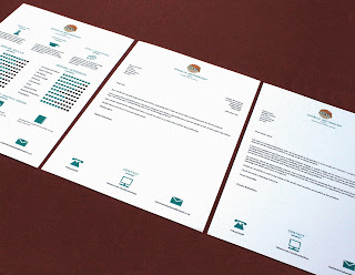
Final Printed Collateral
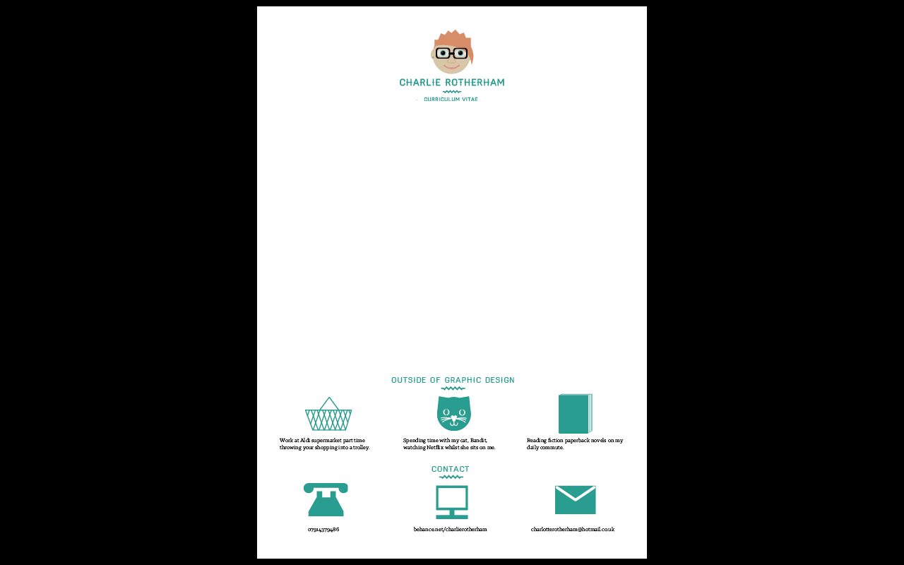
Finalised printed collateral for my self branding, tailored on focusing on getting a job thereby having relevant and appropriate collateral for that aim including; CV, Cover Letter and Thank You Note, A CD Portfolio, Business Cards and Promotional Poster and Carry Tube.
 |
| Printed Products for Self Brand |
I was very happy with the way that the printed collateral came together as it has much more of a purpose and a focus compared to other times I have produced my own branding. The fact that I decided what collateral to produce based on what would be necessary for me in the real world has definitely made sure that my decisions were more personal and refined. I am confident that this branding is going to make me stand out and reflect me as a person and as a designer idiosyncratically.
Online Presence
As part of the brief, we need to produce an online presence to have an outlet to our work and a more professional connection to potential clients and job prospects.
The first thing I did was change my college blog as this is something that is already accessible online. Particularly as it states that I am from Leeds College of Art in my portfolio and printed information so this is something that people can go looking for without me directly including it in that information.
 |
| Application of Brand on Blogs |
I produced 3 banners for the tops of each of the 3 blogs I currently use; PPP, COP and Extended Practice. I saved them as png files and added the images to the tops of the blogs as well as moving the copyright text so that it was much more professionally laid out and clear to see. I was very happy with the outcome of the blogs presentation and allows me to give much more ownership of my blog which I have never done over the entire 3 years.
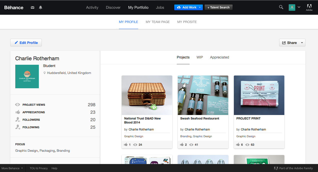 |
| Behance Account |
I also changed the image on my account on Behance to my logo identity so that it was in keeping with my visual brand. It defiantly gave much more of a personality to the account itself which the old brand identity wasn't achieving.
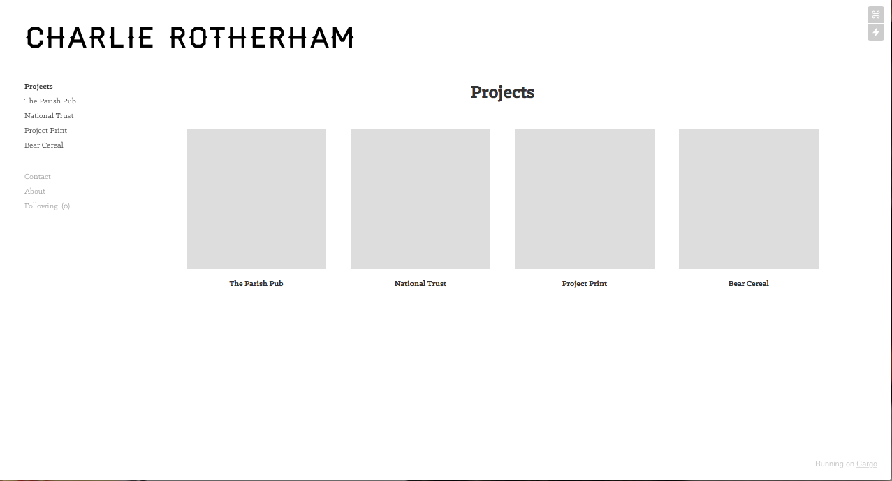
From this, I started looking at producing my own official and more professional live website. This is something that I have not done before yet and is something that I feel is important to creating future opportunities for me and giving myself a more professional impression.
After looking at different sites, I found that the easiest one would be to use Cargo Collective as there are some people who I have spoken to who already use it and have recommended it as a site where it is easy to update and customise the site as necessary.
 |
| Making Website Account |
I made an account for my website, with the aim being for it to be a professional outlet into my work, naming it Charlie Rotherham Design so that it is to the point and direct.
 |
| Layout Set Up of Website |
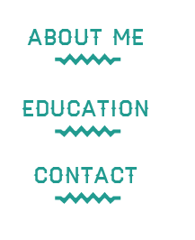
I began by creating 3 different pages which would make up the main body of my website; an About page, a Contact page and a Project page, the latter being the page you end up on first. From this, I began to add briefs to my project page, making the box with the projects longer so that it would fit the full width of the page. I made the project boxes square so that there was an equal amount of space being used which made it more even. Alongside this, I changed the fonts used to Haymaker and Klinic Slab so that it fit with the brand identity that I had as well as take away the word design from my name so that it was more informal whilst maintaining the professional elements.
Website Proposal
Despite starting my website, I was finding it incredibly hard going to code and work the template and I knew that I wouldn't have enough time to produce a live version.
From this, I decided that I would do what I am much more comfortable doing, which was to design a website layout and propose how I would want my website to look. This way, I would be able to communicate what I intend to do in the future.
 |
| Logo and Pages |
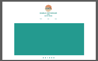
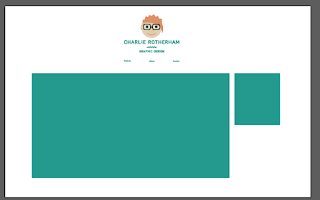
I want my web identity to be in keeping with the brand so I started off by having the logo in the centre of the web page, being the first thing that the user would see thereby orientating them as to the websites purpose and context.
The next thing was deciding on what pages I wanted to have for my site. I don't believe that I would need something that would be overly complicated so I decided to keep my website to just three pages, working with a projects page, an about page and a contact page. These will act as links to get to the corresponding pages.
 |
| Layout for Projects Page Content |
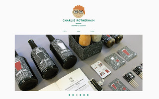
The next thing I had to consider was the layout and information for the Projects page. Initially, I liked the idea of having a wide range of images, one for each project that you could select, however, I found that this soon cluttered up the page so I began to minimise the amount until it got down to just one large image. The simplicity of the one image on a large scale would mean that I would be able to have a large impact to the viewer.
 |
| Moving on the Image |
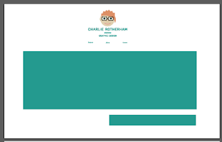
I realised that if I was going to have just one image, I would need to be able to have the images to rotate regularly so that people can select the project based on the image they were looking at. Therefore I included a bar at the bottom of the page so that you could see what image number you were viewing.
 |
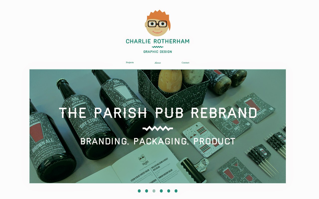
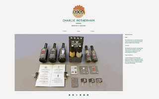
| Project Page |
From this, I applied some images of my work to show how the Project Page would function, moving from one image to the next seamlessly.
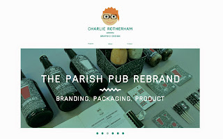 |
| Image Rollover Button Effect |
I soon realised that, by selecting projects in this way, it would make sense for the image to be a rollover button as well so that the user can, not only see what image they have selected but, be able to get some information on the project before they select it. From this, I added the blue colour as a filter and added an overlay of text with the name of the project and what areas of design it encompasses. I felt that this was a very subtle and simple way of communicating these elements to the user.
 |
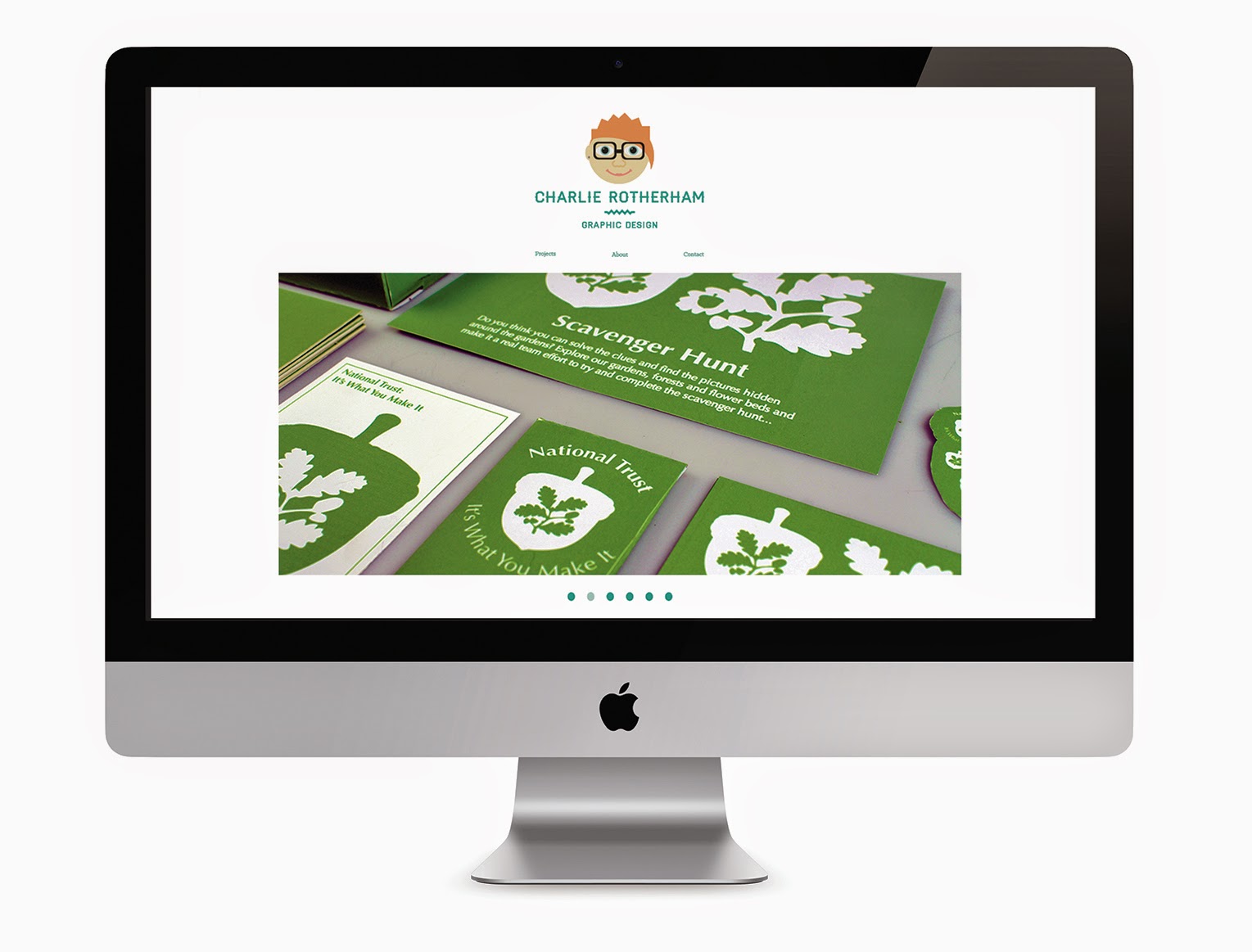
| Initial Layouts for Brief Page |
I started by having the image as large as the Project Page yet I felt that this wouldn't be beneficial as it wouldn't allow for contextualisation of the project or any details. I started to make room for text at the bottom, just like where the bar was on the Project Page but felt that this wasn't suitable.
 |
| Layout Development for Brief Page |
I decided to move the text to the side so that there would be enough space as well as keeping the middle image content the same. The text is laid out exactly like it is in my portfolio so that way there is a similarity. I thought about having it the same layout as my portfolio with the text in the left bottom corner but I realised that it would be nicer to have a mirroring instead so that it was one side for web and one side for print.
 |
| Content to Brief Layout |
I have kept the information for the brief the same as in my portfolio with a short sentence about the main things of the brief. Similar to the Project page, the images for the brief will continue to change and the number of images to view can be seen by a bar at the bottom of the page. This layout would be used for all briefs on the website.
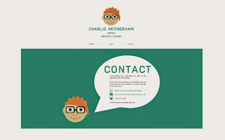 |
| About and Contact Page |
The About Page and the Contact Page were difficult to come up with imagery for to show what they would be. That was then I realised that I had already done an About Page and a Contact Page for the portfolio so I decided that I would use these for the website as well. This would also allow for another connection between the web identity and the printed identity.
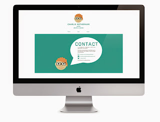 |
| Mock Up Presentation of Website Proposal |
I put up the web pages that I had produced and put them into a iMac mock up so that they looked professional. I think that it is great that I have a planned layout for the website so that when I do get the chance to spend time coding the website properly, I can use it to refer to. The website is simple and subtle, which is what I like, with its basis being purposeful, functional and direct in its presentation of the work.
Submission Boards
I produced a range of design boards to show the way that my brand identity has changed and how it has been influenced by the way that my visual style has developed.
Compared to the previous attempts of this same brief over the three years where I have had to brand myself, this is the first time that I have felt comfortable with what I have produced and have even gone as far to be comfortable to use it when contacting studios. This is a great step forward then where I use to be where I use to not want to contact places for fear of what they would think of my brand identity. If I had the time to improve it, I would continue to try and make the illustration design more sophisticated or maybe simplify it so that it would work better on a white background.