Thursday, 28 November 2013

Studio Brief 2: Designing for Web Interim Crit

For the Crit, we were to discuss how we were doing with the Designing for Web brief and where it was going. We had to get up in front of the group (I was in Group 4) and present what we had done so far.

In my crit, I discussed my idea briefly giving a general overview and discussing how I was approaching it. I showed all of my design sheets and mentioned that I had started coding my Homepage.
What I presented for my Crit
I managed to get a lot of positive feedback in regards to my idea, approach and the fact that my website has a solid purpose.

I was asked what my target audience was and I stated that it was ideally for a Infant to Junior School Pupil who had been asked as homework from school to do some research into Chocolate, making it educational and informative. This was seen as a very focused and specific audience to work with which would influence my design choices. I had mentioned that I had wanted to do a very complex story-style website but had ended up simplifying it down to some pages which were all the same which I felt took away from my initial ideas but I was told that this would be great for the audience as it would be easy for them to understand and use the site, making it more friendlier than the original intention I had.

At the same time, I got some very valuable feedback as there are room for improvements. One great piece of feedback was the use of language that I would need to consider as it would need to consider understanding of a child. For example, production would perhaps be too complicated so maybe use the term 'making'. It was suggested to maybe have a look at the Cbeebies website for influence into how I should approach this.

The decision to use illustrations by myself was well received and was told to do flat-colour illustrations and perhaps have a different colour background for each section so it is clear when the user has changed from section to section. Another great suggestion I got was to select a better, larger typeface which would ideally be friendly, rounded, sans serif and lowercase to aid the audience in connecting with it.

After this Crit, I put these comments into practise (See Design Practise Blog)

Tuesday, 26 November 2013

PPP2: Visiting Lecturer- Evolution Print

Evolution Print are a Sheffield-based Print House which use both Litho Print and Digital Print to produce large amounts of prints or bespoke print jobs.

- Aluminium Plates and Full Colour Prints that can produce 1500 sheets an hour
- CTP Computers to Plate System
- Single sheet of cut paper of different sizes- SRA2 (The size of 16 A4's) to B1 (720x1020) in size but you must remember to leave a 20mm bleed around your work
- They won't print anything less than 70gms and will go up to 450gms
- They don't do a spot varnish or laminate and Binding is out of house
- They use 3 paper types: Gloss, Silk and Uncoated
  • Uncoated is flatter, gives a hands-on organic feel but doesn't give a sharp image
  • Gloss and Silk is sharper and usually for corporate
  • Uncoated bulks up heavier in stock than in Silk- gives a hands-on quality whereas Silk is more compressed and thin
Differences between Litho and Digital Printing:
  • Litho is better quality yet it is more expensive
  • The maximum size for a Digital print is 2 pieces of A4 (SRA2) which is very limited
  • Digital inks are powder based so you can feel the poster on top of the surface whereas Litho uses vegetable inks
  • Litho allows you to use an extra, pure spot colour whereas Digital is a full colour process
Digital Costing Charge
- Click charge means a charge per sheet
- 5 to 10p for black and white or 30p for a colour sheet on just one size
- Litho is cheaper to print on a large scale

Litho Costing Charge
- Litho has an initial fixed cost based on Make Readies (£60) and Plate Costs for a Full Colour (£100)
- Make Readies include getting the inks to the right levels and printing 200 practise sheets to get the prints to the right standards

Printing Methods
- Work and Turn- One side printed and then you turn it so it goes on the back
- Sheet Work- One side printed then completely different on the other side (8 Plates more expensive)

Produced work for:
- Judge Gill
- Pete McKee
- Manchester City Football Club
- Lee Goater
- Activision
- Design Republic
- Manchester Modernist

Basic Mistakes made by Graphic Designers before Printing:
  • Bleed- 3mm include Crop Marks and Trim
  • Separate all Designs individually
  • Don't send books as spreads, send as single pages- send as PDFs as well as original artworks
  • For books, send covers separate
  • If Spot Colours are not needed, set the to CMYK. Spot Colours don't print transparent- set as an Overprint
  • Foils/ Separations/ Perforations- Set as a Spot Colour and Overprint so it can clearly be seen on the file
  • Use correct image sizes and at 300dpi
- To save money where making a booklet, work in either a set of 8 or 16
- Using just 1 or 2 colour allows for it to be less expensive
- Consider whether you are going to see the benefit of using an expensive stock if it is going to get 
  covered in ink?
- They use cylinders rather than tins for ink so they can be reused and have less waste and water used
- They do work for charity as it is their corporate responsibility
- The inks and plates used are bought from local supplies but the paper isn't 
- Coloured stocks are available but you can also use a white stock with a coloured tint behind it

After the talk, we had the chance to take some free samples away. I managed to get myself a business card and a large scale promotional publication. This meant that I was able to physically see and feel for myself the quality of the prints they produce.


Business Card


Large Scale Promotional Publication
As a year group, it has been suggested that we may get the opportunity to visit Evolution Print's Printing House in Sheffield to see for ourselves how they operate on a day-to-day basis. I think this would be an amazing opportunity if it actually came through as it would help our understanding so much more by visually being able to see the processes they use.

Tuesday, 19 November 2013

PPP2: Designer Dose Blog

In regards to my own research into designers which interest me, I have been producing a blog that I started as part of a collaborative group brief in the middle of first year called Designer Dose.

What started out as 5 of us putting up a post every day ended up with me posting to it once a day with a new design inspiration which I would find interesting. I have been using this blog for over the past couple of months.

Designer Dose 

I put my name as a tag on each blog post to show which ones I do with the title and images of the work and the name of the designer. Also, so as to make sure that I give the full reference to the designer I put a link to there work/ portfolio. If this isn't available then I put a link to the place where I found the work so there is at least some reference.

Update: 

Up to this point I have been putting a blog post a day on the site making it over the 1 year anniversary mark which I feel is a very great achievement. However, my laptop broke over the Easter holidays and all of the account information I had for all websites was gone. From this, I have not been able to remember what the details were to get into the account so Ive not been able to update it since Easter Holidays.


Current Blog Activity
It is only in the last few days that I have been able to get onto the website as I managed to get all of my account info back as I had backed it all up. As you can see, in my absence, the amount of views that my inspiration blog has been getting has been great and I have gained more following.

I am going to continue back onto doing my blog because I feel that it is a great rich resource of information that I have been collecting showcasing all of the designs that I am into. I have even included Design Studios that I have contacted, like Robot Food who I have contacted in regards to a visit.

Monday, 18 November 2013

PPP2: Visiting Lecturer- Matthew from GF Smith

GF Smith are a Paper Merchant who purchase paper from all over the world and sell the paper on within the UK

Paper Merchant
- 60% of Paper is from the Lake District in the UK
- 120 year old independent British brand
- High Quality and well Respected

Specifications
- Think about the product you are making and consider the stock beforehand
- Physicality provides a personal touch- nice quality and makes an impact
- Business Cards, Letterheads, Brochures, Envelopes and Packaging, ext.
- 1 million hand-made Envelopes a year
- Designers buy from the Printer and the Printer buys from GF Smith

Products
- Can select either of the Black & White and Colour
- Printing a colour on a piece of paper would look unprofessional and would have white edges
- The dye is the perfect shade and even throughout
- There are 4 Variants available:
  • Colorplan- 50 Colours, 8 Weights and 25 Emboss Texture
  • Smooths- Creams, Whites and Blacks
  • Textures- Nice for Cover Stocks
  • Specials- Wood Pine, Metallics, Fibreglass Inspired
"Good Printer, Good Design, Good Stock- You've got a Good Design"

Factory Services
- 4 Paper Machines Half a Mile Long
- Handmade Envelopes
- Cut Sheets to Size
- Packaging Prototypes

Beauty In The Making Exhibition


"Beauty In The Making Exhibition" (2012) by MadeThought x GF Smith
MadeThought x GF Smith (2012) "Beauty In The Making Exhibition" [Internet] Available from http://www.septemberindustry.co.uk/madethought-gfsmith/ (Accessed 18th November 2013)

- Showcase Brand
- Live Paper Making and Envelope Making

From the talk, we were given the opportunity to have a look and feel of some of the samples that Matthew had brought with him:

Fine Coated Paper Leaflet by Studio Makgill


Fine Coated Paper Brochure by Studio Makgill


Mohawk Navajo Uncoated Paper Brochure


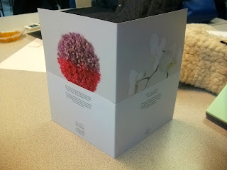
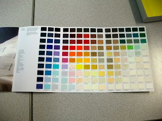
GF Smith's Colorplan Swatch Book/ Notebook by MadeThought


Colorplan Swatchbook

Softy Textured Paper Notebook


Specialist Paper Swatch (Metallics and Fluorescence) 
Textured Papers


Master Specifier (2011) by Sea
Being able to physically experience the stocks for ourselves, getting to feel them and see them in action and how they have printed was great. Don't get me wrong, its good when someone comes in and talks to us but its even better when we are able to get involved as it makes it easier to understand and makes it more interesting. We have been offered the chance to order some samples of paper for ourselves and I will defiantly be taking advantage of that. This will make for great research for the stock element of the Design for Print Research as well.