
 |
| Work Presented For Crit |
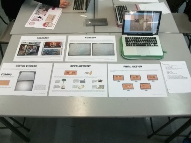
- Could my Design Boards be presented in a better fashion?
- Does the Scroll Bar help or hinder the aesthetic of the website?
- Is the Website relevant to the intended purpose for the target audience?
- Could it be more user friendly in regards to the experience for the target audience?
- is the written content appropriate and the language relevant to the target audience?
We were then able to read the feedback that was left for us from other people to take on board. This was my feedback:
 |
| Crit Feedback |
Generally, everyone commented on the appropriateness of my website for the target audience and the usability, particularly in the way that I had presented my content with illustrations. These elements gained a high amount of approval from my Feedback. Minor suggestions in regards to this was having the Font Lowercase which I can't do as the Font only comes in Uppercase and including Breadcrumbs to my pages for orientation, however, I already have orientation and links to the before and next pages on my web pages so this would probably make my pages more confusing if anything.
One thing some of the feedback sheets suggested was that I had too much writing on my Design Boards and that I should shorten it down or break up the amount of text. I was also encouraged to add the colours for my logo onto my colour scheme. Personally, I don't feel as though I have a lot of writing on their but I will amend this regardless.
An enlightening piece of feedback from 2 people was to re-write my paragraphs so as to have them more story-like and longer sentences. Also, someone said to have a grid to make the text easier to read. Im not sure what this means but I have interpreted it as having the images and text gridded so they have more of an equal amount of spacing together.
I had mixed comments in regards to my scroll bar with many saying it made my website easy to use and made the content easy to read whereas some said that it took away from the aesthetic as it stands out. I was given the suggestion by 2 pieces of feedback to make the scroll bar into arrows however i wasn't given any advice on how to achieve this which didn't help.
Overall, I found some of the recommendations helpful but it would have been more helpful if the comments came with ways of doing the changes as I don't know how to do them. I am happy with the general consensus that it is successful and good, however, so I know that I have been on the right track.
Self- Evaluation:
- How did you approach the brief? - I approached the brief with enthusiasm as it was something new and refreshing. I have been wanting to learn how to do web design since I started the course so I was excited to try it out.
- What was your thought-process behind the brief? - My thought-process behind the brief was based around the content/ subject matter of Chocolate which dictated the content and the audience of children which dictated the aesthetics and presentation of information as well as the way the website worked.
- What worked?/What was Good? - What was good was being able to learn a process and develop it by being able to put what we learnt into practise. This meant that I was able to put some time to actually getting to know the software a little and play around with it. I especially liked the coding aspect of the production as I found it interesting and found myself not being able to stop doing this brief until I had made the website because I had become so submerged into coding.
- What didn't work?/ What was Bad? - What was a shame about the brief was my lack of knowledge at this present time as I had come up with a great website concept but my lack of skill and understanding wouldn't make it plausible for me to produce. This meant that I had to produce a condensed, simpler version so I hope that as I continue on, I will continue to be able to improve and develop my skills to make more grander and elaborate web designs.
- What would you change?- I would change the way that the website scrolls as I wanted the website to be as linear as possible and allow it to scroll freely. Instead i had to add a scroll bar which isn't greatly aesthetically pleasing despite its function.
No comments:
Post a Comment