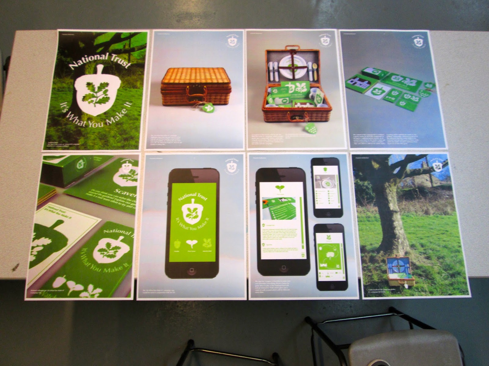
The trouble with our design boards was that Anna produced them from home while she was ill so I didn't have any of the original files, making all of the images when printed poor quality. Also, this would mean that I would have to present them by myself.
 |
| Boards for the Crit annotated by other groups |
 |
| Feedback Sheet |
The groups that had critted each others work had to them merge together and present their work, discussing the feedback that they were given from the previous exercise. From this, we had a whole class discuss on comments that were made on our work in regards to what we need to improve as a year group. This list included:
- Consistancy of Layout Throughout- Sizing of Images (Formatting), Gutters and Margins, Quality of Images and Body Copy/ Typesetting
- Defining Audience ( and Aims and Outcomes)
- Too Much Information (Images and Text)
- Impact- Hierarchy of Information
- Haven't printed work out beforehand- Everyone has used a landscape format, make everything larger- Characters on huge scale, Main Design on 1 Board, Get rid of all white spacing and have Full Bleed Images. It needs to look like an editorial piece rather than some images put on a board.
Study Task:
For the last session, we have to have design boards produced on the briefs that we have done so far so that we can show what we have done in the Module.
We had to have the boards printed in A3 ready for the session so that we could present our work to the whole class.
 |
| Printed A3 Boards for Final Module Crit |


No comments:
Post a Comment