Friday, 24 January 2014

Responsive- Design Process 2: National Trust Final Crit

For our Crit, we started by laying out our work and walking around the room, looking at what everyone else has done so far.
Work for Crit 
Then we had to get in groups of 6 and get into pairs within that 6. We had to crit the work of another pair using a feedback sheet. At the end of the crit, we were then able to read our feedback sheet to see what we have been given from the other pair.


Feedback from the Crit
I got some mixed feedback in regards to my project but I did get some good suggestions and considerations to think about.

Some good points of feedback included the fact that the brand for the campaign is constant throughout a cross-section of media and that it isn't just an advertisement and that I have taken an original approach to the concept. The fact that the product is family-friendly encourages everyone to get involved which is engaging and my boards were well presented and mainly image-based and spoke for themselves as well.

In regards to suggestions, I need to consider how this product is going to be distributed. I was thinking it could be something they buy or something they get when they take out a membership or maybe even something they get free in an event. Another area was to make it more up-to-date technology wise by encouraging people to download the app instead of a disposable camera.  I am going to encourage people to download the app anyway and the purpose of the camera is to record the memories they create and, if I was to include a top-of-the-range camera then it would be too expensive to produce. A suggestion was to incorporate a scavenger hunt and expand on the other app pages which I was already going to add a treasure hunt game into the kit anyway and I would do with producing the pages for the other app pages.Another suggestion was to incorporate more reds and greens into the design yo make it more vibrant. I tried different colour variations beforehand and I couldn't find a combination which looked right, however, I will continue to experiment to see if I can make something work. One last consideration was whether people would be allowed to plant the seeds. I would't have thought there would be a problem with people planting seeds in the gardens as the whole point of the Trust is to encourage nature preservation, however, there could always be specific places where people could plant them.

From this, I am going to continue to develop my answer to the brief to achieve its full potential and I found the feedback helpful with some ideas I can defiantly consider to move on.

Monday, 13 January 2014

Design Production Module Evaluation

As we have finished the Design Production Module, I completed a Self- Evaluation of the whole Module to discuss how it went and to reflect on the work we have produced (see pictures).


OUGD504 Evaluation
I was considered when answering the answers, giving truthful and honest answers and I put emphasis on what I need to improve on regarding my skills and ability as a designer.

Friday, 10 January 2014

Responsive- Design Process 2: National Trust Interim Progress Crit

For the session, we need to produce 5 design boards showing what we have done for the brief so far so that we can get feedback on it from a group of 4 others from the class. Also, we would be focusing on the presentation of our boards as well.
Printed A3 Design Boards
I presented my boards and discussed my idea concept and how I had started the brand for the campaign.

The feedback I got from the crit was mainly positive as they said it was a well-rounded concept that is focused on the audience emotion with the brand. They liked the fact that there was a very focused audience that was different to what was specified but allowed for a different approach to the brief that was unique.
One thing that was mentioned that hadn't even crossed my mind was the face that there needed to be a web-based media to fulfil the need for an integrated campaign. I was given the suggestion of producing an app proposal that would appeal to the younger generation whilst producing a synthesis between digital and printed response. This could include a checklist of things to bring, an interactive walk that could be used and give a different route every time and maybe some picnic games which could be submitted by other National Trust members and changed weekly.

Wednesday, 8 January 2014

PPP2: Studios I'd like to Visit/ Contact

Having felt inspired by the talks that we have been having from visiting lecturers as well as the PPP sessions, I felt it would be a good idea to try and find some design studios which, given the time and money to visit, I would like to see.


Solid -ID by here design


"Ceviche" by here design
here design [Internet] Available from http://www.heredesign.co.uk/index.php (Accessed 
Here Design are a studio based in central London who's work seems to revolve around using vector imagery to produce clean brand identities as well as other work like editorials. Currently, with their location being in London, it would be quite hard for me to arrange a visit so I think this would be something that would be more relevant to the third year when I can direct my year and own learning. 
"Wahoo for Water Aid" by Numiko
"Scene Stealers for Film 4" by Numiko
"Good Causes for National Lottery" by Numiko

"Stand Up For Cancer for Channel 4 and Cancer Research" by Numiko
"Foxes Live for Channel 4 and Windfall Farms" by Numiko
Design Council by Numiko
Numiko [Internet] Available from http://numiko.com (Accessed )
Earlier in the year, we were given a talk from the design company Numiko who gave us a presentation and showed us their work. I was really taken by them as they use a mixture of vector images as well as photography and layout to produce work which I think that I would be able to fit in with. 


Brasserie FARNHAM by lg2


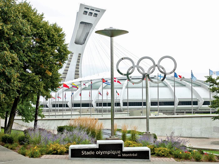
"Parc Olympique" by lg2 


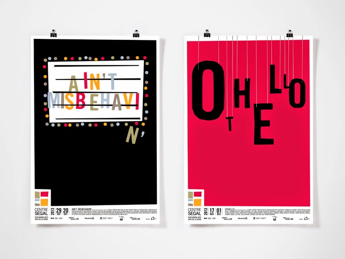
"Campagne 2013-2014" by lg2
lg2 [Internet] Available from http://lg2.com/fr/realisations
lg2 are a studio who work mainly on producing brands for retailers. There latest work are based around television advertisements but there earlier stuff revolves around print based brand identities and collateral. The style they work in is sophisticated within its illustrations, making it work for the client and giving it a professional finish. The studio is based in Montreal and Quebec in Canada so this would be difficult for me to visit but I guess I could always try and contact them anyway to see if they could maybe answer some questions for me on their practise.


"Hotel Excelsior" by Mr. Cup


"2014 Letterpress Calendar/ the Creative Manifesto" by Mr Cup
What I like about Mr. Cup is that he travels around the world for work and inspiration producing work as he goes along. His blog is a feast for the eyes! His work is a lot different to mine as it is very physical and hands on with printing techniques and letterpress, however, the quality of his work is phenomenal and I feel this would be a great experience if I was able to learn from his expertise.