Friday, 21 March 2014

PPP2- Life's A Pitch Session 3

1. What is a business plan?
  • Outline your business- what will it look like in a years time? Three years? Five years? 
  • What is your mission/ purpose?
  • List your overall objectives by outlining your business goals
  • What are your business strategies- what is your unique selling proposition?
  • What is the total start up capital you need to launch your business?
  • What do you estimate your business monthly expenses to be after launch? 3 months? 6 months?
  • What will be your businesses monthly income?
  • Create an action plan
  • How do we get ourselves out there? 
2. What is your business image?
  • Tone of voice- social, serious? 
  • Company manifesto?
3. How can you promote your business?
  • How do you tell your potential clients you are available and ready for projects?
  • How do current studios communicate their offers?

Thursday, 20 March 2014

Responsive- Design Practise 2: Final Module Crit

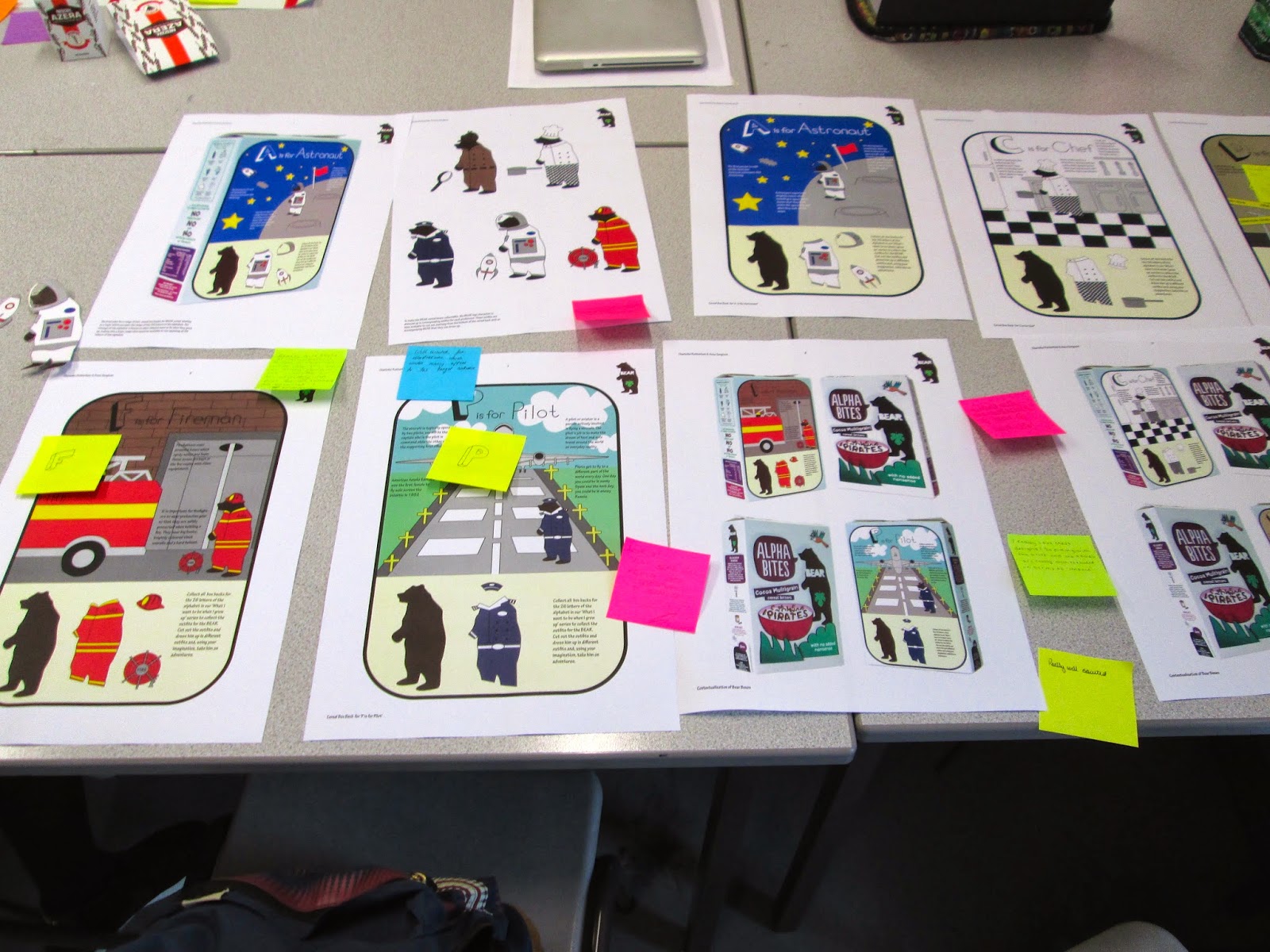
To start with for the Final Module Crit, we had to display our Collaborative Practise Design Boards out as a pair. Then the whole class went around the room to look at everybody's work, using Post It Notes to leave comments about the work and the design boards so that each group had some feedback.
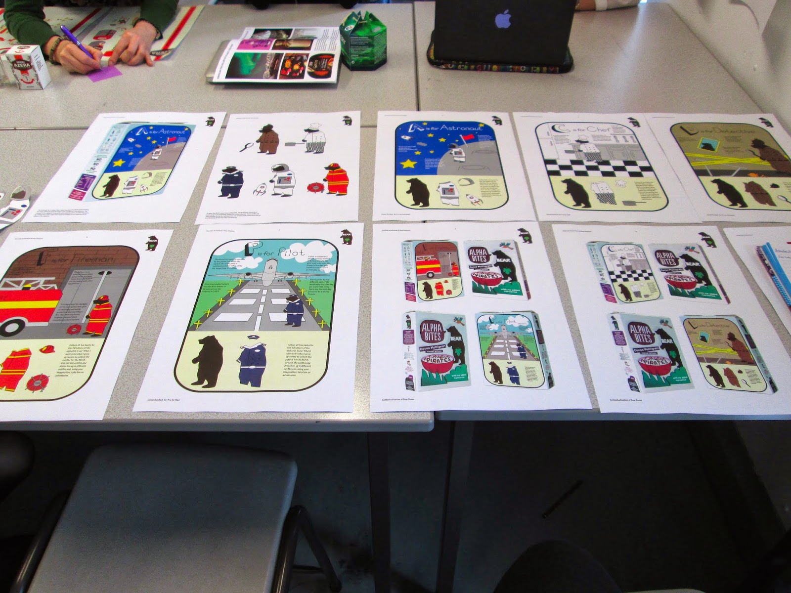
Lay Out Collaborative Practise Design Boards
Post It Notes Feedback
When we had gone around the class, we came back to our own collaborative work and found what feedback other people in the class had given us.
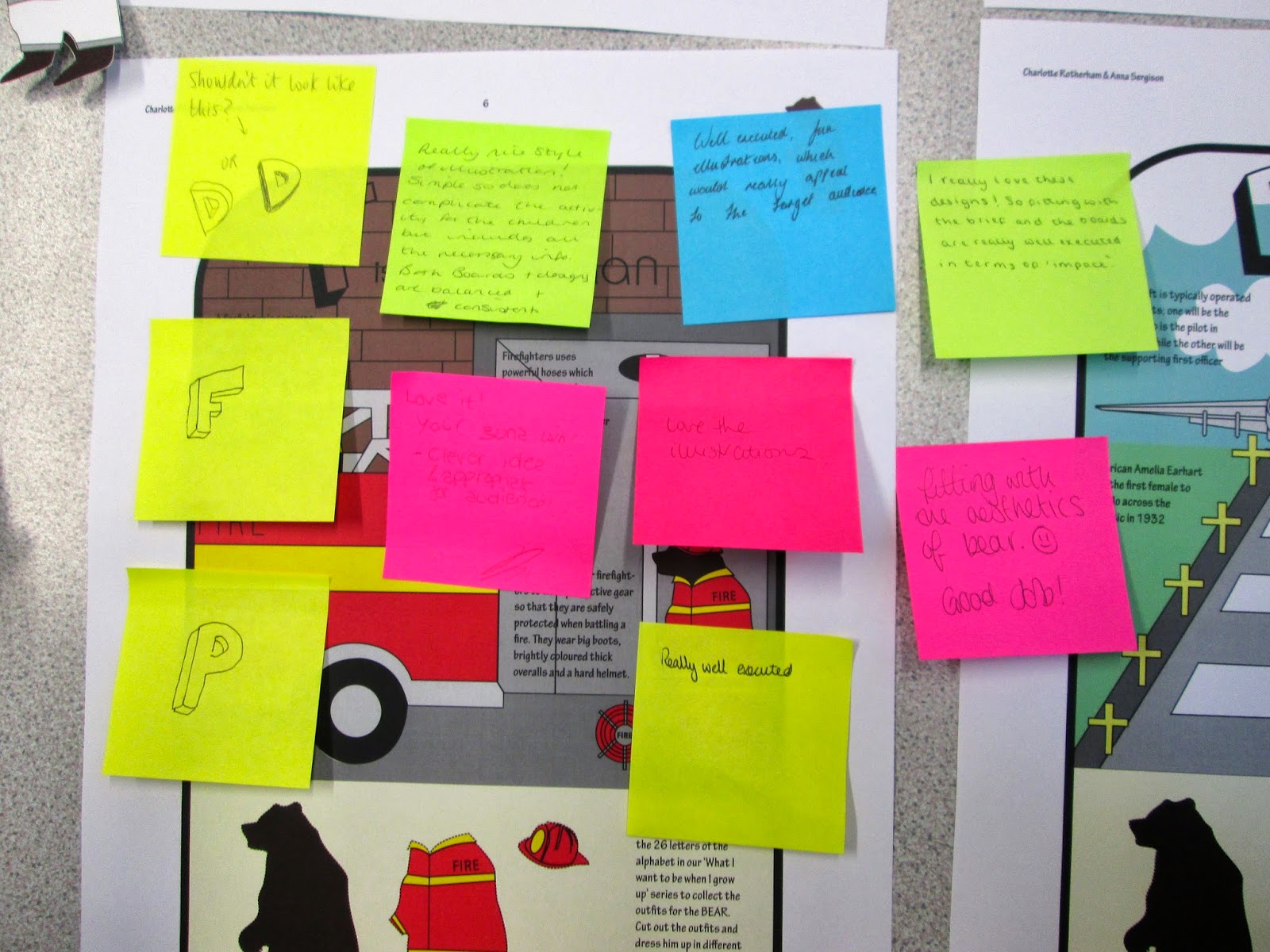
Feedback
The amount of positive comments was overwhelming and something I did not expect- even one going as far as to say we would win! People liked the style of our illustrations, how we had produced them and how we had mocked them up. We did get one piece of constructive criticism which was someone had suggested that we re-design 3 of the main letters on the titles of the backs so that they look more 3-D. This is something that can be easily changed and will be done. Honestly, I found more mistakes in our boards and designs from seeing them printed then anyone who came to look at them, such as a page number mistake and some of the illustrator image vectors being mis-aligned and having some white showing. These elements are easily changeable as well so I will do these to improve the overall quality of the work.

After this, we had to get into groups of 3 collaborative pairings (Anna and myself were with Ant and Ewan and Grace and Jane) and discuss the type of feedback we would like on our individual practise boards.

As a year group, we discussed the type of feedback that we would want for the individual practise boards being;

  1. Consistency/ Effective layout of Boards (Presentation)- Project Report
  2. Project Management- How do you evidence it? Have you evidenced it? Is there enough evidence from the time available?
  3. Have you answered the brief? If not, why not?
  4. Visual Quality and Technical Ability
  5. Suggestions of Improvement and why?
  6. Evaluation of work- What works, what does't and why?

Using these as pointers, we had to go round in our pairs and give feedback on everyone else's individual work, filling in Feedback sheets. This was my feedback on my individual boards and individual brief work:
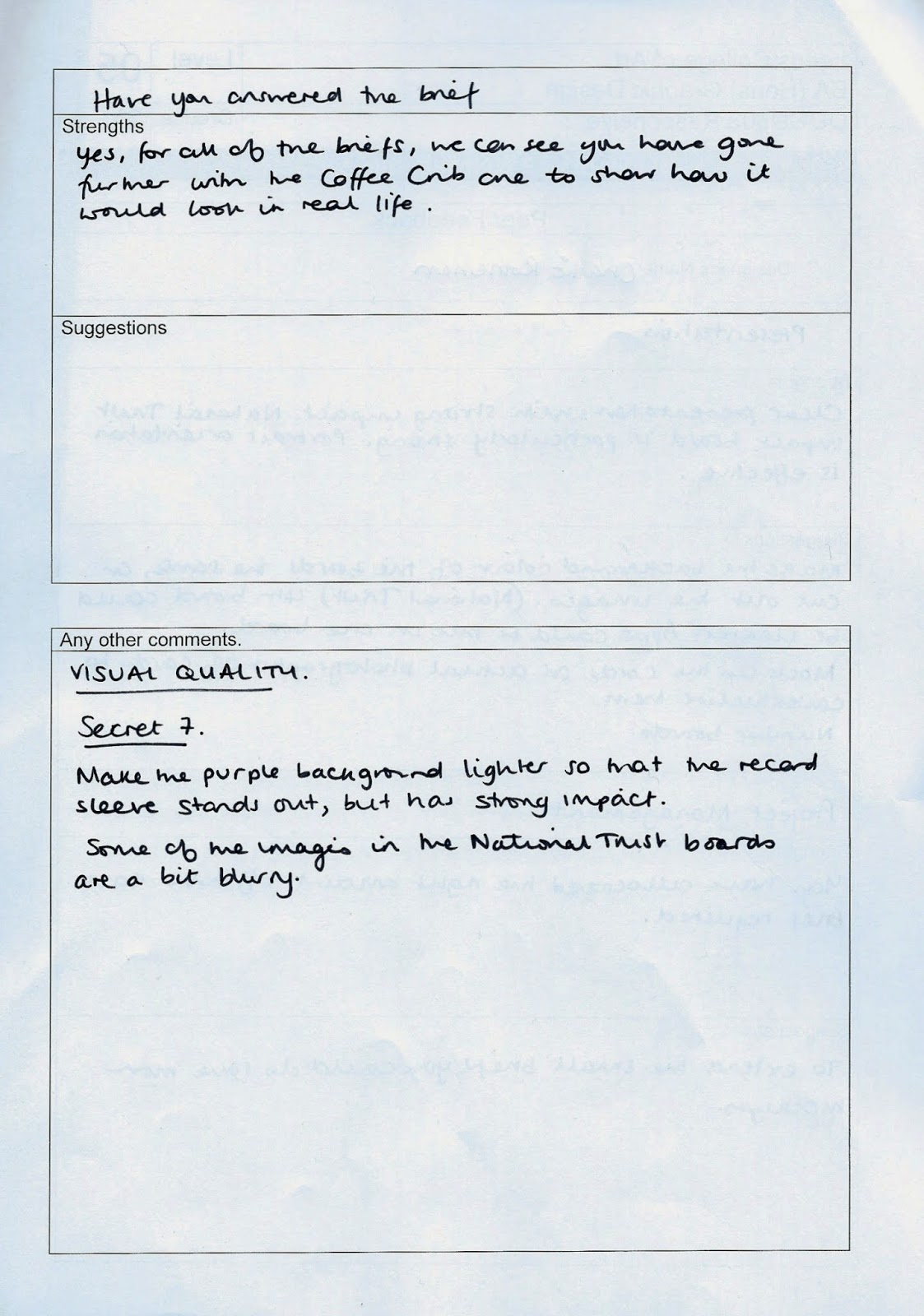


Feedback Sheets from the other 2 Collaborative Pairs
What I got from the feedback was mainly positive, such as having good layout, impactful boards and clear designs, with a couple of minor tweaks that I can do to the boards and my briefs to improve their quality, such as expanding on them to contextualise them and to improve the image quality. This way, it will mean that I get to show and display my work in the most consistent and professional manner possible.

Tuesday, 18 March 2014

Design Practise 2: Studio Brief 1- Research Book Final Crit

For the final crit, we had to have a mocked up version of what we had designed so far. It had to be a physical printed copy so that it was easy to see any spelling and grammar mistakes through the printed body copy.

We were put into groups (I was in Group 4) where we had to lay the work out, discuss our work with the other members of the group before going around each members work around the table and filling in a feedback sheet.
Mock Ups for Final Crit
For this crit, again, like the last one, I had a lot of questions that I needed answering;
  • Appropriate stock I could use (preferably sustainable)?
  • Would my images benefit from having a green filter on them?
  • Would the work benefit from an inclusion of illustrations?
  • Would the front have more impact if I inverted the white and green colour of the logo to have a full bleed image?
  • For having a flipbook/ notepad format, could you recommend any methods/ binding techniques I could try? 
  • Which of the 2 packaging ideas is the most appropriate?
From the crit of my current work, I got this feedback:


Feedback from Final Crit
The feedback I got from my crit was that they liked my photographs but it would be a good idea to try and include illustrations to add a more unique element. The group unanimously preferred the open out gate but to produce it without a padlock on it as it gives the wrong impression. The main comment in regards to stock choice is that they felt an off-white stock would be more successful, finding some FFS approved paper that has been recycled or perhaps even making my own paper or buying paper which is handmade. It was agreed that it would be better to have a full colour bleed inverted image on my font cover so that it has much more impact and makes the book much more interesting therefore I will do this straight away. It was also suggested that I try out some more layouts and experiment more with my placement which I can go onto doing from here.

In a way this crit has helped so that I have more reassurance in what to include for my book but at the same time I still feel like I have a lack of direction. I am going to keep going, go with the comments made and develop and experiment further with the contents.

Friday, 14 March 2014

PPP2: Life's A Pitch Session 2

You need to make sure all of the research information is based in the UK as different countries have different legislation in regards to copyright and intellectual and creative property:

What is the nature of your business?- Music, sweets, non for profit?
What is your moral stance of the business?
What must you consider?- Logistics, Screenshare?
What is your intended market?- Retail? Corporate?
Where will you work from?
  • Are you a Partnership/ Co-op/ Limited Liability/ Limited Company? 
  • Are you gonna work from Home/ Media Centre/ Office Space/ Desk Space (in another studio)
How much do you charge?- Per hour/ Per project?
What liabilities do you incur?- Breach Copyright
What finical security should you put in place?- Tax/ Insurance/ Security
What records must you keep?- Bought/ Sold/ Paid yourself- get an accountant
Will you pay tax?
Where is your business going and where is it going to end up? What is the plan?
What is your brand identity? Ethos? Brand Guidelines? 

Friday, 7 March 2014

PPP2: Life's A Pitch Session 1

Need to be thinking ahead and making some initial decisions:

Options: Freelance, Working in a Studio, Going into Partnership, Setting up own Studios/ Company

What plans for the future? Where will you potential clients come from? Where will I work?

How much do I charge? Will I get Paid? What will I need? Do I pay VAT/ TAX, ext

Setting up a potentially viable business:

- Cost of setting up: Utilities, WiFi, Rent, Expenses
- Rates: Charge per hour or per work
- Business Plan?

In groups, we will be working on a small enterprise which will need to research on and produce a presentation on.

Thursday, 6 March 2014

Responsive- Design Process 2: Collaborative Practise Final Crit

For the final crit of the Collaborative Module, we had to produce design boards showing the final designs that we had produced so far. We had to get into the previous weeks crit groups and swap boards with groups from another table, criting each others work. We also had to fill out a feedback sheet for each group so that they could get feedback on their Boards as well as the work itself.

The trouble with our design boards was that Anna produced them from home while she was ill so I didn't have any of the original files, making all of the images when printed poor quality. Also, this would mean that I would have to present them by myself.


Boards for the Crit annotated by other groups

Feedback Sheet 
I could totally understand the comments that were given towards the poor image quality of the boards due to the fact that I hadn't been sent the original file in a PDF format so I was having to work with them being pixelated. Alongside this was the suggestion of having information in columns and better image alignment which I fed back to Anna after the session was over. One grammatical error was found and, even though I spellchecked the boards beforehand, I managed to find that Anna had spelt my name wrong which I was embarrassed about. This feedback is all valid, however, as it means that we have a clear aesthetic to go for when we are producing the final ones. Despite this, we were given good feedback on the context of the idea and the actual design of the box back which I was pleased about. One comment wanted to know when we would be producing any others but I am currently waiting on Anna to produce the drawings for it before I can produce them.

The groups that had critted each others work had to them merge together and present their work, discussing the feedback that they were given from the previous exercise. From this, we had a whole class discuss on comments that were made on our work in regards to what we need to improve as a year group. This list included:
  1. Consistancy of Layout Throughout- Sizing of Images (Formatting), Gutters and Margins, Quality of Images and Body Copy/ Typesetting
  2. Defining Audience ( and Aims and Outcomes) 
  3. Too Much Information (Images and Text)
  4. Impact- Hierarchy of Information
  5. Haven't printed work out beforehand-  Everyone has used a landscape format, make everything larger- Characters on huge scale, Main Design on 1 Board, Get rid of all white spacing and have Full Bleed Images. It needs to look like an editorial piece rather than some images put on a board.
Study Task: 

For the last session, we have to have design boards produced on the briefs that we have done so far so that we can show what we have done in the Module.


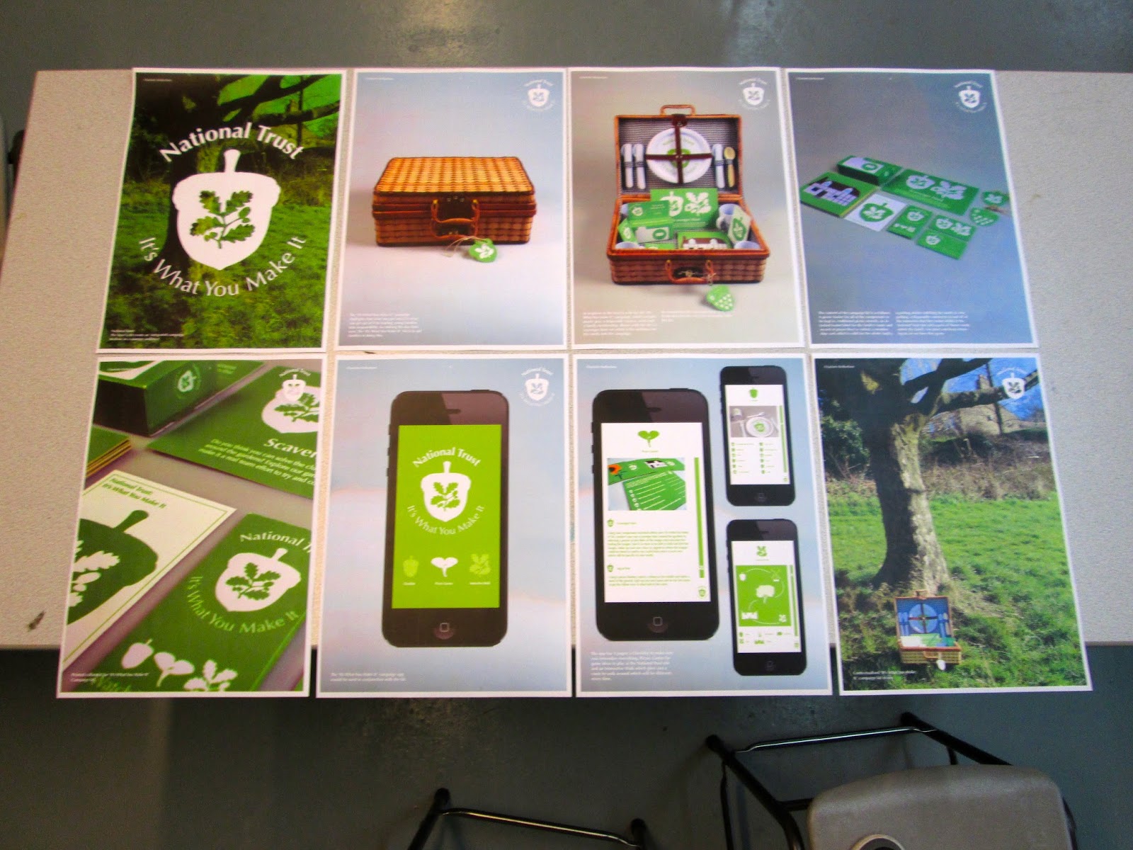
Printed A3 Boards for Final Module Crit
We had to have the boards printed in A3 ready for the session so that we could present our work to the whole class.