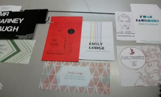
Following on from the Study Task, we had to print out the 3 x A3 Free Ads and have them cut out.
 |
| Finished Free Ads Printed and Cut Out |
From this we had to make 2 sets of lists on scrap pieces of paper:
What are the 5 words you used last week to describe your Design Practise?
- Thorough
- Considered
- Developing
- Organised
- Integrated
What are the 5 words you used to describe your personality?
- Organised
- Friendly
- Eccentric
- Hard-Working
- Disciplined
From this, we found that it was hard to remember exactly what we had put due to the fact that are practise is constantly developing and changing
Then we had to list 5 words to describe what we were trying to communicate through each of the ads about us and the 2 other designers:
Oli:
- Brand
- Ethos
- Unique
- Purposive
- Modern
Beth:
- Classy
- Multi-Disciplined
- Professional
- Structured
- Organised
Me:
- Integrated
- Bold
- Simple
- Multi-Disciplined
- Developing
We then had to present the Free Ads we had made to our group so that we could see how we had interpreted each other.
 |
| Selection of Free Ads as a Group |
 |
| My Free Ads (Mine by Oli is the Middle One on the Mac Screen) |
Using the Free Ads that have been done for us as well as what we had done for ourselves, we had to list what is reflective and unreflective of ourselves by them:
5 Things in the ads that reflect me:
- My Hair!
- Simple Layouts
- Use of Space
- Minimalist Style
- Type justified to the side
5 Things in the Ads that don't reflect me:
- The C looks like a G
- Large amounts of Description used on the Ads
- Colour choices
- Layering and Overlapping of Text and Image
- Structure of Ads
We then had to move from our Ads and look at a different groups Ads. We moved to J'nae, Barney and Emily's.
 |
| Other Groups's Free Ads |
With theirs, we had to objectively compare the different Ads to see how they communicated each person.
5 ways in which the Ads, as a collective, communicate the individual in a similar way:
Barney:
- Ordered
- Information Input
- Distinctive
- Bold
- Direct, To- The- Point
Emily:
- Geometric Shapes
- Information Input
- No Contact Details
- Bold
- Brave Visuals
J'nae:
- Fashion Editorial Style
- Light
- Clean
- Professional
- Tone of Voice
5 ways in which the Ads, as a collective, communicate the individual in different ways:
Barney:
- Layout Presentations
- Tone of Voice
- Different Visual Identities- Pattern vs Minimalist
- Typefaces
- Colour Schemes
Emily:
- Layout Presentation
- Reflect Different Visual Identities
- Tone of Voice
- Handmade vs Digital
- Typefaces
J'nae:
- Design Process
- Fields of Interest/ Specialisms
- Levels of Professionalism
- Traditional vs Modern
- Handmade vs Digital
From this, we went back to our Free Ads and saw what a different group had written about our Free Ads
 |
| Notes on our Free Ads by another group |
Then we had to make a note of things that the other group had mentioned a lot in their notes and anything that matched the initial list we had made about our personalities and design practises.
Beth:
- Clean Limited Colour
- Traditional Design of Purple one
- Professional (Match)
- Clean and Precise (Match)
Me:
- Eccentric (Match)
- Clean and Minimal
- Digital
- Doesn't have a running common theme amongst the Ads
Oli:
- Tone of Voice
- Minimal Colour
We went onto discussing how our personalities and professional practise sometimes effect each other. This led onto producing a list of Pros and Cons based on the idea of your personality being reflected in your professional practise.
Group List:
Pros:
- Development of own personal visual identity
- Soulless design is bad design so personality included is good
- People have paid for your style of work
- Add depth, opinion and tone of voice to the work
Cons:
- Paid to reflect someone else's beliefs and not your own
- Shouldn't let own beliefs get in the way of work
- Could be unprofessional
- Needs to be reflective of the team/ collective
Class List:
Pros:
- Recognisably your own signature work
- Humanizes the work- more approachable
- Shared values
- Suitability to client- appropriateness to job and role (they know what they are going to get)
Cons:
- Only being defined by one thing or what you like- narrow field of vision
- Personality conflicts with professionalism- split personality
- All about yourself means you cant work in a team- fine line between cockiness and confidence
- Become comfortable in what you have
 |
| Scrap Paper we had to Write the Lists on |
What makes you you and what makes you a designer? Relationship between what you do and what you want to do. Growth as an individual and how you are informed.
Study Task:
For the Study Task, we needed to produce some answers to these statements. They must include an image to illustrate the points. The first set are not to do with design and must be reflected in the images and answers whereas the second set need to be about graphic design.
5 Statements that clearly state things about you as an individual and your personality:
 |
| My Books |
1. Reading- I enjoy reading as a hobby and carry a book with me all the time. I like to read during my commute. When reading, you always learn something new and gives you the ability to look at topics, problems and issues from a different perspective.
 |
| My Cat, Bandit |
2. Pescetarianism- I am pescetarian so I don't eat meat. I have a pet cat called Bandit and I don't like the prospect of someone wanting to hurt her. I don't like the idea of animals being hurt and I don't like watching it so I don't eat them.
 |
| My Guitar |
3. Music- Music influences much of the things that I do in life. I go to gigs and festivals, read about bands, stream videos and buy the merchandise. I even try and play my own.
 |
| My American Flag Jumper |
4. American Culture- I have a strong connection with american culture as I am very interested by a lot of their brands, music, history, lifestyle and iconography, particularly the flag. I have yet to make it over to America but I aim to visit at some point rather than just seeing it on TV.
 |
| My Student Card |
5. Education- Education is important and should be free and available to everyone. You can learn something new everyday at any age. I am pretty pleased and proud to be at Leeds College of Art and I want to make the most of the time I have to learn as much as I can.
5 Statements that clearly express you as a practitioner and where you're up to now:
 |
"Accept and Proceed" (2007) by Craig Ward
Ward. C (2007) "Accept and Proceed" [Internet] Available from http://www.mrcraigward.com/?p=140#about (Accessed 2nd March 2013) |
1. Aspiration- I want to be able to work for a well established studio where I would sometimes able to travel with my work. I intend to work into America at some point and be able to gain some following from having a good reputation and portfolio so that I would be able to work anywhere. Craig Ward is a Graphic Designer who has done exactly this, working his way up in the UK to the USA and making a name for himself. He has done what I want to do, proven it can be done and for that I respect him.
 |
"Iconic Artists to Guess" (2012) by re:design
re:design (2012) "Iconic Artists to Guess" [blog] 15th July re:blog Available from http://reramble.wordpress.com/2012/07/15/iconic-painters-to-guess-pt-1-of-3/ (Accessed 2nd March 2013) |
2. Skills- Since I have started the course, I have improved my skills using software as I can now use the basics of Illustrator which has improved my confidence in regards to the outcomes that I am producing to briefs. I'm not as behind as everyone else and can created work that looks more polished and professional when it is suited. This is illustrated perfectly by the work of the studio re:blog who show how just using the basics and keeping work simple can make the most effective communication. I respect them for being a design collective who usually keep their work simple and clean.
 |
"DESK" (2011) by Jongmin Kim
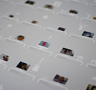
Kim, J. (2011) "DESK" [Internet] Available from http://desk.cmiscm.com (Accessed 2nd March 2013) |
3. Skills- I wish to learn the skill of web design as I have never done it before. It would be beneficial so that I could transfer my skills to web as well as producing print- based products. Also, much of the industry is based around being able to produce work digitally via audience interaction from the web. I respect Interactive Designer Jongmin Kim who makes all of his interfaces different whilst keeping the necessary interactivity of the audience to make it exciting for them to use.
 |
"Kendall Square" (2010) by Daniel Blackman
Blackman, D. (2010) "Kendall Square" [Internet] Available from http://dblackman.com/kendall-square/ (Accessed 2nd March 2013) |
4. Placement- I feel it would be very beneficial to be able to get a placement within the years that I am a student. Being able to gain invaluable experience will allow me to see what I want to focus on and where I fell my skills would be best suited to. Given the choice, I would want a placement with Daniel Blackman as he produces a range of products and uses an eclectic mixture of media thereby not restricting himself and I respect the fact he continually pushes himself into new territory.
 |
"Fast Eddie's Barber Shop" by Commoner, Inc.
Commoner, Inc. "Fast Eddie's Barber Shop" [Internet] Available from http://portfolio.commonerinc.com/#/fast-eddies-barber-shop/ (Accessed 2nd March 2013) |
5. Specialisms- I like the prospect of not being defined by being in a selected area. I would like to keep my options open. If I was to specialise, it would be in the area of Branding and Identity as it encompasses other large area of design within it due to the fact it can be expanded into promotion, retail, product, packaging and publishing. In this area, I respect the design studio Commoner, Inc. as they keep the designs traditional yet classic so it will not become outdated, which is what you want when designing a successful brand identity.


No comments:
Post a Comment